Thursday, September 23, 2010

Imposition Intuition

A recent episode at Vashon Island Imaging prompts this blog about how to imposition gang-ups for efficient cutting and trimming.


Pam Swanson printed a rack-card job from a file supplied by the client (above). Rack cards are 4 X 9 inches (10.16 X 22.86 cm).

Normally you gang-up two on an 8.5 X 11 inch (21.59 X 27.9 cm), and that is what the client had done. There was nothing 'wrong' with the imposition supplied, so Pam printed it. Later she discovered that the way the cards were positioned required 6 cuts to separate and trim them. Multiply that by 1,000 cards and that's a lot of cuts.

You might ask, why didn't we just use a guillotine? ...For two reasons quite different but equally important:

- We don't have a large one (but soon we will)
- We probably wouldn't have used it even if we did have one

Let me explain:

We don't normally get requests for such large quantities, so our trusty Boston® paper trimmer usually serves our needs. But that doesn't matter considering that I wouldn't have trusted a guillotine to make the thin trims required for this job.

It takes a really fine guillotine to trim 1/16th of an inch. When you make very thin slices with a guillotine the blade will make an uneven diagonal cut through the pile, or even 'shred' some edges, if it isn't razor sharp. Even using a paper trimmer you have to be careful making thin slices, as I am sure you are well aware.

Pam was thus stuck with an 6,000-cut project. The plus side of that is that she will never make that mistake again. In the future she will triple check impositions before printing anything ganged-up.

Another plus is that she managed to find moments of Zen during the ordeal resulting in a poem dedicated to paper trimmers everywhere (and reprinted at the end of this blog with her permission).

Counterintuitive Impositions

Imposition is important to keep the front and back in registration during duplex printing. You don't have to be a genius to know that, eh? Still, even knowing that most people inadvertently imposition in a way that creates more labor than necessary down the line. They do so because imposition is counter-intuitive. How so?

Most people place the gang-up in the center of the sheet, stacked. That makes visual sense... it looks balanced. Anyway, that's most people's placement choice. They also leave some space between the two cards ...they are separate cards, right?

There's nothing 'wrong' with such a layout, except that it requires the most number of cuts -- six -- to separate and trim the two cards.


Eliminating the space between the two cards may save you one cut but only if the bordering areas are the same color. Then you have five cuts for this imposition layout:


The card Pam printed could have been reduced to 5 cuts if the two cards were impositioned back-to-back or belly-to-belly, as below.


The least number of cuts possible is three, as below.


This efficient imposition only works for non-bleed art. That is, the postcard picture requires a white border that is at least as wide as the non-print area around the edges of the sheet, 1/4 inch... just right for borders.

If the picture has to bleed then you are back to 5 cuts (as below) because the printer may not print 'bleed' or doesn't do a very good job of it. Either way it's inviting trouble... that is why bleed printing always costs more. It has nothing to do with the ink and everything to do with the trimming.


Getting the imposition correct for the backside is just as counterintuitive. In fact, it has made me crazy for my entire life. I usually end up doing it in what seems to be every possible combination before getting it right. That's because I was too lazy to make a 'dummy'.

I've been making dummies for more than 40 years. Burt Holmes showed me how when I was his assistant at Basford Incorporated, an industrial advertising agency in New York, in 1966.

Dummies are paper miniatures of your project. They are especially useful to figure out pagination. For cards, if you sketch out the front layout on a sheet of thin 'see-thru' paper, like tracing paper, you can place it over the layout for the back and easily get the imposition right every time. Every time I am too lazy to do that I end up confused as usual.


In relation to one another, one is 'upside down and positioned on the other side of the sheet, as shown above, for duplex printing.


If you use a manual feed tray the artwork doesn't need to be turned upside down but it does need to be on the other side.

Use Trim for Mini-Cards


As it turns out, the 4:9 ratio image proportionately reduces to exactly the right size to fit in the trim zone. Those can be used for mini-cards. Of course, type will need to be edited and resized but, hey ...added value for your customers. The one shown is a combo we put together for the Peaks Lodge in Revelstoke, BC (if you are a snowmobiler, clue in to Revelstoke).


The mini-cards are used for Peaks Lodge contact info and are handy for guests to pop into their pockets.


A combo of rack and mini cards will be the October special at Vashon Island Imaging. We'll be selling packages of 100 for $44 and 500 for $111. There will be some restrictions, like non-bleed art for example. Still, great prices and good value for money.

Time is money and taking a little up front to figure out a good imposition layout can ultimately save you an enormous amount of time.

Follow these two rules:

1.) Don't be a dummy, make one
2.) Make 'upside down other side' a mantra

After a while, imposition will be an intuition.

Speaking of intuition, here is Pam's poem:


There's plenty more at www.poetpam.com.

Tuesday, September 21, 2010

Re-Creating Photo Grain Accurately

The gritty look of grainy film is a style thing for some photographers. To get that look they often use high-speed film, the kind used for low-light photography. Then they boost the film's sensitivity by 'pushing' the film during development, which produces larger sized clusters of silver-halide grains.

Back in the day I developed a way of enlarging grain even more by dipping the wet film alternately into very hot and cold water. That technique is called 'reticulation'.

Monster-sized grains became the featured look of this 1969 public-service advertisement for the Motorcycle Industries Council. The 6-ad campaign presented ecologically oriented messages and was cited by the lauded publication Communications Arts®. It was a collaboration between Car & Driver® magazine art director Tom Ridinger, Cycle® magazine copy writer Art Guerero, and yours truly.

If you are a man you can well understand how reticulation works. What happens if you relax in a sauna and then jump into ice water? Certain parts shrivel up, eh? That's what the grain does too. Reticulation forces smaller grains of silver to clump together into larger grains.

To make monster-sized film grain I used Kodak® Tri-X film and shot it at ISO 3200, which is 3 stops faster than the film's normal ISO 400 speed. To boost the film speed like that you over-develop, that is you develop it longer or use a higher temperature or both. Pushing one stop requires a 25% boost in development time; pushing two stops needs a 50% boost and 3-stops needs 100% more time if the temperature is 68° F (19° C) . Instead of standing there in the dark for a half-hour I'd boost the temperature way up. Then right at the end I'd dip the film into ice water. Zap!

The first time I used the grainy look was for Ghost Ship Albatross.


There is a story behind this picture. It was taken from the top of the mast of a 56-foot English cutter sailing in the Block Island Race Week regatta. I was hoisted to the top of the mast in the bosons chair (a canvas sling) while the ship was under full sail. At the top of the mast the rolling of the ship is intensified. Hanging on for dear life and trying to shoot was bad enough. Then I fumbled while changing rolls and all my film fell into the sea... except the roll that was still in the camera, which had this shot. So it's special for me.

Ghost Ship Albatross made its first appearance on the cover of a brochure for the National Association of Engine and Boat Manufacturers, sponsors of the New York Boat Show®. But that was in 1972 and since then a lot of water has passed under my hull.

Recently I rescued a 60 X 40-inch (152.4 X 101.6 cm) print of the picture that had been in storage and was suffering for it. The print was made by a New York custom lab called Modernage back in 1972 and adorned one of the rooms in my studio at 23 East 73rd Street. As I hung it in the Vashon Island studio I thought to myself, what a voyage this print has made.

Red arrow points to Ghost Ship Albatross on studio wall at my New York studio in 1973 and to yours truly (in blue checked shirt) photographing the late great hair stylist Arnold Miller at work on a model. Arnie was the founder and brains behind Matrix Essentials®, which was sold to Clairol® by his wife Sydell when Arnie died in the early 1990's. It always blew me away that the CEO of a giant company would do his own styling work... then again, he was a superstar on the international haute coiffure scene.

Today the very same print of Ghost Ship Albatross has found safe harbor in the Vashon Island Imaging printing studio.


This 7-inch (17.5 cm) lower left corner section was particularly damaged by time and travel. First it went from New York to Hawaii where it lay in storage from 1981 to 1991 before being shipped to Vashon Island where it remained in storage until a couple of months ago when I started feeling sorry for it.

To my surprise the old water-damaged print got a lot of attention and I could tell that folks were genuinely enthusiastic about it. So I decided to publish Ghost Ship Albatross as a limited edition of giclée prints. That's when I discovered that the original negative had gone missing in action. There are more than 500,000 pictures in my old film archives and the archive was organized way before computers.

At first I thought I was in luck when I found the envelope containing the original 41-year old 35mm negatives from that infamous roll. But the one negative I needed had been snipped off the roll and wasn't there! You know how that goes... I had put that very special negative in a 'safe' place. So I decided to use a copy negative made of a 20 X 16 inch (50.8 X 40.64 cm) exhibition print from an old portfolio collection.

The red arrow points to a bird in the fog -- the 'albatross' -- enlarged below.

Darkroom technicians at Modernage thought that the bird was a dust mark and they very carefully retouched it out of the big 40 X 60 (152.4 X 101.6 cm) print I ordered. You can imagine my horror when I opened the package. The albatross shown here is 280 X 280 pixels, representing a 1.2 inch (3 cm) section of the 32-inch-wide print (81.28 cm). Blogspot limits pictures to 320 pixels on the long dimension, which makes it difficult to show details. Sometimes I enhance them for illustrative purposes, so that you see a closer approximation of what I see. Its a step beyond color management... you could call it 'perception management'.

The copy negative was shot 4 X 5 inches (10.16 X 12.7 cm) to accurately recreate the grain texture in the original. Shooting a large format picture avoids the problem of grain enlargement.

Copying Can Make Grain Stronger

Grain enlargement occurs with smaller formats because they don't have enough grains of their own to capture each individual grain in the original. Micro-clusters of grains are rounded-up into single grains.

Any rounding involves averaging, so the single-grain version won't have the same perceived color as the original cluster. The result is stronger looking grain... which may be a good thing in some cases, but not this one.

The tendency toward stronger grain is further enhanced by the contrast kick that occurs in any photocopying process. This phenomenon and its implications are discussed in detail in my book, Giclée Prepress - The Art of Giclée (www.gicleeprepress.com).

The 4X5 negative is copied with a digital camera. Two exposures are made, one with a softening filter on the camera lens. The softening effect should be ever so slight. The purpose is to get an alternate set of grains that contain more mid tones. The two exposures are merged into a single layer for further prepress.

I can hear you saying that the picture could just be softened in PhotoShop®, but the effect is not the same because you are softening only one set of grains. Have a second set of grains creates a third generation when the first and second grain sets are merged.

Fine Tune Grain with Unsharp Mask

All pictures taken with digital cameras need to be sharpened to some extent, some more than others (see picture of test strip #1, below). That is because digital cameras use algorithms that involve a certain degree of dithering, which softens the edges between pixels. There's much more about that in the book but the gist of it is that you need to sharpen using Unsharp Mask.

Sharpening the image 4.4 / 444 delivers sharp grain but makes the picture look darker.

All sharpening increases the contrast of pictures and also changes the dynamic tone range, eroding mid tones. That is one reason mid tones need to be retained in the copying stage.

The grain texture in the digital master needs sharpening to get rid of the camera's dithering and get closer to the look of the grain in the original. However, if you have strong grain to begin with the amount of sharpening needed may kick the contrast too much and make the grain look too strong. That can be minimized by making several copies of the image layer, sharpening them to varying degrees, and tweaking the look with adjustments to Layer Opacity and Blending Options

Test Strips Reveal What Monitor Doesn't

Grain matching can't be done on your monitor. Test strips are a must. As you can see from these three, the look of the picture was altered by the degree of sharpening.

Test strip #1 shows the un-sharpened, dithered original image.


Test strip #2 shows result of heavy sharpening (4.4 / 444) and looks too dark and contrasty*.


Test strip #3 combines the contrasty -- but very sharp -- layer (test strip #2) with a third layer that is a copy of the original (test strip #1) sharpened 1/4 as much (1.1 /111).


Final look has layer blending that is 44% of the sharp dark layer (44% opacity and 44% fill) on top of the lightly sharpened layer.


* 4.4 / 444 is a heavy setting for the Unsharp Mask unless you are making large prints. The print made of Ghost Ship Albatross is 36 X 24 inches (60.96 X 90.44 cm) and at that size the sharpening setting is 'moderate'. There have been instances when I have doubled up on the sharpening. If you like grain, that double dip should satisfy your taste for true grit.

Monday, September 20, 2010

Something for Nothing

Even though we are told time again that there is no such thing as free lunch, people still hope to get something for nothing. Actually, they do every time money is spent for something because the money was made from nothing. You see, our society transacts business using fiat currency.

'Fiat money' is a term that derives from the Latin word fiat, which means 'let it be done'. In the case of our money, it is created by government decree. The Fed says 'let there be money' and there is.


I love a good magic show as much as anyone but not when it comes to making money appear out of thin air... because the money can just as easily disappear.... Witness what happen to the world's economy.

How can The Fed can do that? Who or what is 'The Fed' anyway? We all know that it is a 'Central Bank', just like the central banks in other countries. Every country needs a central bank, right?

Conventional wisdom would have you believe that Wall Street greed caused our fiscal fiasco and that The Fed rescued us from certain disaster. But things aren't always as they appear to be.

Ed Griffin pulled the wool off my eyes and the result was like a line out of that song Amazing Grace...'I was blind, but now can see'. Amazing is what I see going on now. I am so incensed by it that I want to share what I learned with you, the same way I usually share news and information about pixel perfect printing.

In Your Best Interest?

You are probably thinking 'what does this have to do with giclée prepress?' Let me explain.

You know that I am into the Zen of giclée. In my book, Giclée Prepress - The Art of Giclée, and in many previous blogs I have described the many facets of the elusive state of being called Zen. The gist of it is that as prepress artists we have many repetitive tasks, 'thoughtless' ones. You know, when you feel like a robot.

During those stretches the mind wanders. You aren't 'here' you are somewhere else. Call it daydreams or whatever you like. You think about stuff. I want you to think about what Ed Griffin has to say.

I have been born again by Griffin's understandable explanation of how the nation --and world's -- economy actually runs. Now I understand who does what to who, and why.

It turns out that The Fed is not on our side at all. It is an 'Appearance of the Fourth Kind', according to Griffin who quotes from the sayings of Affectatus, a philosopher in an ancient land called Frigia.... But I disgress.

When it comes to politics I'm 'RGB'... red for some issues, blue for others and green for most. Mix those colors and what do you get? Gray. It's an appropriate color because my understanding of the money mess we're all in has been in a 'gray area'. I hear this and I see that. I think this and I ponder that. But I can't say that I totally get it. How about you?

Then one day I got an email from Randy Ettman which came as a total surprise since the last time I even heard the name was when I was in High School and we were classmates. We got in touch of course and after a catch-up found ourselves commiserating on the states of our respective economies. That is, crying on each other's shoulders.

Randy asked if I'd read 'The Creature from Jekyll Island' by Ed Griffin and of course I hadn't (I am not what you would call a reader, I'm a picture guy). He said he would send me a CD, and he did. But with a crazy name like that I let the disc gather dust. Then one day I rediscovered it while cleaning up. Rushes of guilt sprang forth as I realized I hadn't even thanked Randy for sending it. So I got right on it and listened to an eye-opening lesson in the economic facts of life.

As prepress artists and giclée printers we work hard for our money. I mean in the sense of long hours with tight profit margins. Its hard to balance the books when the spending power of the money we earn is eroding... intentionally, according to Griffin.

It has been several weeks since I first listened to the CD and I have replayed it thrice since. Today I listened to it again and was prompted to write this blog. I want you to listen to what Ed Griffin explains about the origins of The Fed and our fiat money system. That will give you plenty to think about during your moments of Zen.

As long as fiat money is the currency of the land our economy will be volatile. As Griffin points out, the number of dollars we pay for something is unrelated to real value. Dollar prices change, but real values do not change.

One anecdotal story Griffin tells concerns the buying power of an ounce of gold. Back in ancient Rome a thousand years ago a one ounce gold coin would buy a Toga, a belt and a pair of sandals. With an ounce of gold today you can buy a fine suit of clothes, a belt and a good pair of shoes. The real price for those wardrobe items hasn't changed, although now a cup of coffee costs $5 instead of 5¢.

Only things have real value. That is why they call it 'real estate'.

Until 1971, when Nixon took the USA off the gold standard and out of the Bretton Woods agreement, the US dollar was backed by gold. Since then the dollar 'floats'... But what is the dollar floating on?

Promises Promises

Floating currencies based on nothing but promises are only as valuable as people think they will be tomorrow... in a year... or a decade... whatever. What they think is based on what they see and hear. Spin doctors try to alter what people see and hear because how something is perceived defines what it 'is' in their minds. Which brings me back to Griffin's well named character, Affectatus.

The word affectatious means 'to wear something out of character in an effort to put up a facade'. The character Affectatus explains that things...

1.) Are what they appear to be
2.) Neither are nor appear to be
3.) Are but do not appear to be
4.) Are not and yet appear to be

The thesis of Griffin's explanation is that The Fed is an appearance of the fourth kind. He explains how the plans for what became The Fed were laid out at a secret meeting of the world's richest men on Jekyll Island in 1910. Where do the plans lead? To quote from the website www.bibliotecapleyades.net, "Griffin sees doomsday as an engineered financial debacle the severity of which will cause panicked Americans to welcome — a World Bank "rescue" with a world currency. The IMF/World Bank is already functioning — in conjunction with the Federal Reserve — as a world central bank. A world currency is already designed, awaiting a crisis to justify its introduction."

That may sound far fetched to you now but it won't after you listen to Griffin's one hour explanation. Believe me, this is stuff you need to understand if you want to keep on being a happy go lucky giclée prepress artist.

Pass It On

Everyone's played 'pass it on' when they were kids. That's what this blog is all about. Now that I can see what is really going on I am outraged and want to do something about it. Like the character Howard Beale in the movie Network, I'm mad as hell and I ain't gonna take it anymore. But what to do?

1.) Try not to feel hopeless. It is so easy to be apathetic under the guise of denial. The institutions that are the fabric of society are huge and monolithic. There is no personal contact anymore. It's easy to see yourself as a cog in the wheel... or a brick in the wall.

2.) Pass it on. Right now... as you read this, I am accomplishing that goal, which is to persuade you to listen to Ed Griffin during one of your giclée prepress Zen states. If more people understand this situation for what it really is there will be a better the chance to rectify the situation.

3.) Vote. But be an informed voter. Sort out the facts. The airwaves and blogs are already filled with well-scripted political messages that are as confusing as they are divisive (be design). It takes a little work to separate the spin from the stories and get at the underlying truths.

Newscasters note that independents will be especially important in this year's mid-term elections. And many states formerly red or blue are now purple. Independents are a group that can swing elections, if they vote. Well, count me in on that.

Call me a dreamer if you like. Those who know me see a pragmatist in disguise as an artiste. I know full well that the 'cognizanti' is only a very small percentage of the total population. And that fractiousness is the goal of the intelligentsia. Divide and conquer. That's what 'polarity' is all about.

Ah 'polarity'. The yin and yang... black and white... red and blue... vanilla and chocolate... good and bad... true and untrue. Which side are you on?

There are no 'sides'. Polarity involves all sides at all times. They are co-dependent. Like the one between us and the institutions that (try to) run our lives. They do so partly -- maybe mostly -- because we let them. We play by the rules after all. And we pay by the rules too. Which brings me back to money.

By being informed I can work around the situation. The best workaround is not to feed the creature. Avoid paying interest of any kind. Interest is the lifeblood of the fiat currency system. I do that by using cash wherever possible, which turns out to be about 95% of the time. Credit card transactions now account for only 1/10th of my purchases. Further, I am divesting all investments which involve interest payments to banks, like mortgages. Then there's barter... stuff for stuff directly, without the need for any currency at all.

Think about it...The Fed makes money from nothing and distributes it through banks. When the banks loan you that money (nothing) they a.) Charge you interest and b.) Force you to promise them your real property as collateral for... nothing. That interest is paid by the sweat from your brow.

The magic of this shell game is that when it has gone full circle they have something and you have nothing. So what's new?

Even the name Federal Reserve System is an oxymoron.

● It is not Federal. It is a private cartel in partnership with the government.
● There are no reserves of anything other than promises.
● It is not a system. It's a monolithic central bank.

The Fed is not unique. It was modeled after other central banks and they are all in cahoots with each other. Nor is this anything new. The first paper currency -- called 'Jiao Zi' was used in China's Sichuan Province 1000 years ago during the Song Dynasty, a period of flourishing trade.

Jiao Zi text says that the note may be used instead of 77,000 wen of metal coinage (then made of copper or iron and now popular as 'I Ching' coins).

The square hole in the center was for stringing coins together. A string of coins weighed just over 70 pounds (32 kilos). Mule trains hauled the tons of coins needed to make big purchases. The shipping costs between Chinese provinces could be as much as 25% of the coins' value.

Jiao Zi were originally notes made between people to make deals... like IOU's. They were backed by the metal coinage of the realm. The notes were made for convenience and to save people the shipping costs for the huge amounts of heavy coins needed to transact business. So many Jiao Zi circulated that the government created a savings bank to 'organize' everything. Then what happened? If you guessed that the notes evolved into credit instruments you would be right. But that didn't happen first in China.

In 1694 the Bank of England became a monopoly by Royal decree. Thenceforth only they could create currency. Private 'jiao zi' weren't allowed anymore. It didn't take long for other countries to catch on to this money making idea. By the early 1900's Germany's Warburg Bank had emerged as Europe's most powerful financial institution... and guess who was at that secret meeting on Jekyll Island? None other than Paul Warburg.

Enough said. Google® 'Jekyll Island' or 'Ed Griffin' and you'll be on your way to understanding the world a little better. You can download the program that I have on the CD from any number of sites. Or if you email me (douglas@vashonislandimaging.com) I will send you a copy of it.

Now I'll get back to the real 'currency' of our business, prepress.

Saturday, September 18, 2010

History Repeats Itself


It was déjà vu all over again today as I worked on yet another restoration job. This one involved really old negatives shot on '616', a now defunct roll-film size that once produced large negatives 6 X 3.5 inches (15.24 X 8.89 centimeters). The last time I handled 616 film negs was when I was a junior at Bayside High School in New York. Back then I had a darkroom in the basement of my parents house where I developed film shot with a Rolliflex® (120-size film) and a Minolta SR-2 (a 35mm camera). Word got out that I knew how to develop pictures and one day a customer brought some 616 film for processing.


Yours truly (right) in 1960 with high school classmate Dave Nolte (left). He and I started a photo business in shooting weddings, bar mitzvahs, and portraiture of people and pets.


I remember that the wide 616 film was so flimsy that it buckled easily making it almost impossible to thread onto those old spiral film-processing reels. If you managed to maintain your sanity the resulting negatives produced outstanding prints, however.


Uneven processing caused by buckling of the film during development results in a mottled appearance that is very difficult to fix, as shown above.

But that was in 1960 at the very tail end of the 616 era, shortly before Kodak® discontinued making films in that size. 35mm format was by then replacing many of the larger old formats, made famous by Life magazine photographers who preferred the 'miniature' size cameras for reportage.

Now good quality prints are often giclées, not photographic prints. To make giclées photo negatives need conversion into digital images.

Photo Copying Vs. Scanning

The process begins with photographing the negatives with a digital camera. This is done with a simple copy stand and light box. The light box light source isn't so important if you are shooting black-and-white negatives. Lining up the camera squarely is important and accuracy when shooting will save you a lot of time later correcting the 'skew' in PhotoShop®.


This is the copy stand set-up I use. The light box is swappable. The one pictured is a fluorescent one that I use for copying black-and-white negatives. For color I use the dichroic head from an old Omega® enlarger turned upside down.

You might ask, why not just scan them? Because photocopying delivers a better result than scanning for giclée prints. The reasons for this are detailed in my book, Giclée Prepress the Art of Giclée (www.gicleeprepress.com). There you can also read complete instructions about how to make digital files from film negatives and positives (slides). The gist of it is that good digital cameras have better image-processing algorithms and more precise exposure controls. In addition their dithering is picture oriented. Unless it is a very expensive one, a scanner is best used for business graphics and technical illustrations, like blueprints. The book explains why.

Find the base exposure for an 'average' negative. Use your camera's highlight warning to find the point at which highlights burn out. The highlight warning on my Nikon flashes any blown out picture areas on the preview screen. So I adjust the exposure until the clearest part of the negative film (at the edges) flashes a warning, then back off one third of a f/stop. There should be no 'white' in the digital negative. White should be a shade of light gray (10%-20% depending on the nature of the image).

Once the exposure has been found, I copy all similar average negatives. Negatives that are thinner or thicker than average require some exposure bracketing, but not very much... and eventually the best parts of the bracketed exposures are recombined into a single PhotoShop® layer.

Digital Processing in PhotoShop®


When a picture is first opened in PhotoShop® it is the Background, which is fixed and resists certain adjustments. Right click on the Background and change it into a normal Layer. Label that layer as the original master, copy it (to make a working copy) and then turn it off and forget about it. Then use the working copy for the following PhotoShop® processing sequence:

● Invert
● De-saturate
● Auto Levels
● Duplicate Auto Levels layer


If you have a lot of pictures to prepare, you can make a PhotoShop® Action of the above sequence. That will save you a lot of time. The rest of the procedure involves manual adjustments in this sequence on the duplicate of the Auto Levels layer.

● Levels
● Brightness & Contrast
● Tone Balancing (Gradients)
● Burn & Dodge

Levels


When shooting the original negative your slight underexposure should have delivered a digital version with a light gray white point. Now you can trim that back closer to white using the Levels controls. Likewise, trim in the black point. Then adjust the mid-tones for the best overall look.

Brightness & Contrast

Tweak the look created with Levels adjustments by using Brightness & Contrast controls.

Levels histogram shows black point on left and white point on right. Those points are like goal posts and all the action happens between them. What is white stays white and what is black stays black.

The black and white points are fixed when you use Levels. The darkest tones cannot be made darker. Nor can the lightest tones be made lighter. That is what Brightness controls do.

Turning down brightness moves the black point left to a point that is off the histogram (blue arrows). The opposite occurs if you turn up the brightness (yellow arrows). Anything off the chart doesn't show in the picture.
Brightness controls move the white and black points beyond the left and right chart boundaries of the chart. Anything off the chart doesn't exist. That means the dynamic tone range is shifted up or down (or both) until white and black are shades of gray. This is fully described in the book.

Contrast flattens the amplitude of the curves, compressing or expanding the tone range dynamically. Reducing contrast compresses both light tones and dark tones closer to a single tone, 50% gray. Increasing contrast pushes the tone range the other way, toward two tones, black and white.

Gradient Tone Balancing

Frequently one part of a picture is too light or too dark compared to the rest of the picture. If so, make two duplicates of the image layer. Adjust one for the light part and one for the dark. Put the dark one over the light one. Make a layer mask for the upper layer using Gradients. Tweak the blend by erasing away parts that are unwanted.

Painting With the Eraser

A similar technique is to make one layer adjusted for darks and another for lights. I usually put the darker layer on top and erase through it to reveal the lighter layer below. The technique is like painting with light. Adjusting the opacity of the Eraser can make subtle effects.

Multiple Layers for Greater Control


Make as many different layers as you need to generate the widest possible dynamic tone range... the most tones. The layers can be individually adjusted for the parts of the picture that need work. They can also be used to bring out the subject(s).

Burn & Dodge

After the above procedures use the Burn and Dodge tools to fine tune tone balance.

Negatives that are extremely under or over exposed can't be totally done with the overall adjustments described above. For those kinds of images try to get a good range of mid tones. Doing that isn't usually a problem as under and over exposed images generally have low contrast.

This underexposed picture had its highlights and shadows restored using the burning and dodging techniques described below.

To build contrast start by alternately dodging highlights and burning shadows. Use a light touch (intentional pun). Build up the contrast slowly. A dash of mid-tone work here and there helps even out look. After building the contrast to a 'certain' point you will be able to use global adjustments (Levels, etc.) to get closer to a normal looking picture.

Instant Sepia


Sepia is a popular look for old pictures. For 'instant sepia' shoot the negatives with your camera set for 6700°-7200° Kelvin (if you are using a daylight-balanced light box). That fools the camera and produces brownish colored images that are easily tweaked in PhotoShop® to the sepia shade you prefer.

True, when you invert the negative into a positive the brownish yellow tones will become bluish cyan ones. However, those can easily be reversed back to sepia using Hue & Saturation controls together with Color Balance.

Sepia is only one of many traditional tint colors for black-and-white pictures. Those who practice the alchemy of darkroom work use special chemicals called Toners to change or replace the silver halides in photo prints making them look warmer (reddish) or colder (bluish). Some popular toners are Selenium (red-brown to purple-brown tones), Blue (cold grays, actually), Gold (blue-black tones), Copper (reddish tones), and Iron (blue tones). PhotoShop® adjustments can easily match any of those looks, especially using multi-tone, gray scale tools.

Multi-Tone Variations In Grayscale Mode


Working in gray scale mode (vs RGB or CMYK) variations are possible using multi-tone tinting controls such as these:

● Duotone
● Tritone
● Quadtone

You'll need to convert your image to gray scale to use those tinting tools but after you've gotten the effect you want you can always switch back to RGB, and then further tweak your colors with the adjustments described earlier in this article.

The Color of Money

One color I'm sure you'd love to tweak is that of your money.

Converting photo negatives to digital images for giclée prints will bring you a new category of customers and a lot of new business. At least that has been our history at Vashon Island Imaging. It's a history that I hope will keep on repeating itself.

Thursday, September 16, 2010

Balancing Digital Rights


Rights to pictures is a shadowy subject to which many artists and photographers turn a blind eye because of the confusion that prevails. These issues have been a conundrum for artists and photographers ever since I can remember. After all, what artists charge for their work depends in part on how they are used.

Trade associations like the Graphic Artists Guild and the American Society for Media Photographers (ASMP) establish policy guidelines but there is no way to enforce them (and there is always somebody willing to sell for less than those guidelines suggest). Magazine articles, newsletters, forums, blogs and emails continually discuss rights and rates issues, yet many people -- dare I say most -- still don't get it.


In the image food chain there is direct linkage between picture rights and income. Like a chain, its as strong as the weakest link. Lately the interrelationship between picture rights and income seems more like a missing link. The balance is an inverse proportion, especially for digital picture rights.

Admittedly, I am in total denial when it comes to selling my pictures and illustrations on or for the Web. I am clueless about how to even approach the subject and don't know where to find the facts. There are no clear guidelines or price structures as there are with and picture outlets. Like most photographers and artists I have a general sense of what I can expect to receive if one of my images is used in a magazine or newspaper. But what about use for a blog like this? How much is that picture worth?

Although this subject may seem a bit far afield for a blog about prepress for pixel perfect printing, it really isn't. It is our responsibility to protect the rights of our clients and, by extension, those of artists and photographers everywhere.

It goes without saying that we should never print artwork or any intellectual property that does not belong to our clients unless they have written permission from the creator of the original(s). Those pieces that we do print should bear the name and copyright of the artist(s) who created them. But you already knew that, eh?

What you may not know are these 10 effective ways to protect your digital rights that are described below in an article put together by Paul Melcher. The piece came across my desk in the form of an email from ASMP Seattle member Kate Baldwin who distributed Melcher's informative article to the organization's mailing list. Now, I'd like to share it with you. The article that follows is © Paul Melcher whose details can be found at the end of the piece.

10 Ways to Fight for Your Digital Rights as a Photographer

Fighting for your digital rights would seem to be an uphill battle these days. Let’s face it; the rights of photographers have been badly battered.

First came Google®, when it won the case to publish images in its search results without paying anything. Then came National Geographic® and others, republishing entire issues on CD-ROM without paying additional fees. Even today, the magazine industry poor-mouths its way to paying pennies for images on Web sites that now have bigger circulation than the corresponding print editions.

And yet, many in the photo industry still view the Web as their savior. The question is, How so?

An image posted on the home page of a site that receives one million hits per week is not licensed at the same price as an image on the cover of a weekly magazine that has one million readers. Why is that?

What makes publishers believe that images online are worth less than those in print? What makes photographers and photo agencies agree?

Most of the discourse is about how a magazine’s online edition generates far less revenue than its print edition. Since when has that been the concern of photographers and agencies? Is this now one of our responsibilities — to guarantee revenue on top of licensing images?

It shouldn’t be.

Here are 10 ways we — all of us in the industry — can fight back.

1. Stop treating “digital rights” as an add-on to a license. Maybe we should make “print rights” as an additional right. We should treat Web usage as a full-blown license of its own.

2. Stop licensing images online as “one week on home page” or “one day inside, 1/4 page.” A Web site is not a magazine; it doesn’t work that way. We should also stop making a distinction between commercial and editorial usage. Most editorial sites have a hundred times more traffic than corporate sites. We should treat the Web as an entity. It has measurable traffic — much more so than a magazine. Charge a license based on traffic; that is how sites charge advertisers, isn’t it?

3. Don’t buy into the poverty talk. Many editorial sites today have a budget bigger than their print siblings. As publications close their print editions for online only, they shift their budgets. Some with the biggest traffic charge $400,000 for a one-day banner ad.

4. Don’t buy the “it’s good publicity” argument. How many images have you ever licensed because one of your images appeared online? Would you offer your images for pennies to a print magazine because it’s “good publicity”?

5. Stop believing that because the image is of a smaller size and only 72 dpi, it has less value. That is like saying that if an image is used in B/W, although it was shot in color, it has less value. Where does that come from? The value of an image has nothing to do with the numbers of pixels it has — nothing. Does a Cartier-Bresson or Leibovitz image lose value with fewer pixels?

6. Stop waiting for others to act. Stop expecting someone else to show you the way. Google® is taking your rights away, yet you turn a blind eye. Call that association to which you pay a hefty membership fee, and tell them to act. Tell your agency to stop giving away your rights and your images. And if they don’t, leave them. This is your problem, now. Not someone else’s in the future. It’s not going to go away; it’s only going to get worse.

7. Focus less on what to shoot next — and more on licensing what you already have. Unless we start dealing with the issues at hand, those magical pictures you plan to shoot in the future will only generate a fraction of what your existing images can.

8. Stop being beggars. Your images are needed. In fact, they are the core value of many publications and Web sites. These publishers are not doing you a favor by using your work; you are bringing them the value they need in order to run their business. What you do is unique. Trust me, if they could do it themselves and shut you out, they would. But they can’t.

9. Stop being technophobes. It’s not cute anymore. All the information is at your fingertips. Read, learn. Saying you don’t understand is no excuse anymore. You shoot digital, don’t you? So stop the crap about how you do not understand RSS feeds or HTML, or anything Web-related. No one buys it — and if they do, it’s only so they can squeeze more out of you.

10. Stop being afraid. Stop being afraid of losing clients, afraid of tomorrow, afraid of big corporations, afraid of your own decisions. The images you shoot or that you license have the value you give them. Bargain if necessary, until you have no breath left. And leave the table if you have to.

Your images are like your children. Don’t let them be mistreated.

Paul Melcher brings more than 17 years of experience in technology breakthrough and leadership roles for world-renowned photography agencies and was named by American Photo as one of the "50 most influential individuals in American photography." Mr. Melcher is currently the C.K.O. of Zymmetrical.com, the first mid-stock visual art marketplace, and strategist for Adbuynet, an on-line, self service, video advertising agency. He also a consultant for a variety of high tech software service companies that are involved in the image licensing world. For more information about Paul Melcher visit his blog at blog.melchersystem.com.

Tuesday, September 14, 2010

Snappy Snapshots for Sexagenarian Sizzlers


Servicing sexagenarians has become a hot business for us at Vashon Island Imaging. The Viagra® crowd brings us faded family photos to be restored before precious memories disappear. We put the 'snap' back into their snapshots and provide the client with both a digital file and a 5 X 7 inch print (12.7 X 17.78 cm) at a price they can't refuse.

Restoration is an offshoot of prepress work. It is business we are encouraging because it is great filler work and highly profitable. Consider that 90% of the job ticket is billable hours, which go straight to the bottom line. However, to make money you have to work fast because people don't have unlimited funds for restoration work these days.

Family albums are low hanging fruit for prepress artists like me. Think about it... Older folks saved those albums for exactly this time of their lives. Imagine their distress when after all these years they open the album to find that the pictures have their own version of Alzheimer's and that their memories are fading fast.

These same people are concerned about their legacies. Those family pictures were supposed to be passed on through future generations, but they will never make it in their current form. Most of them are aware of digital solutions for archiving pictures, like CD's and optical drives, but they are clueless about where to take their family snapshots to have them rescued from the ravages of time.

I'm a sexagenarian and have watched time ravage my own picture archive. Black-and-white negatives and prints are holding up well (as expected). However, anything color is in deep trouble, whether slides or prints. Color slides and negatives have two enemies, unstable dyes that fade, and 'protective' plastic pages that melt away releasing oils that stain and permanently damage film emulsions. (The plastic pages sold for CDs also have this problem after only 15 years.)


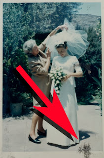
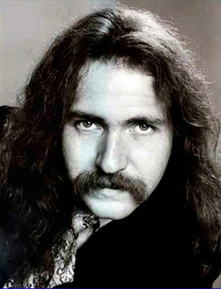
This 1973 portrait of yours truly taken by Dona Tracy hasn't changed much over the years. Either have I (ha ha). It was printed on Kodak® Kodabromide paper processed in Dektol developer, the combination used at Life magazine photo laboratories back in the day.

How well 40 to 50 year old color prints in my archive have survived is all over the map. Mind you, although my archive isn't kept in a humidity and temperature controlled environment, I live in a temperate zone without extremes and the work is kept in very subdued light. Dye transfer prints have survived in good shape. Kodak® Type-C prints (printed from color negatives) are borderline and have that 'old' look about them. Kodak® Type-R prints (a color-reversal process made for printing slides) are badly faded. The worst are old Polaroid® prints, which turn pink as their cyan dyes disappear.

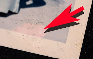
Polaroid® print from 1961 shows degradation of all dyes, particularly cyan.

Kodak® Type-C print has lost its cyan dye but the magenta and yellow have held up pretty well. The total lack of cyan information makes the restoration of accurate original color dicey.

The problem is like disappearing ink... a time bomb. But folks can't hear it ticking because after all, how often do you open the old family album these days?

Chances are none of this is or will be of any concern to you until you too, are a sexagenarian. But guess what?

Sexagenarians are the leading edge of the 'baby boomer' tsunami that has reached our shores. There are an unlimited number of family albums out there begging for affordable restoration. Once the word is out that you provide such a service, watch what happens... your dance card will fill up fast. That is why we offer sexagenarians sizzling deals they can't turn down.

Piece Pricing Is Preferable

We try to keep the price to about $15 per picture, including a 5 X 7 inch (12.7 X 17.78 cm) print. Keep in mind that we are talking about snapshots here, so in comparative terms a 5 X 7 is big. Some folks end up getting bigger sizes needless to say. However the printing is the smallest part of the job. Some customers aren't even interested in prints, as they are more interested in the digital files of the restored images. In those cases you have no job costs at all.

Our customers set the $15 price for the snapshot service. Formerly we tried working at an hourly rate but that seemed awfully high to our customers. If you quote $50 or $75 an hour folks get nervous. But if you point to a snapshot of their Mom and ask for $15 that seems more reasonable.

There is no clear relationship between the $15 price and our normal hourly billing rates. To make our targets we've got to process five snapshots per hour. Sometimes that is possible, but often the throughput is less. I just finished a job with an average speed of only two per hour... or $30. However, that's the exception and I should have seen it coming (read on).

Knowing when to stop is the key to making money. Restoration work is like a hike in the woods. You can go forever. If you are like me your heart is with the picture not the price. I always put in more time than I should, however that is my way of giving back to the customer. In today's economy it is better to extend service than to cut price.

'Twice as good' is my mantra while I'm working on family album restoration work. Each restored picture should look twice as good than the original. That too is an imprecise measurement, but you get the idea.

It may well be that the pictures you are working on will have mostly $15 price tags with a few that costs $20 or $25. Whatever, with piece pricing the customer has an easier time deciding.


Importantly, take a very close look at each snapshot you are servicing. If some of the pictures look problematic take time to explain that to the customer. Point out any unusual problems. That job I just mentioned, that took an extra long time, should have been $25 or $30 each since the throughput rate was 2 per hour.


Extreme close-up of black fibers embedded in picture's emulsion. They are from the album paper and are the result of compressed storage in a humid environment. Many albums end up in the basement or an unheated attic at the bottom of piles being squeezed hard by the weight of the stuff on top. Dried glue drops, tape and those 'corners' they sell for albums create high points that can push paper fibers into the soft emulsion surface of old color prints.

This time I didn't look closely enough to notice a huge problem, however.... the album pages had shed black paper fibers which had became embedded in the emulsions of certain prints (especially Polaroid® prints). On others, the glue from one side had seeped through stained prints on the other side.


The fibers turned out to be so embedded that some were impossible to remove. Using cotton swabs with a variety of solvents did nothing, and water softened the emulsion so that it wiped away with the fibers, as shown above...yikes!


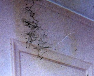
Yellow stain of chemical migration from glue has been intensified for easier recognition. Seepage is aggravated by humid conditions. Nice fibers too, eh? It was lots of fun removing those, let me tell you.


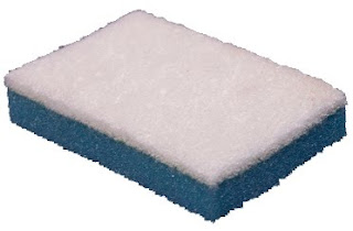
A scouring pad sponge turned out to be the solution for removing the fibers. Only certain types work on pictures. NOT the ones that are green and yellow and meant for scrubbing pots! The scouring pad part must be a soft plastic so that it doesn't scratch the surface of the prints. Using this sponge I was able to get rid of 90% of the fibers by rubbing hard in a crisscross pattern

Restoration Is Prepress On Steroids

Technically speaking, restoration work is not prepress.

Prepress is the adaptation of an image for a particular type of output. It does not generally involve changing the picture, although I stretch that definition in practice every day of the week. Vashon Island Imaging is known for making pictures look good and that usually means 'intensification' of the image to extend its dynamic tone range.

The techniques used for restoration are actually the same ones used for general prepress work for giclées. You could say that restoration is prepress on steroids. Such work is described in detail in my book, Giclée Prepress - The Art of Giclée and in prior blogs. Following now are some techniques for servicing snapshots:

As Similar As They Are Different


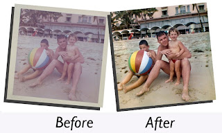
Old snapshots are different from one another and have inconsistent tonal qualities. However, they share common aging problems so you'll find yourself doing the same things over and over, and after a while the work goes fast.

You may even be able to make PhotoShop® Actions for the most basic adjustments. That's because all pictures of a certain type share the same problems. An old Polaroid® may have completely different problems than other types of color prints, but all old Polaroid® prints have the same problems.


This old black-and-white print didn't fade with age. It was originally a badly underexposed picture printed on contrasty paper. These kinds of problems are not difficult to fix.

Old black-and-white prints present their own rainbow of challenges but they are generally not time or age related. Black and white images are made of silver particles, which are relatively inert. Instead the problems you encounter with old black-and-whites is poor photography combined with bad processing.


This old Polaroid® print is brown where lack of proper fixing left silver salts that have oxidized into brownish shades. Remember those smelly fixative wipers that came with the original black-and-white Polaroid® film packs? If you didn't wipe completely, covering the entire surface with the fixative, this is what happens.

Compounding the restoration may also be physical damage. Some glues, pastes, papers and tapes leave chemical stains, as I have come to discover.

The result of all these assaults is an album full of photos that are:

● Faded
● Poorly photographed (over or under exposed)
● Unevenly lit (especially flash photos)
● Badly processed (motley degradation)
● Damaged by water, tape, tearing or other

What a treasure trove for a prepress artist, eh? If you decide to have at it, here are some easy techniques we use at Vashon Island Imaging:

Capture Highlight & Shadow Details

When copying the snapshot, under expose the capture so there is no white. The white parts of the picture should be 10% gray (at least).

If it is a dark picture make an alternative over exposure in which all blacks are 90% gray. If you use more than one exposure, combine the best parts of both into a single layer.

On the left is how the image capture should look as you begin your prepress work. Whites should be grays at this early stage of production, making available a wider assortment of adjustment tools that will not respond to white.

Working in grays is better than whites at this stage. It is easier to pull white out of gray than the other way around. For example, if a face is blown out or faded, under expose your capture so that white is 10-20% gray, then lighten the whites of the eyes and teeth. Subtle use of the Dodge and Burn tools will allow you to contour highlights in the light gray tones. You can only do that if the white point is low enough to begin with. And as I say, it is easier to lighten gray than to darken white. Whites have no data so there is nothing to work with.

Light gray tones are also more adjustable with both mid tone and highlight controls. The lighter the gray the less it responds to mid-tone adjustments.

Clean & Spot Capture

Start prepress work with a thorough cleaning, removing any dust & scratches or other mars. There are usually plenty of those in old snapshots so this part of the job can be tedious. Concentrate on the most important parts of the pictures, their subjects, and work your way out from them. I use the Rubber Stamp clone tool for that job.

Duplicate that picture layer and get it cropped and sized. If you included a gray card in the picture keep a bit of that gray in the frame (crop it out after color adjustment).

The lowest layer in the stack should be the original image. It's there for back-up so you can switch it off and forget about it. Consider the duplicate picture layer as the new original.

Set Levels and White Point

Use Levels and get the picture looking as balanced as you can. I often start by using Auto Levels to see what PhotoShop® has to think about the situation. About 25% of the time I agree and keep that version on a separate layer, if only to cannibalize it later. Quite often using Auto Levels provides a great starting point for further Levels adjustments. I like my pictures darker and warmer than the folks at Adobe and I have an Action that copies the Auto Levels layer and applies a Brightness setting of -22 (moves the white point to gray).

Use the Burn and Dodge tools to bring out the most important parts of the subjects in the picture. If they are faces, intensify the eyes and make sure that the whites of the eyes (and teeth) are white enough. De-saturate and adjust the brightness of those that aren't.

Do all burning, dodging and tone 'depth' adjustments before making color adjustments. Reversing the procedure can alter the colors.

Make Color Adjustments After Tone Depths Are Set

Next I use Auto Color and am frequently surprised to see PhotoShop® deliver an entirely different interpretation than the Auto Levels or Auto Contrast adjustments. To see for yourself, do Auto Color first one time, and Auto Levels first the next time. What works best in my opinion is Auto Levels first, followed by Auto Color which usually makes the picture slightly less contrasty and a little warmer.

If you use Auto Color on a separate layer you can combine the best parts of the Auto Levels layer with those of the Auto Color layer. If you make such a combination, re-visit Levels for a final tweak.

Sharpen Resulting Image

When you are happy with the result, make a duplicate of that layer and sharpen it using the Unsharp Mask tool. How much? That's a matter of taste however for a file that is about 2,200 pixels on the long side settings of 2.2 / 222 are not unusual. That may seem extreme but the 5 X 7 inch (12.7 X 17.78 cm) giclées will look outstanding.

Another technique is to make additional layers and sharpen them to varying degrees, then re-combine the best parts of those layers. This is a good trick for portraits, making the eyes sharpest of all.

Changing the Opacity levels of various layers can further tweak the look, as can adjustments to their Blending Options (lighten & darken).

Clean and Blend Sharpened Image

No matter how thoroughly you spot and clean a picture, when you sharpen it more spots and scratches appear. Thus, after sharpening you may have some more spotting and cleaning to do. Try the following procedure to quickly get rid of the light spots.

1.) Set the sharpened layer's Blending Options for darken.
2.) Adjust mid tones of the un-sharpened layer beneath to 1.07 or so

In this way the softer pixels below fill in the lighter sharpened ones above making most of the objectionable light-colored spots invisible. The reverse holds true for getting rid of dark spots. Merging the results of both procedures reduces the need for laborious spotting with the Rubber Stamp tool.

Not that you will entirely escape the drudgery... Some handwork is always needed after sharpening. Don't forget that you can set the Blending Options for the Rubber Stamp, which can make spotting go way faster.

Creating Repair Patches

If there's a section that is unusually dusty or dirty, replace it with a repair patch made by airbrush work or blur tools.

1.) Copy offending part of image onto a separate layer.

The copied section of the picture will be converted into a repair patch by defocusing it using Blur tools.

2.) Place repair patch layer beneath image layer.
3.) Apply some Blur to the repair patch (Gaussian Blur, Surface Blur, etc.).

Alternatively, select the offending area and airbrush over it on a separate layer. (To get the paint colors right, sample the image with the Eye-dropper tool.) Then...

4.) Set the Blending Options of the image layer on top to darken.
5.) Adjust mid-tone Levels of the patch underneath to about 1.07, (slightly lighter).

Adjusting the Levels of the patch gives you control of the amount that the patch shows through the image, which has its blending set for darken. The light spots in the sharpened layer can't darken so the patch shows through, filling in the light-colored crap in the sharpened layer. Reversing the procedure also works.

Use Noise to Recreate Grain & Digital Textures

Severe problems may require that repair patches be placed over the image layer to replace entire sections, not just the spots. Any airbrush work you do lacks the 'grain' texture of the original image. Lacking that texture your retouching stands out like a sore thumb.

The fix is to recreate the look of the grain by adding noise and then blurring that noise. The size and type of noise must be precisely adjusted in combination with the amount of blur. It's a little fussy but with those adjustments you can recreate the look of almost any type of film grain or digital texture.

You're As Good As Your Last Print

Although they probably wouldn't admit it, when our colleagues and customers see our work the first thing they look for are problems. Once satisfied that there is nothing wrong, they relax and enjoy the fruits of our labors.

There's always a client that will insist on making a change, usually as some sort of power trip. But hey, it goes with the territory. Once a client has been identified as being a 'helper' all future work we do for them contains red herrings.

99% of the time our clients are blown away by what we do with pictures that looked lost. Sometimes I am surprised myself to see how basic prepress can bring pictures back from the dead.


One of my earlier blogs details the account of restoring a picture washed away in Hurricane Katrina. That picture (seen above) took days, not hours, of tedious detail work. To keep from getting discouraged, remember that this job is an advertisement about you... so it better be good!

When clients are pleased I like to say, 'Ingen Kunst Als' a Swedish expression with a double entendre. As slang the expression means, 'Nothing to It'. Literally translated it means 'No Art At All'. Being an artist, you can appreciate the irony.

Making snappy snapshots for sexagenarians may not be as sexy as printing fine-arts giclées. However, restoring humble snapshots and memories thought lost brings smiles (and checks) that are just as big as those we earn for fine art.