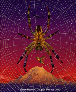
 Within Reach features a spider and was the subject of an earlier blog.
Spiders have been around for 140-million years and are remarkable creatures for so many reasons. The one that interests me most is their primal symbolism, which evokes an emotional response in just about everyone. That makes them good subjects for pictures.
Another is the mastery with which they build their webs, often in places that provoke a sense of wonder. For example, I once saw a huge orb web suspended between two trees 50 feet apart... how did the little bugger do that?
Like fishermen spiders repair and rebuild build their webs over and over again as wind and airborne flotsam take their toll on the fragile filigree. Which brings me to the inspiration for my latest pair of illustrations called 'Beginning of the End'.
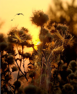 Beginning of the End No. 1
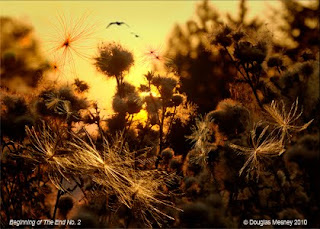 Beginning of the End No. 2
As the field was being mowed, huge clouds of ground up dried goldenrod and field grass fouled the extraordinary web recently shot. So back it was to the camera to record this calamitous moment in the spider’s life, when the world around was mowed to the ground.
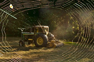 As I was shooting super close-ups of the goldenrod seeds caught in the web, I recalled a scene made of thistles at sunset a month earlier (shown below). That led to the 'aha' moment when 'Beginning of the End' began.
 Few things go as planned and so it was with this illustration. When I joined up the new picture of the fouled web with illustration of thistles at sunset my heart sank as I realized that the web was fouled with the wrong kind of seeds. But that wasn't the end, it was just the beginning... especially of the 'karmic' part of this picture and story. This picture it seems was 'meant to be'.
They say that if you can think of something you can make it happen. I believe it and also believe that everything you need is right around you at any given time, but not always obvious. You have to tune your awareness in an allowing mode instead of a resistant one. It’s part of 'going with the flow' instead of paddling upstream. Anyway...
I was 'cleaning up' to get ready for another project when I discovered a jar full of thistle seeds collected a few years earlier. A shiver goes down my spine again as I recount the episode.
Getting back to work on Beginning of The End, I had plenty of time to think about that serendipity because 18 individual picture elements had to be pre-assembled from 70 frames to make all the pieces of the illustration... a job requiring several days. The challenge was to manipulate the depth of focus required for each individual piece as well as the illustration as a whole.
Effect of Lenses on Depth of Focus
Different lenses produce different kinds of depth perception, as you well know. My tastes are for the look produced by extremely wide-angle lenses. Back in the day my normal lens for 35mm work was a 21mm Nikkor, for example.
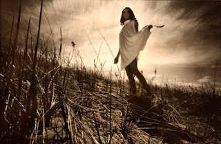 Super-wide-angle lenses with dark red filters produced my trademark look beginning in 1960 when this picture was made of model Carol Douglas on the Fire Island dunes.
Wide-angle lenses expand depth perception, whereas telephoto lenses compress it. Compared to one another, a telephoto picture has a flatter look. Wide angle lenses have unlimited depth of field but with telephoto lenses the depth of field is shallow (narrow).
Depth of field is also known as 'depth of focus'..As a rule of thumb, the longer the lens, the less depth of focus. Extreme wide-angle lenses have the deepest depth of field. In a wide-angle shot just about everything is in focus but in a telephoto picture the focus is selective.
Selective focus is what they call pictures that go in and out of focus. You see these pictures all the time... the subject is in focus and the background is out of focus.
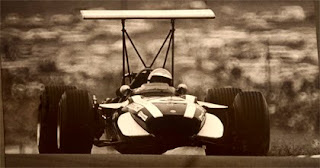 Extreme telephoto shot taken at Watkins Glen Grand Prix in 1964 made with a Russian 500mm MTO lens. A rare lens, the MTO uses 'folded optics' to give powerful magnification in a short lens. Many photographs like mirror-reflex lenses because the render out-of-focus highlights as 'donuts'... as seen in the following blow-up of a piece of the background of this picture.
Some photographers achieve a special form of selective focus by manipulating the 'swing and tilt' of the lens, which alters the plane of focus.
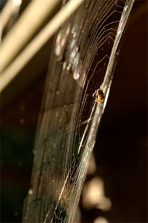 Plane of focus is clearly seen even in this thumbnail-sized picture.
The plane of focus is the part of the picture that is in focus. As you focus the lens, the plane of focus moves toward or away from you. Whatever is in the plane of focus looks sharp. As things leave the plane of focus they get less and less sharp. This effect provides opportunities and challenges, especially if you make photo illustrations, which are essentially collages.
Collages Require Consistent Ingredients
Collages come in many forms ranging from abstract to decorative to photo-realism, which is my style. All my illustrations are collages of other pictures, and this new work is no exception being a collage of 50+ photos. Here are its ingredients:
1.) Thistle sunset background - 3 frames merged (for pixel density)
2.) 10 individual seeds - each 3 frames merged (for focus depth)
3.) Spider web - 5 frames merged
4.) Spider - 8 frames merged
5.) Birds - from archive
Photo-realism is a demanding form of collage because all the pieces have to come together as a recreation of reality that looks, well... real.
If you make these kinds of pictures you know that consistency is all important. Three key considerations for each picture element are:
1.) Focus
2.) Perspective
3.) Lighting
There are many other factors for which are fully described in my book, Giclée Prepress - The Art of Giclée. Here we will focus on, well... focus. To be more precise, depth of focus.
Mastering Depth of Focus
The way you master depth of focus is the same way you master any other collage... in sections. In this case, subjects that don't 'fit' into the field of focus are shot in 'layers' of focus. The thistle seeds in this picture were shot in three focus layers, for example (seen below).
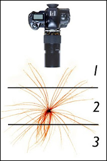 Using a Medical-Nikkor 105mm lens at f/22 (for maximum depth of field), each seed was shot for near focus (1), middle focus (2) and far focus (3).
You might ask, why didn't you use a wide-angle lens that has enough depth of field to get the whole thing in one shot? Because a wide-angle lens can't get close enough to make the thistle seed big enough in the picture. Some things need microscopes, after all.
Shooting the seeds was an exercise in 'macro' photography, which is what they call super close-up work just shy of 'photo-microscopy' (when you shoot through a microscope). In both cases you have extremely limited depth of focus. That may be a good thing for some pictures but not for what was needed in Beginning of the End.
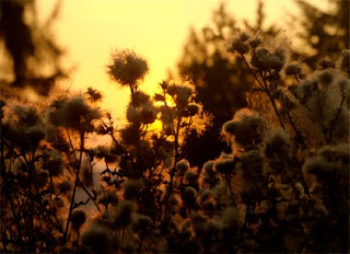 Thistle Sunset
The look of Beginning of the End had to be based on the background picture, Thistle Sunset. That scene was shot with the Nikkor 70-210 mm lens, at the long end of its range. The result is a selective focus look with a few points of sharp focus surrounded by a lot of out-of-focus elements.
The design objective for the new illustration was to create an 'artificial' plane of focus running vertically through the foreground of Thistle Sunset from top to bottom. Into that plane of focus the new subjects of the picture -- thistle seeds and spider/web -- would be arranged.
Close Point Defines Focal Plane
 New close point made from copying other out-of-focus flowers, then processing them to get them bigger and softer which is how they would look if originally shot closer to the lens.
 To create an artificial plane of focus new 'close points' have to be established. This was done using out-of-focus plants and flowers. Those were placed on the uppermost layers and given soft edge blends into the sharp elements under them.
 Sandwiched between the new close points and the background scene, the seeds, spider and web were stacked to overlap each other front to back, as they would in reality.
The elements appearing within the picture's new plane of focus needed to be totally sharp. No parts of the seeds or spider web could be out of focus because that wouldn't look real. Focus fluctuations within the logical' plane of focus disturb the eye unless they are very intentional and obvious.
Match Lighting
For a good collage, consistent lighting is as important as focus. Nothing gives away an assembly more than shadows that go the wrong direction, or highlights on some elements and not others.
Thistle Sunset is a back-lit scene. The thistles are silhouetted against a bright yellow sky. The sun peeks through providing dapples of light within the plane of focus - additional elements needed to match the look of that lighting.
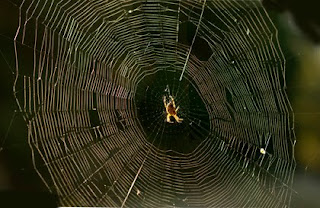 Spider webs are made of proteinaceous spider silk extruded from a spider's 'spinnerets' as a continuous gossamer-thin filament. The silken thread is nearly invisible unless lit from behind... which is why so many webs end up in my face and hair. Back light makes spider webs stand out but another problem remains... the background.
Spider webs are so thin that any background texture showing through them will make their isolation from that background much more difficult. For example, a hand-made path was used to make the selection to isolate the web in the illustration Within Reach (top of page) and that took an entire day.
It is much easier to use an automated tool like the Magic Wand or Select/Color Range. However to use those tools you need a fairly 'solid' background. To obtain that requires the use of a telephoto lens long enough to selectively blur the background as much as possible. The webs for this illustration were shot with a 210mm lens, which is a 'medium' length telephoto lens.
An even better way to shoot spider webs is to use an extreme telephoto lens, like a 500mm or longer. For pristine webs I normally use a 1200mm. When you use such a long lens the entire web is within the plane of focus of the lens. However, then your pixel resolution is limited to a single frame. That's OK if your camera shoots enough pixels for you to work with. But if you want to make a giant giclée of spider web you'll need way more pixels than your camera can shoot. To get sufficient pixel density you need to shoot the web in sections and reassemble it in PhotoShop®.
 To create a totally sharp web with enough pixels it was shot as five frames, each focused on a different 1-inch 'slice' of the total 8-inch web depth.
 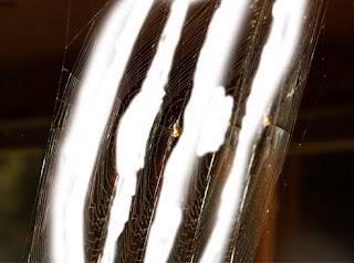 The five parts of the web picture have been pulled apart to show the layer slices. The pieces were assembled in PhotoShop® to make a totally sharp web... well, almost totally. For realism the farthest and closest parts of the web were allowed to go a little soft.
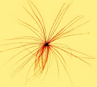
The same shooting technique was applied to the thistle seeds. Each was shot as five slices then reassembled in PhotoShop®. The lens used was a Medical-Nikkor 105mm with an extension tube that allowed a thistle seed to fill the entire frame from a distance that provided enough room for all the flagging required (see below).
Recall that macro lenses shoot like telephoto lenses. Both have shallow depth of field. Shooting super close-ups, your depth of field may be a quarter of an inch or less. While a short lens would give more depth of focus, it would also distort the shape of the seeds, making them look weird.
But back to lighting...
Two lighting set-ups were used to photograph the thistle seeds. One simulating the look of objects in the path of the sun's rays, the other for objects in the dappled shadows and their rim-lit edges.
You might ask, why didn't you just shoot them outside under real match-light conditions? The answer is rain. We get a lot of it here and I was too impatient to wait. Besides, the studio environment provided much greater control of the thistle seeds, which fly away on a breeze as gentle as a sleeping baby's breath.
The thistle seeds were placed on a sheet of moistened glass in front of black velvet. A single Tensor® lamp was used to simulates sunlight. A Tensor® lamp's Kelvin temperature is only 3000°. By exposing for Kelvin 7300° the color of the light becomes a golden yellow, like the sunlight in Thistle Sunset (shown below).
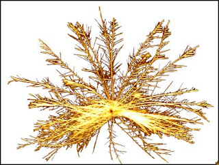
Match lighting required shooting almost directly into the Tensor® lamp, so it and the lens had to be heavily 'flagged'. A 'flag' blocks light from hitting the lens, the subject, or other part of the picture.

The best flag for a lens is a piece of black paper with a square, rectangle or circle cut out of it (above). Place it between the lens and the subject and move it forward or backward until it precisely crops the subject (below).
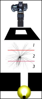
Offset the light position and use additional flags to get the effect you want, moving it closer to (or away from) dead center behind the subject. The result is a sparkling look for the gossamer threads of the thistle seeds.
Black velvet is the best background material for shooting back-lit objects for isolation in PhotoShop®. It is the blackest black you 'see' and doesn't show shadows. Even the faintest amount of back light will separate the subject from such a dark black BG. Place the velvet as far back as you can to keep it out of focus. That makes isolation even easier.
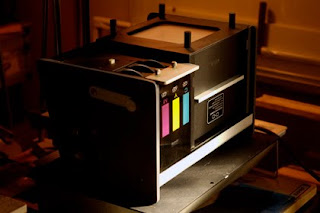
To recreate the silhouetted look of back-lit thistle seeds against the open sky they were shot on a light box. In this case I used old Chromega® enlarger light source (shown above). Like the Tensor® lamps, the enlarger light source is tungsten with a low Kelvin temperature. Shooting with the camera set for a high Kelvin temperature therefore warms up the color so that it closely matches the golden sky in Thistle Sunset (shown below).
Using f/22 with low-powered light sources requires very long exposures. The Tensor® light exposure was about 4 seconds. To avoid shutter blur the camera was secured to a sandbagged tripod. A long shutter-release cord triggered the exposure so the camera didn't need to be touched.
The Chromega® light box exposure was a quarter of a second for the Tensor®-lit shots. The copy stand set-up provided for shake-less shooting without the need for sand bags, but the long shutter release cord was again used.
Arrangement of Objects in Composition
With the 50+ frames assembled into the 18 objects appearing in the new illustration, it was time to put them into the picture. The challenge was to construct a pleasing composition that recreated the look of life in the field.
Composition has been the peripheral subject in a number of my blogs but I'll touch on it again here. The strongest compositions are based on triangular layouts of the principle objects. This is fairly clear to see in the original version of Beginning of the End No.1.

In the first version there are two triangles.
1.) Lower triangle (composed of thistle seeds and spider)
2.) Upper triangle (involving the large dark thistle 'pom pom')
Those two triangles are rounded out into an oval by the two birds.
The objective of a good composition is to keep the eye moving around within the borders of the picture and never provide an 'escape route'. Three layout arrangements provide the maximum effect:
1.) Triangle
2.) Circle
3.) Oval
It takes a deft artist to keep control of the layout when many elements are involved in the composition. Nor are all compositions intended to be crystal clear. Many are abstract or seemingly random looking yet keep your eye's attention. The best have 'pathways' in and around the picture... the triangles, circles and ovals in the layout create those pathways.

Beginning of the End No. 2 shows a classic oval arrangement, this one with a pushed in side giving it a kidney-bean shape. To be honest, it took a while to find this arrangement and a prior No. 2 will not be published.
Well, we've reached the beginning of the end of this blog. If you like the yarns I spin about the art of giclée, check out my book. It will deepen your perception of pixel perfect printing.


No comments:
Post a Comment