Giclée Prepress Becomes Giclée Bible
Time has run out for Giclée Prepress - The Art of Giclée.
My book has been renamed:
Giclée Bible - The Art of Printing
This blog has the new name too, and has been moved.
Why?
The answer is at gicleebible.blogspot.com or just click here... gicleebible.blogspot.com
Saturday, January 1, 2011
Saturday, December 25, 2010
'The Little Bird' Goes to Press
Baby Books Launched on Christmas
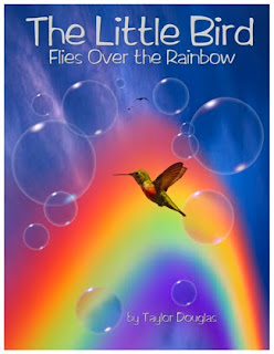
Vashon Island Imaging announces the launch of a new book, The Little Bird Flies Over the Rainbow (ISBN 978-09865751-2-9).
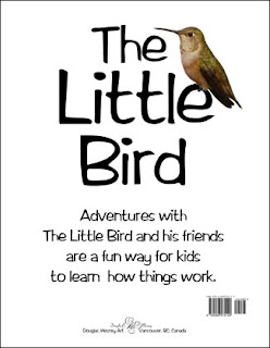
The Little Bird, by Taylor Douglas, is a spiral bound, 36-page book aimed at children between 3 and 9 years old. It is a large book, 8.5 X 11 inches, richly illustrated throughout with full color pictures. (You can see the entire book at the end of this blog).
 © Douglas Mesney 2010
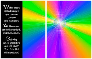
The Little Bird's main theme is color,
what it is and where it comes from.
The illustration above shows light refracting
through a droplet of water in the rainbow.
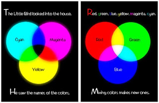
The next illustration (below) reveals color wheels,
how colors blend, and the names of the colors.
The Little Bird is a concept book. The goal is to present information in a non- linear way, as a child encounters it in actual life. Life isn't divided up into subjects (although it is in many schools).
One's stream of consciousness is a winding journey. Learning is non-linear. Discovery of one thing leads to another. Eureka moments and epiphanies occur when diverse concepts are combined. These books therefore present a 'winding' story with interwoven concepts.
A Picture Is Worth A Thousand Words
Each illustration in The Little Bird is available as wall art, lifting the books favorite scenes and characters off the pages and onto the walls of children's' rooms and play or learning areas.
Most of the illustrations are mastered at 30,000 pixels on the long side so they look as good as 8-foot murals as they do in the books.
Children particularly like our glowing pictures, which are printed on high-cotton-fiber paper that is sensitive to UV light. Kids love that effect.
At Vashon Island Imaging we have a special line marketed as 'Nite Lites' based on the UV paper. The idea is to use a low-wattage UV light as as night light which also makes the picture come alive in the dark. It is particularly realistic for night scenes like Star Gazers (below).
Sherlock Holmes said that most people look but don't see. That can be interpreted many ways. Most certainly can't see through a child's eyes or think the way a child does. They have lost the imaginary.
What made Disney a genius was bringing his characters off the screen and into our lives. A kid can go to Disneyland and shake hands with Mickey Mouse. That makes Mickey and Disney's whole world as real as Santa Claus in the mind of the child.... which wouldn't be the case if Mickey only lived in a cartoon.
Taking a page out of Disney's book for The Little Bird, we have posters of all the pictures in the book(s) in a variety of sizes. They are also available as wallpaper and light boxes, made to the customer's measurements.
www.babybooks.com
Vashon Island Imaging will soon launch a new website to market The Little Bird and other forthcoming book/poster productions: www.babybooks.com. Until the new site is up, advance copies of the new book can be purchased directly from the author (me)... and you know how to get me by now, eh?
Following below is a 'bird's eye view' of our first Baby Book. It's pretty hard to actually read these small blog pictures, for which I apologize.
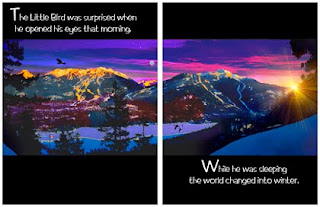
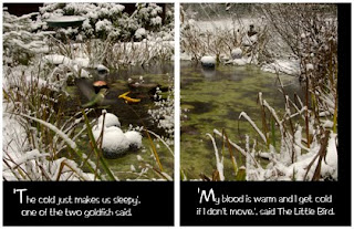
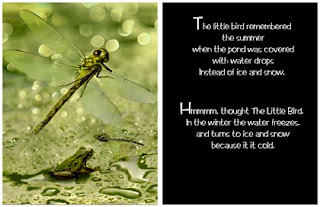
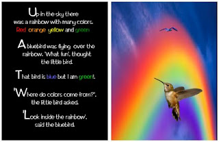
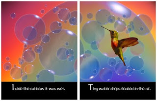
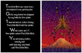
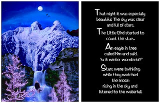
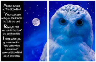
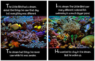
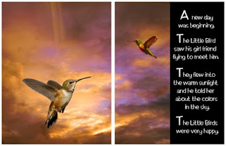
The gist of the story is that The Little Bird wakes up to discover winter. The Little Bird learns about winter from his friends around the pond. He flies up into a rainbow and discovers where colors come from, and what they are called. On the way home he tells his friends what he learned about color. That night he dreams about colorful fish in a bigger pond. The next morning he meets his girl friend, tells her about the colors in the sky, and is very happy.
 © Douglas Mesney 2010
 © Douglas Mesney 2010
 © Douglas Mesney 2010
 © Douglas Mesney 2010
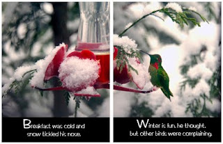 © Douglas Mesney 2010
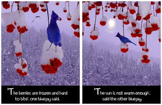 © Douglas Mesney 2010
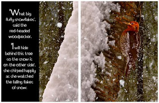 © Douglas Mesney 2010
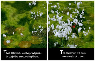 © Douglas Mesney 2010
 © Douglas Mesney 2010
 © Douglas Mesney 2010
 © Douglas Mesney 2010
 © Douglas Mesney 2010
 © Douglas Mesney 2010
 © Douglas Mesney 2010
 © Douglas Mesney 2010
 © Douglas Mesney 2010
 © Douglas Mesney 2010
 © Douglas Mesney 2010
 © Douglas Mesney 2010
 © Douglas Mesney 2010
 © Douglas Mesney 2010
Fun read, eh? ...And a bargain at $24.95.
Be the first on your block to have a copy, etc....
Let me know you read about it here and The Little Bird will sign your copy.
Vashon Island Imaging announces the launch of a new book, The Little Bird Flies Over the Rainbow (ISBN 978-09865751-2-9).
The Little Bird, by Taylor Douglas, is a spiral bound, 36-page book aimed at children between 3 and 9 years old. It is a large book, 8.5 X 11 inches, richly illustrated throughout with full color pictures. (You can see the entire book at the end of this blog).
 © Douglas Mesney 2010
The Little Bird's main theme is color,
what it is and where it comes from.
The illustration above shows light refracting
through a droplet of water in the rainbow.
The next illustration (below) reveals color wheels,
how colors blend, and the names of the colors.
© Douglas Mesney 2010
The Little Bird is the first in a series of books that are bigger, longer and more complex than most other children's books. Each has a variety of concepts bound into an interesting tale.The Little Bird is a concept book. The goal is to present information in a non- linear way, as a child encounters it in actual life. Life isn't divided up into subjects (although it is in many schools).
One's stream of consciousness is a winding journey. Learning is non-linear. Discovery of one thing leads to another. Eureka moments and epiphanies occur when diverse concepts are combined. These books therefore present a 'winding' story with interwoven concepts.
A Picture Is Worth A Thousand Words
Each illustration in The Little Bird is available as wall art, lifting the books favorite scenes and characters off the pages and onto the walls of children's' rooms and play or learning areas.
Most of the illustrations are mastered at 30,000 pixels on the long side so they look as good as 8-foot murals as they do in the books.
Children particularly like our glowing pictures, which are printed on high-cotton-fiber paper that is sensitive to UV light. Kids love that effect.
At Vashon Island Imaging we have a special line marketed as 'Nite Lites' based on the UV paper. The idea is to use a low-wattage UV light as as night light which also makes the picture come alive in the dark. It is particularly realistic for night scenes like Star Gazers (below).
When viewed with UV 'blacklight' this large poster of
Star Gazers (above) looks as real as the real deal.
Maybe that's why kids love the glowing effect.
Great educators know a secret... the one that launched the Walt Disney® empire. It's a very simple concept... that kids live in their own world. That is something that is difficult for adults to remember.Star Gazers (above) looks as real as the real deal.
Maybe that's why kids love the glowing effect.
Environmental Learning
Sherlock Holmes said that most people look but don't see. That can be interpreted many ways. Most certainly can't see through a child's eyes or think the way a child does. They have lost the imaginary.
What made Disney a genius was bringing his characters off the screen and into our lives. A kid can go to Disneyland and shake hands with Mickey Mouse. That makes Mickey and Disney's whole world as real as Santa Claus in the mind of the child.... which wouldn't be the case if Mickey only lived in a cartoon.
Taking a page out of Disney's book for The Little Bird, we have posters of all the pictures in the book(s) in a variety of sizes. They are also available as wallpaper and light boxes, made to the customer's measurements.
www.babybooks.com
Vashon Island Imaging will soon launch a new website to market The Little Bird and other forthcoming book/poster productions: www.babybooks.com. Until the new site is up, advance copies of the new book can be purchased directly from the author (me)... and you know how to get me by now, eh?
Following below is a 'bird's eye view' of our first Baby Book. It's pretty hard to actually read these small blog pictures, for which I apologize.
The gist of the story is that The Little Bird wakes up to discover winter. The Little Bird learns about winter from his friends around the pond. He flies up into a rainbow and discovers where colors come from, and what they are called. On the way home he tells his friends what he learned about color. That night he dreams about colorful fish in a bigger pond. The next morning he meets his girl friend, tells her about the colors in the sky, and is very happy.
 © Douglas Mesney 2010
 © Douglas Mesney 2010
 © Douglas Mesney 2010
 © Douglas Mesney 2010
 © Douglas Mesney 2010
 © Douglas Mesney 2010
 © Douglas Mesney 2010
 © Douglas Mesney 2010
 © Douglas Mesney 2010
 © Douglas Mesney 2010
 © Douglas Mesney 2010
 © Douglas Mesney 2010
 © Douglas Mesney 2010
 © Douglas Mesney 2010
 © Douglas Mesney 2010
 © Douglas Mesney 2010
 © Douglas Mesney 2010
 © Douglas Mesney 2010
 © Douglas Mesney 2010
 © Douglas Mesney 2010
 © Douglas Mesney 2010
Fun read, eh? ...And a bargain at $24.95.
Be the first on your block to have a copy, etc....
Let me know you read about it here and The Little Bird will sign your copy.
Wednesday, December 22, 2010
Blast from the Past
'Incredible Slidemakers' Posters Available Again
There are about 35 people in the world who would probably love to get their hands on a brand new copy of the classic 1976 Incredible Slidemakers poster (shown above). That is now possible because yesterday, while cleaning up the studio, I found 50 pristine copies.
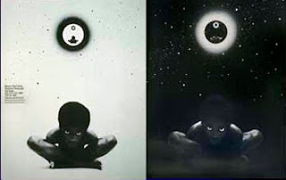
In another envelope I found a like number of pristine Mesney's Third Bardo posters (printed on UV-reflective paper) dating from 1973...
 © 1973 The Incredible Slidemakers
Front and back of the reversible poster designed by Tom Ridinger when he and I collaborated and the company's name was changed to Mesney's Third Bardo. 'Bardo' derives from to the Tibetan Book of The Dead in which the third bardo is the twilight state between death and transfiguration... which always seemed an appropriate description of an artist's lot in life.
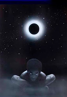 © 1969 Douglas Mesney
The poster featured my first photo illustration, 'Space Lady'.
It was done in 1969 by traditional airbrush work on a black-and-white print.
The original and the posters were printed on
blacklight-sensitive paper that glows under UV light.
That makes this picture the precursor to our current 'Nite Lights' style,
printing giclées on UV-sensitive art paper.
Up on another shelf I found a neatly bundled roll with about 100 copies of the classic 1972 New York National Boat Show poster, smothered in dust and cobwebs.
The boat show and Bardo posters are two classics that were designed by Tom Ridinger, himself the subject of a recent blog (Inter-Continental Color).
The Incredible Slidemakers poster dates from a time near the apex of that enterprise's arc. It was an arc of triumph for those who participated. They were the ones who pioneered 'multi-image' and special effects film work.
In 1973 we started tinkering with slides at Mesney's Third Bardo. Slide shows and speaker-support slides were an ad-on to the photo and graphics work we were doing for George Rounds at the New York National Boat Show.
Slides turned out to be fun. Soon we were selling chart-and-graph slides for all sorts of corporate presentations. There was a big market for fancy ones. The fancier and more expensive we made them, the more people wanted them. (Sighing... 'those were the days, my friends'.)
On one occasion our slide-copy camera (a Forox® at the time) overexposed a few titles. They were designed as dark blue and came back from the lab looking like neon.
 © 1974 The Incredible Slidemakers
Our first reaction to the mistake was, 'yikes!'
That quickly turned to 'Ohhhhh Wowwwww',
which translates now as 'OMG'.
A Star Is Born
Instantaneously, we were into the special effects business. I surrendered all my star filters and other fruitcake filters to the Forox® department and we were off to the races.
Within a year we had a reputation around New York. Within two years that reputation spread across the USA. Within three years we had a bucket of awards and a stash of cash (for new toys).
Whenever people saw our graphics they'd say, 'incredible!'. So we changed the name of the company from Mesney's Third Bardo to The Incredible Slidemakers. The name stuck ...people still call me 'Mr. Incredible'.
 © 1975 The Incredible Slidemakers
After taming, the original mistake became one of ouor most popular
special effects, called an 'Outer Glow', shown above as a three-slide split
for a wide-screen, three-projector slide show.
The poster was the focal point of Incredible's 1976 promotion, revealing 60 of our most complex special effects. Some of them seem gaudy now, as well as nostalgic. All of them are truly 'incredible' considering that they were made before PhotoShop® ...before computers... before well, anything...!
A talented crew used an assemblage of modified photo gack hanging off a pair of Forox® slide-animation cameras to shoot the effects you see on the poster. Somewhere I have a copy of an old US Patent that we got for a rotating stage based on a set of electric trains.
 The original Incredible Slidemakers at play.
Anyone who was there can tell you,
I ran Incredible like a kindergarten laboratory.
Talk about R&D, we reversed the usual ratio,
devoting virtually all profits to new toys.
Everyone was encouraged to explore
his or her versions of the Muse.
Guess you could call that a 'Muse & Views' management style.
Doesn't work well for the enterprise, but employees love it.
Left to right: John Leichmon, Tim Sali, Douglas Mesney, Fred Canizarro
and Rocky Graziano. Jim Casey is foreground right and if you know
who is forground left, clue me in please.
Now, here's the most 'incredible' part of all... I still use many of those same pieces of equipment and photomechanical techniques right here, right now, at Vashon Island Imaging.
Just yesterday I did a big slide copy job for a Vashon artist. She needed an 'instant portfolio' made from about three dozen slides show her installation pieces.
The slides were photo-copied using a Nikon digital camera mounted on a copy stand rigged with the old Forox light box and the old Chromega color-enlarger light source, both survivors of the Seventies, like me.
If you use a scanner, you know how long it would take to do three dozen slides the right way (ie., not automated).
Now consider this... I had a working set of digital files in less than an hour.
You see, traditional techniques like those have not been improved by the digital revolution, when it comes to fine arts reproductions using the giclée printing process. There are many reasons for that explained in my book, Giclée Prepress - The Art of Giclée as well as in earlier blogs. But I digress...
That kind of speed and efficiency allows us to offer artists affordable file-making. Face it, how many artists can afford Tango scans? Without Tango or similar quality digital scanning, photomechanical techniques using a digital camera produce better results.
And, how long did you say it would take to produce those Tango scans? ...Uh huh.
Cheaper, Better Faster
You used to have to choose two of those three attributes when you shopped for digital transformation of slides. Now you get all three... at Vashon Island Imaging (www.vashonislandimaging.com).
Customer perception is the most critical part of any business proposition. In this case the customer is an artist seeking a high-quality printed portfolio for a reasonable cost.
I don't need to tell you how important it is to put the squeeze on prices these days. We do that by adding value instead of lowering our rates.
We are able to deliver a $15 package that includes 'scanning', basic prepress, an 8 X 12 print on art paper, and an internet-sized version. That combo adds enough value to make the total perceived value-to-price ratio irresistible for many artists. So it's win-win and we are also finding that families are also using the same offer to have their old photo albums captured and restored before they fade much farther.
Again, it's a question of speed and efficiency. Those two are critical for a business. Even if you are 'only' a hobbyist printer, you got stuff to do, right? Time is of the essence.
Limited Edition
These posters are truly limited editions. They just don't get more limited than this.
If you're one of The Incredible Slidemakers and would like a copy of our infamous promotion poster, get in touch. They're free for you guys (except for a $12.95 handling fee). For the rest, copies are available for $39.95... while they last.
For a more complete back story about Mesney's Third Bardo and The Incredible Slidemakers please refer to the Epilogue of Giclée Prepress - The Art of Giclée. (An on-line biographical slide show is available at www.incredibleimages.com/Profile.)
There are about 35 people in the world who would probably love to get their hands on a brand new copy of the classic 1976 Incredible Slidemakers poster (shown above). That is now possible because yesterday, while cleaning up the studio, I found 50 pristine copies.
In another envelope I found a like number of pristine Mesney's Third Bardo posters (printed on UV-reflective paper) dating from 1973...
 © 1973 The Incredible Slidemakers
Front and back of the reversible poster designed by Tom Ridinger when he and I collaborated and the company's name was changed to Mesney's Third Bardo. 'Bardo' derives from to the Tibetan Book of The Dead in which the third bardo is the twilight state between death and transfiguration... which always seemed an appropriate description of an artist's lot in life.
 © 1969 Douglas Mesney
The poster featured my first photo illustration, 'Space Lady'.
It was done in 1969 by traditional airbrush work on a black-and-white print.
The original and the posters were printed on
blacklight-sensitive paper that glows under UV light.
That makes this picture the precursor to our current 'Nite Lights' style,
printing giclées on UV-sensitive art paper.
Up on another shelf I found a neatly bundled roll with about 100 copies of the classic 1972 New York National Boat Show poster, smothered in dust and cobwebs.
The boat show and Bardo posters are two classics that were designed by Tom Ridinger, himself the subject of a recent blog (Inter-Continental Color).
The Incredible Slidemakers poster dates from a time near the apex of that enterprise's arc. It was an arc of triumph for those who participated. They were the ones who pioneered 'multi-image' and special effects film work.
Multi-image was (is?) a term used to describe slides shows on steroids.
For about 10 years the use of multiple projectors became a fad amongst big corporations (who could afford them). It would take almost as long to tell you the story as my career in multi-image lasted. For me it began with a mistake. An example is the 60-projector image wall arcing around a Saab at the Frankfurst Auto Show in 1991... my last European show before returning to The States.
In 1973 we started tinkering with slides at Mesney's Third Bardo. Slide shows and speaker-support slides were an ad-on to the photo and graphics work we were doing for George Rounds at the New York National Boat Show.
Slides turned out to be fun. Soon we were selling chart-and-graph slides for all sorts of corporate presentations. There was a big market for fancy ones. The fancier and more expensive we made them, the more people wanted them. (Sighing... 'those were the days, my friends'.)
On one occasion our slide-copy camera (a Forox® at the time) overexposed a few titles. They were designed as dark blue and came back from the lab looking like neon.
 © 1974 The Incredible Slidemakers
Our first reaction to the mistake was, 'yikes!'
That quickly turned to 'Ohhhhh Wowwwww',
which translates now as 'OMG'.
A Star Is Born
Instantaneously, we were into the special effects business. I surrendered all my star filters and other fruitcake filters to the Forox® department and we were off to the races.
Within a year we had a reputation around New York. Within two years that reputation spread across the USA. Within three years we had a bucket of awards and a stash of cash (for new toys).
Whenever people saw our graphics they'd say, 'incredible!'. So we changed the name of the company from Mesney's Third Bardo to The Incredible Slidemakers. The name stuck ...people still call me 'Mr. Incredible'.
a three-slide special effects transition for a multi-image slide show.
 © 1975 The Incredible Slidemakers
After taming, the original mistake became one of ouor most popular
special effects, called an 'Outer Glow', shown above as a three-slide split
for a wide-screen, three-projector slide show.
The poster was the focal point of Incredible's 1976 promotion, revealing 60 of our most complex special effects. Some of them seem gaudy now, as well as nostalgic. All of them are truly 'incredible' considering that they were made before PhotoShop® ...before computers... before well, anything...!
A talented crew used an assemblage of modified photo gack hanging off a pair of Forox® slide-animation cameras to shoot the effects you see on the poster. Somewhere I have a copy of an old US Patent that we got for a rotating stage based on a set of electric trains.
 The original Incredible Slidemakers at play.
Anyone who was there can tell you,
I ran Incredible like a kindergarten laboratory.
Talk about R&D, we reversed the usual ratio,
devoting virtually all profits to new toys.
Everyone was encouraged to explore
his or her versions of the Muse.
Guess you could call that a 'Muse & Views' management style.
Doesn't work well for the enterprise, but employees love it.
Left to right: John Leichmon, Tim Sali, Douglas Mesney, Fred Canizarro
and Rocky Graziano. Jim Casey is foreground right and if you know
who is forground left, clue me in please.
Now, here's the most 'incredible' part of all... I still use many of those same pieces of equipment and photomechanical techniques right here, right now, at Vashon Island Imaging.
Just yesterday I did a big slide copy job for a Vashon artist. She needed an 'instant portfolio' made from about three dozen slides show her installation pieces.
The slides were photo-copied using a Nikon digital camera mounted on a copy stand rigged with the old Forox light box and the old Chromega color-enlarger light source, both survivors of the Seventies, like me.
If you use a scanner, you know how long it would take to do three dozen slides the right way (ie., not automated).
Now consider this... I had a working set of digital files in less than an hour.
You see, traditional techniques like those have not been improved by the digital revolution, when it comes to fine arts reproductions using the giclée printing process. There are many reasons for that explained in my book, Giclée Prepress - The Art of Giclée as well as in earlier blogs. But I digress...
That kind of speed and efficiency allows us to offer artists affordable file-making. Face it, how many artists can afford Tango scans? Without Tango or similar quality digital scanning, photomechanical techniques using a digital camera produce better results.
And, how long did you say it would take to produce those Tango scans? ...Uh huh.
Cheaper, Better Faster
You used to have to choose two of those three attributes when you shopped for digital transformation of slides. Now you get all three... at Vashon Island Imaging (www.vashonislandimaging.com).
Customer perception is the most critical part of any business proposition. In this case the customer is an artist seeking a high-quality printed portfolio for a reasonable cost.
I don't need to tell you how important it is to put the squeeze on prices these days. We do that by adding value instead of lowering our rates.
We are able to deliver a $15 package that includes 'scanning', basic prepress, an 8 X 12 print on art paper, and an internet-sized version. That combo adds enough value to make the total perceived value-to-price ratio irresistible for many artists. So it's win-win and we are also finding that families are also using the same offer to have their old photo albums captured and restored before they fade much farther.
Again, it's a question of speed and efficiency. Those two are critical for a business. Even if you are 'only' a hobbyist printer, you got stuff to do, right? Time is of the essence.
Limited Edition
These posters are truly limited editions. They just don't get more limited than this.
If you're one of The Incredible Slidemakers and would like a copy of our infamous promotion poster, get in touch. They're free for you guys (except for a $12.95 handling fee). For the rest, copies are available for $39.95... while they last.
For a more complete back story about Mesney's Third Bardo and The Incredible Slidemakers please refer to the Epilogue of Giclée Prepress - The Art of Giclée. (An on-line biographical slide show is available at www.incredibleimages.com/Profile.)
Monday, December 13, 2010
Anomalogical Observation No.1
Things to Watch for In You Give A Hoot
This brief piece starts a new 'featurette' about things that go bump in the night. Being a night owl, that's when I work and I don't like things that bump then unless they are of a 'particular kind' (heh heh).
Anamological Observations will provide some insight into things that might otherwise make a giclée printer feel insecure. It's all part of becoming a wise old night owl.
This first piece is about our new Epson® 9900 giclée printer and let me say before going any further that we are quite happy with this fabulous new 10-color machine. Moreover, I am aware that any new system or device has a 'beta-test' phase, which is a kind of shakeout using real customers to find and fix bugs.
Usually, at Vashon Island Imaging (www.vashonislandimaging.com) we wait before buying anything totally new because we don't like being guinea pigs. For us there's only a fine line between shakeout and shakedown.
This time was different for a variety of reasons, which have nothing to do with anything other than our need to be able to switch between gloss and matte black more efficiently than we could with our 9880 model... which we now can with the 9900. But I digress...
The 9900 is doing a great job but two things have happened which I will term anomalies at this point. (Epson®, clue in.)
The first has to do with the machine. The other day it just went away. Oh, it was there in all its massiveness... but wouldn't respond to anything. Even the on-off switch did nothing. That was spooky.
Being an old dog my first instinct in these situations is to turn everything off and then back on after waiting 10 - 15 seconds. So I unplugged the 9900 and then plugged it back in... And it fired right up with nary a touch of any buttons at all.
So there's that.
The next one has been going on for a few days. It's the ink meter. The one for light black (T5967) reminds me of John Wayne's gun.
About a week ago the ink meters threw up a big yellow exclamation point warning that the light black ink cartridge was at 11% (we use the new 350 ml size, although this was -- still is -- the 150 ml cart that the machine came with).
Making note of the light-black ink levels decent, I also logged media cosumption. I calculated that it was using the light-black ink at 1% per foot of 44-inch-wide media (with heavy coverage).
As it got down to 2% I dutifully fetched a new cart off the shelf and prepared to do my first ink change on the new 10-color printer. My attention got focused at the 1-% mark and I even read the instruction book at that point.
I started printing small stuff because I hate changing carts in the middle of a big one. Even though Epson®'s got it down now -- you can change any color in the middle of a print without seeing any flaws in the print -- there is still room for human error ...or even anomalies.
With the 9880 we had an anomaly one time changing the yellow ink cartridge in the middle of a 44-inch by 12-foot print. The picture became a triptych that day, instead of a continuous panorama, when the yellow ink somehow pumped dry despite the new cart.
So there's that, too. Anyway...
The 9900 kept printing more and more small stuff. Finally, I had to print a big one. Boy, was I on my toes... but it got printed with no probs, and the ink meter kept reading a solid 1% throughout. Hmmmmph, I said to myself, and did another... and another....
As I write this blog the ink meter has been exclaiming 1% while 20-feet of 24-inch-wide media (heavy coverage) has printed perfectly... and the machine is still going strong.
Now, a couple of other colors are showing ink-level warnings. Yellow is at 7%, cyan is at 11% and matte black is at 12%... so we'll soon see whether this is a light-black anomaly or a more colorful one.
Stay tuned... there may be a Guiness Book of World Records thing happening here.
This brief piece starts a new 'featurette' about things that go bump in the night. Being a night owl, that's when I work and I don't like things that bump then unless they are of a 'particular kind' (heh heh).
Anamological Observations will provide some insight into things that might otherwise make a giclée printer feel insecure. It's all part of becoming a wise old night owl.
This first piece is about our new Epson® 9900 giclée printer and let me say before going any further that we are quite happy with this fabulous new 10-color machine. Moreover, I am aware that any new system or device has a 'beta-test' phase, which is a kind of shakeout using real customers to find and fix bugs.
Usually, at Vashon Island Imaging (www.vashonislandimaging.com) we wait before buying anything totally new because we don't like being guinea pigs. For us there's only a fine line between shakeout and shakedown.
This time was different for a variety of reasons, which have nothing to do with anything other than our need to be able to switch between gloss and matte black more efficiently than we could with our 9880 model... which we now can with the 9900. But I digress...
The 9900 is doing a great job but two things have happened which I will term anomalies at this point. (Epson®, clue in.)
The first has to do with the machine. The other day it just went away. Oh, it was there in all its massiveness... but wouldn't respond to anything. Even the on-off switch did nothing. That was spooky.
Being an old dog my first instinct in these situations is to turn everything off and then back on after waiting 10 - 15 seconds. So I unplugged the 9900 and then plugged it back in... And it fired right up with nary a touch of any buttons at all.
So there's that.
The next one has been going on for a few days. It's the ink meter. The one for light black (T5967) reminds me of John Wayne's gun.
He can shoot forever without reloading.
About a week ago the ink meters threw up a big yellow exclamation point warning that the light black ink cartridge was at 11% (we use the new 350 ml size, although this was -- still is -- the 150 ml cart that the machine came with).
Making note of the light-black ink levels decent, I also logged media cosumption. I calculated that it was using the light-black ink at 1% per foot of 44-inch-wide media (with heavy coverage).
As it got down to 2% I dutifully fetched a new cart off the shelf and prepared to do my first ink change on the new 10-color printer. My attention got focused at the 1-% mark and I even read the instruction book at that point.
I started printing small stuff because I hate changing carts in the middle of a big one. Even though Epson®'s got it down now -- you can change any color in the middle of a print without seeing any flaws in the print -- there is still room for human error ...or even anomalies.
With the 9880 we had an anomaly one time changing the yellow ink cartridge in the middle of a 44-inch by 12-foot print. The picture became a triptych that day, instead of a continuous panorama, when the yellow ink somehow pumped dry despite the new cart.
So there's that, too. Anyway...
The 9900 kept printing more and more small stuff. Finally, I had to print a big one. Boy, was I on my toes... but it got printed with no probs, and the ink meter kept reading a solid 1% throughout. Hmmmmph, I said to myself, and did another... and another....
As I write this blog the ink meter has been exclaiming 1% while 20-feet of 24-inch-wide media (heavy coverage) has printed perfectly... and the machine is still going strong.
Now, a couple of other colors are showing ink-level warnings. Yellow is at 7%, cyan is at 11% and matte black is at 12%... so we'll soon see whether this is a light-black anomaly or a more colorful one.
Stay tuned... there may be a Guiness Book of World Records thing happening here.
Got Milk?
How to Restore Damage from Rust Stains
We get some odd jobs at Vashon Island Imaging, but this one 'tops' them all... restoring an old milk bottle cap.
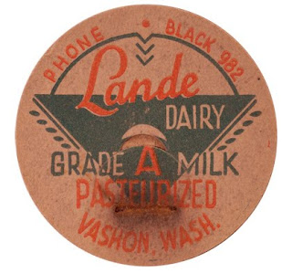 An original Lande® Dairy bottle cap was discovered in the attic.
Years of contact with a rusting staple had badly stained it
and the printing ink was flaking off the deteriorating paper
due to thermal cycles and humidity in the attic.
Katrina Lande came to us with the newly discovered family treasure because we have a reputation for good restoration work. She explained how her ancestors ran Vashon Island's biggest and best dairy. 'They had electric milking machines,' she proudly explained to me. But that was a long time ago.
Since then the bottle cap had lain in the attic slowly disintegrating along with everything else up there. Katrina was rightfully concerned about its preservation, now that it had been found. I recommended two things:
1.) First, capture and restore an image of the cap. Then...
2.) Preserve the original in a sandwich of acid-free paper in a light-box with low humidity. A darkroom paper box is a perfect container... but don't put it back in the attic. Keep it where you live... turns out that things being preserved like many of the same creature comforts we do.
At my studio the most important treasures of my past live in the same rooms I do. It's something I've been doing for the last ten years after I discovered for myself the dangers of storage in less than perfect conditions. Now I consider my past mistakes as some sort of 'natural selection' process for my art. However, the extreme damages to once beautiful pictures were a tough way to learn about archiving.
Easy As One-Two-Three
The restoration work on the Lande® bottle cap was straightforward and provides an easy-to-understand model with which to consider more complex restoration jobs. It is a three step process in PhotoShop® using a digital image of the bottle cap (we made ours using a Nikon® D2X) on a copy stand).
1.) Isolate key graphic components on separate layers
2.) Create a new background (BG)
3.) Prepress each element according to its needs
Finished yet?
OK, there's more to it than that, but not much. Here's the procedure used in this particular case:
 Each graphic element to be restored is placed on its own layer. 1.) Red type (Pasteurized) (right) , 2.) Green (Logo triangle graphic), 3.) Paper piece construction (center)
The starting point is to take the picture apart according to the elements that need to be repaired. Cutting them out of the background and pasting them onto their own layers separates those elements for restoration.
The cutting Paths are made using the pen tool working at a zoom of 500% to 800% (on a 22-inch monitor).
A completed path is converted into a Selection (Path / Make Selection).
The selection is expanded (or contracted) 1 pixel to include a bit more of the item being isolated. Large cutouts require 2 pixel or maybe 3 if they are really big... you just don't want a hard edge or an overly soft one.
Feather the selection by 1/2 pixel.
Copy and paste the selected part of the picture onto another layer.
And so it goes until everything that needs work has been isolated on separate layers. Once the separations have been made, each can be independently repaired.
Remaking the Graphics
 Restoration of the graphics began with the Red type. Using the original (saved) selection previously made (above), that selection was filled with red on yet another layer. The red color was determined by sampling the original type in an undamaged area. I actually sampled three areas and averaged them to get a composite shade of red.
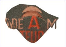
Then the same thing was done for the Triangle, filling it with green.
Making a new paper background was the next step.
Between the printing and damage there wasn't much clean BG paper left in the original bottle cap. Carefully cutting out bits and pieces and collating them together into a collage, a useable sized piece of 'new' paper was crafted onto its own layer. That layer was duplicated thrice and those bits flipped and flopped to create four pieces that could be kluged together into another, even bigger chuck. Etcetera.
The new paper was used two ways. First, to cover the damaged old paper. Also to provide texture for the type and triangle patches. Those graphics were filled with solid colors when we left off (above). The solid colors don't look realistic because they lack the texture of the paper.
Paper Texture
To make paper texture copy the new paper layer and use Brightness & Contrast to generate a high-contrast version... it should have black and gray flecks against a mostly white BG.
Set the Blending Options for that layer to Darken. Now, you can put that layer on top of any other and by setting the Blending Options to Darken add a facsimile of paper texture. Thus, texture was added to the red type and green triangle to provide more realism.
Layer Blending for Nuances
When restoration work involves completely remaking certain elements, blend a bit of the original back in to the extent you can wherever you can. The new paper BG just discussed provides a good example.
It's easy to see that the rust-stain damage has darkened the paper of the original bottle cap.
Yes, you can replace the whole BG with new paper, but that's not as realistic as blending in the new paper only where the old needs replacement, and only to the extent needed.
Do precisely that by first placing the new paper layer over the original damaged version, then setting the new-paper layer's Blending Options to Lighten. Presto, the rust damage is gone.
Fine-tune everything with judicious use of the Eraser. By adjusting the opacity, softness and size of the Eraser the blend will be perfected.
Lastly, use the Sponge to adjust the saturation of key spots if need be. Remember that the Sponge can also have its opacity and effect dialed for precision adjustments.
 The original red type(above) is placed over
the solid-red-fill type and the extremely damaged
part erased away (lower center).
The same technique was done for the Red type and for the green triangle, except that the Blending Option was set for Darken.
Recompose for Final Prepress
Gather all the layers together into a Group.
Copy the Group and Merge it.
Use the Merged layer as a Sub-Master for further work, which will be the normal range of prepress adjustments. What are those?
Prepress adjustments are described in full in my book, Giclée Prepress - The Art of Giclée, which you can proofread at www.gicleeprepress.com. They are also described, as individual case histories, in this blog ... like this story. (If there's something you'd like to learn about, let me know.)
Both my book and blog are about the 'Zen of Giclée'... restorations of your faith as well as your pictures, no matter how old they (or you) are.
Having milked that pun for what its worth, I'll leave it at that and cap this blog.
Friday, December 10, 2010
Cross-Country Color Management
How to Manage Color Conversations
Tom Ridinger is a digital artist whose imaginative works defy their photographic DNA, appearing at first to be watercolors.
"During the years between 1980 and 1999 I spent many hours under Macbeth® lights in printing plants throughout the country," says Ridinger. "I've witnessed 'prima-donna' art directors invade the pressman's territory suggesting and sometimes demanding color moves that did nothing but confuse the issue and make more problems.
"My approach then is the same as now, gain the trust of the printers by letting them do their jobs. What I cared about then was flesh tones and flesh tones only (the exception being corporate brand colors, which were often a fifth color [on a four-color press] so it was never really a big deal).
"It is often a meaningless orthodoxy to try to match colors to the chrome [color transparency or slide] on the printing press when there are frequently too many conflicting issues," the artist concludes.
 A pinnacle point in the collaboration between Tom and I
was an award-winning ad campaign for Motorcycle Industries Council in 1970.
Those were boom years, just before automotive enthusiasm ran out of gas
during the 1973 oil crisis.
In the early 70's we collaborated again at Mesney's Third Bardo. There, Tom and I put together book covers, magazines, and corporate work. We were a great combo because our graphic design sense was very close if not identical. However, like many great rock bands, we decided to solo. Our voyages took us in different directions, Tom as a picture editor and mine as an audiovisual illustrator.
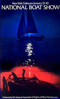 1972 National Boat Show poster,
for George Rounds at NAEBM,
(National Association of Engine and Boat Manufacturers)
was one of the last projects Tom and I collaborated on.
My current work as a giclée printer has brought us together again... with roles reversed. Now Tom delivers pictures to me, instead of the other way around. Either way, it's great to be working with Tom again and a priviledge to be able to show you his work as a teaching case history for this blog. I am looking forward to printing giclées that make his work blossom.
The Language of Color
My enthusiasm to be working with Tom was tempered by my awareness that printing giclées for long distance clients can present challenges. Many of the traditional ways to talk about color have been become virtually irrelevant in the digital printing environment.
Among other things Pantone® colors viewed by MacBeth® lighting are being supplanted by digital number codes.
Ink-flow that was once controlled by 'taps' on printing traditional printing presses is now controlled with PhotoShop® algorithms like 'Levels, Brightness & Contrast, Hue & Saturation' etc..
The objective remains the same, however: true color that is repeatable.
As it turns out, machines can do better than people when it comes to color control... at least 95% of the time. That leaves only 5% to talk about. That particular 5% is the peak of the giclée pyramid. It is the special 'je ne sait qois' that makes one print great compared to others.
Peak Performance
The other day I was driving back from our Vancouver BC studio and listening to NPR's reportage about a particular violin that was to be auctioned for $18 million... hardly going for a 'song', eh? Anyway...
After chuckling to myself about listening to a 'Strad' (Stradivarius) on an old car radio, I pondered about the instrument and those who its owner (a London collector) might allow to use it.
They played some magnificent bits by maestros playing the violing. That almost got me into the mood for some classical music, but not quite.
I thought about Ferraris (I do that a lot in my trusty little Honda® Civic up and down Interstate 5 between Seattle and Vancouver).
Whatever it is, it's its good as its owner/operator, I thought to myself. For example, me fiddling around with a Strad would be like those million monkeys they talk about. Ibid, the car.
You could have the best giclée machine in the world and still get insufficient results. It's easy... just following the directions.
If you let the machines color manage everything you will get results that are satisfactory for 95% of the people 95% of the time.
But what if that isn't good enough?
Learning to Drive
You can do better if you understand and control what the printer is doing. That, and everything else about giclée, can be discovered in my book, Giclée Prepress - The Art of Giclée as well as in previous (and future) blogs. Meanwhile...
Like violin playing and race-car driving, giclée printing (any printing) is all about nuances. The dynamic tone range of the print can be used to measure the excellence of one print over another.
Traditional photography provides a good comparison. The photo is as good as the print delivered. The print is as good as the darkroom artistry applied during its development. Now of course it's all digital but the same principles apply.
You can read the PhotoShop® manual and your printer's instruction book until the proverbial cows come home but they won't teach you anything about printing. Just as your car manual won't teach you how to drive.
Stradivarius for Dummies hasn't been written yet. Until it is you can trust my book to provide everything you need to know about printing giclées at least. But I digress...
The Music of Color
People talk about the language of color, but can they hear its music?
Instrumentally, how you play your printer will determine whether your prints look flat or sharp. It's all about tuning the picture to the printer. The goal is achieving a dynamic tone range with enough 'rare tones' to provide detail in dark and light tones. It is those areas that are normally deficient. That is, their deficiency has its roots in 'normalization'.
Normalization is my term for the plethora of algorithms that process imagery by averaging.
Averaging is weighted towards mid tones. Tones at the extremes of the histogram are generally sacrificed and must be restored if the giclée is to 'sing'. That restoration is part of the fine-tuning procedures called giclée prepress.
It's All in The Nuances
Great giclée results from a special collaboration between the printer and artist. Their collaboration results in the printer's ability to interpret the artist's intentions. It's all about nuances.
You wouldn't want to accentuate something the artist is sensitive about, would you? Or suppress a key feature? Yikes! Should be -- and can be -- the other way around. As the song goes, ...'you've got to accentuate the positive... eliminate the negative'.
But where to start?
Do You See What I See?
For long distance communications to be effective, it's important that both the artist and printer are looking at the same thing. In the old days viewing the originals and printed proofs under a MacBeth® light system did that, together with PMS® color numbers. People still do that but it's faster and easier to use 50% gray as the common ground.
As you are aware, photographers include an 18% gray card in shots so that users of the pictures can get their colors and tone ranges correct in subsequent reproductions. But what if one of those is missing?
When a good neutral (gray) reference point is not available in the picture, make your own. Case in point, Tom Ridinger's pictures.
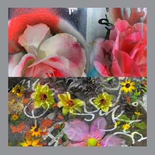 The artwork should be 'floated' over a layer filled with 50% gray.
Use samples of the most potentially problematic parts
and/or areas of importance.
At Vashon Island Imaging (www.vashonislandimaging.com) we ask our long-distance clients to surround their pictures with a 1/4 to 1/2 inch ( cm) of 50% gray.
By using the neutral eyedropper tool in PhotoShop® Curves, and clicking on the 50% gray border, the pictures colors will snap to a correct color tone range.
Using that simple procedure, Tom and I can look at our monitors and talk effectively about what we see... because we are looking at nearly the same thing. Then when I ask him which parts he's sensitive about (if any) he cane tell me and I can prepress accordingly.
From then on its all about making prepress adjustments and test prints that match my monitor (which is a Sun Microsystems® CRT).
There you have it... a short cut for cross-country color management.
Tom Ridinger is a digital artist whose imaginative works defy their photographic DNA, appearing at first to be watercolors.
Ridinger's illustrations combine gritty city graffiti with
metro blossoms that find their bloom in New York neighborhood gardens.
The series of 20 images is called Rap City In Bloom.
The title puns Rhapsody In Blue a 1924 musical suite by George Gershwin.
metro blossoms that find their bloom in New York neighborhood gardens.
The series of 20 images is called Rap City In Bloom.
The title puns Rhapsody In Blue a 1924 musical suite by George Gershwin.
Tom and I go back all the way to before computers. We are both old dogs of media wars spanning nearly five decades. We met in the Sixties when Tom was an art director at Ziff Davis. Working with Gene Butera, Tom and I brought a European sense of design to Car & Driver magazine feature stories. Many of the pieces we did together were our own version of a photo-journalistic style with roots in Life magazine and the German pictorial Twen. I still have a well worn 1960's copy of that magazine.
"During the years between 1980 and 1999 I spent many hours under Macbeth® lights in printing plants throughout the country," says Ridinger. "I've witnessed 'prima-donna' art directors invade the pressman's territory suggesting and sometimes demanding color moves that did nothing but confuse the issue and make more problems.
"My approach then is the same as now, gain the trust of the printers by letting them do their jobs. What I cared about then was flesh tones and flesh tones only (the exception being corporate brand colors, which were often a fifth color [on a four-color press] so it was never really a big deal).
"It is often a meaningless orthodoxy to try to match colors to the chrome [color transparency or slide] on the printing press when there are frequently too many conflicting issues," the artist concludes.
 A pinnacle point in the collaboration between Tom and I
was an award-winning ad campaign for Motorcycle Industries Council in 1970.
Those were boom years, just before automotive enthusiasm ran out of gas
during the 1973 oil crisis.
 1972 National Boat Show poster,
for George Rounds at NAEBM,
(National Association of Engine and Boat Manufacturers)
was one of the last projects Tom and I collaborated on.
My current work as a giclée printer has brought us together again... with roles reversed. Now Tom delivers pictures to me, instead of the other way around. Either way, it's great to be working with Tom again and a priviledge to be able to show you his work as a teaching case history for this blog. I am looking forward to printing giclées that make his work blossom.
The Language of Color
My enthusiasm to be working with Tom was tempered by my awareness that printing giclées for long distance clients can present challenges. Many of the traditional ways to talk about color have been become virtually irrelevant in the digital printing environment.
Among other things Pantone® colors viewed by MacBeth® lighting are being supplanted by digital number codes.
Ink-flow that was once controlled by 'taps' on printing traditional printing presses is now controlled with PhotoShop® algorithms like 'Levels, Brightness & Contrast, Hue & Saturation' etc..
The objective remains the same, however: true color that is repeatable.
As it turns out, machines can do better than people when it comes to color control... at least 95% of the time. That leaves only 5% to talk about. That particular 5% is the peak of the giclée pyramid. It is the special 'je ne sait qois' that makes one print great compared to others.
Peak Performance
The other day I was driving back from our Vancouver BC studio and listening to NPR's reportage about a particular violin that was to be auctioned for $18 million... hardly going for a 'song', eh? Anyway...
After chuckling to myself about listening to a 'Strad' (Stradivarius) on an old car radio, I pondered about the instrument and those who its owner (a London collector) might allow to use it.
They played some magnificent bits by maestros playing the violing. That almost got me into the mood for some classical music, but not quite.
I thought about Ferraris (I do that a lot in my trusty little Honda® Civic up and down Interstate 5 between Seattle and Vancouver).
Whatever it is, it's its good as its owner/operator, I thought to myself. For example, me fiddling around with a Strad would be like those million monkeys they talk about. Ibid, the car.
You could have the best giclée machine in the world and still get insufficient results. It's easy... just following the directions.
If you let the machines color manage everything you will get results that are satisfactory for 95% of the people 95% of the time.
But what if that isn't good enough?
Learning to Drive
You can do better if you understand and control what the printer is doing. That, and everything else about giclée, can be discovered in my book, Giclée Prepress - The Art of Giclée as well as in previous (and future) blogs. Meanwhile...
Like violin playing and race-car driving, giclée printing (any printing) is all about nuances. The dynamic tone range of the print can be used to measure the excellence of one print over another.
Traditional photography provides a good comparison. The photo is as good as the print delivered. The print is as good as the darkroom artistry applied during its development. Now of course it's all digital but the same principles apply.
You can read the PhotoShop® manual and your printer's instruction book until the proverbial cows come home but they won't teach you anything about printing. Just as your car manual won't teach you how to drive.
Stradivarius for Dummies hasn't been written yet. Until it is you can trust my book to provide everything you need to know about printing giclées at least. But I digress...
The Music of Color
People talk about the language of color, but can they hear its music?
Instrumentally, how you play your printer will determine whether your prints look flat or sharp. It's all about tuning the picture to the printer. The goal is achieving a dynamic tone range with enough 'rare tones' to provide detail in dark and light tones. It is those areas that are normally deficient. That is, their deficiency has its roots in 'normalization'.
Normalization is my term for the plethora of algorithms that process imagery by averaging.
Averaging is weighted towards mid tones. Tones at the extremes of the histogram are generally sacrificed and must be restored if the giclée is to 'sing'. That restoration is part of the fine-tuning procedures called giclée prepress.
It's All in The Nuances
Great giclée results from a special collaboration between the printer and artist. Their collaboration results in the printer's ability to interpret the artist's intentions. It's all about nuances.
You wouldn't want to accentuate something the artist is sensitive about, would you? Or suppress a key feature? Yikes! Should be -- and can be -- the other way around. As the song goes, ...'you've got to accentuate the positive... eliminate the negative'.
But where to start?
Do You See What I See?
For long distance communications to be effective, it's important that both the artist and printer are looking at the same thing. In the old days viewing the originals and printed proofs under a MacBeth® light system did that, together with PMS® color numbers. People still do that but it's faster and easier to use 50% gray as the common ground.
As you are aware, photographers include an 18% gray card in shots so that users of the pictures can get their colors and tone ranges correct in subsequent reproductions. But what if one of those is missing?
When a good neutral (gray) reference point is not available in the picture, make your own. Case in point, Tom Ridinger's pictures.
 The artwork should be 'floated' over a layer filled with 50% gray.
Use samples of the most potentially problematic parts
and/or areas of importance.
At Vashon Island Imaging (www.vashonislandimaging.com) we ask our long-distance clients to surround their pictures with a 1/4 to 1/2 inch ( cm) of 50% gray.
By using the neutral eyedropper tool in PhotoShop® Curves, and clicking on the 50% gray border, the pictures colors will snap to a correct color tone range.
Using that simple procedure, Tom and I can look at our monitors and talk effectively about what we see... because we are looking at nearly the same thing. Then when I ask him which parts he's sensitive about (if any) he cane tell me and I can prepress accordingly.
From then on its all about making prepress adjustments and test prints that match my monitor (which is a Sun Microsystems® CRT).
There you have it... a short cut for cross-country color management.
Subscribe to:
Comments (Atom)


