© Douglas Mesney 2010
Vashon Island Imaging announces the launch of a new book, The Little Bird Flies Over the Rainbow (ISBN 978-09865751-2-9).
The Little Bird, by Taylor Douglas, is a spiral bound, 36-page book aimed at children between 3 and 9 years old. It is a large book, 8.5 X 11 inches, richly illustrated throughout with full color pictures. (You can see the entire book at the end of this blog).
 © Douglas Mesney 2010
The Little Bird's main theme is color,
what it is and where it comes from.
The illustration above shows light refracting
through a droplet of water in the rainbow.
The next illustration (below) reveals color wheels,
how colors blend, and the names of the colors.

© Douglas Mesney 2010
The Little Bird is the first in a series of books that are bigger, longer and more complex than most other children's books. Each has a variety of concepts bound into an interesting tale.The Little Bird is a concept book. The goal is to present information in a non- linear way, as a child encounters it in actual life. Life isn't divided up into subjects (although it is in many schools).
One's stream of consciousness is a winding journey. Learning is non-linear. Discovery of one thing leads to another. Eureka moments and epiphanies occur when diverse concepts are combined. These books therefore present a 'winding' story with interwoven concepts.
A Picture Is Worth A Thousand Words
Each illustration in The Little Bird is available as wall art, lifting the books favorite scenes and characters off the pages and onto the walls of children's' rooms and play or learning areas.
Most of the illustrations are mastered at 30,000 pixels on the long side so they look as good as 8-foot murals as they do in the books.
Children particularly like our glowing pictures, which are printed on high-cotton-fiber paper that is sensitive to UV light. Kids love that effect.
At Vashon Island Imaging we have a special line marketed as 'Nite Lites' based on the UV paper. The idea is to use a low-wattage UV light as as night light which also makes the picture come alive in the dark. It is particularly realistic for night scenes like Star Gazers (below).
 © Douglas Mesney 2010
When viewed with UV 'blacklight' this large poster of
Star Gazers (above) looks as real as the real deal.
Maybe that's why kids love the glowing effect.
Great educators know a secret... the one that launched the Walt Disney® empire. It's a very simple concept... that kids live in their own world. That is something that is difficult for adults to remember.Star Gazers (above) looks as real as the real deal.
Maybe that's why kids love the glowing effect.
Environmental Learning
Sherlock Holmes said that most people look but don't see. That can be interpreted many ways. Most certainly can't see through a child's eyes or think the way a child does. They have lost the imaginary.
What made Disney a genius was bringing his characters off the screen and into our lives. A kid can go to Disneyland and shake hands with Mickey Mouse. That makes Mickey and Disney's whole world as real as Santa Claus in the mind of the child.... which wouldn't be the case if Mickey only lived in a cartoon.
Taking a page out of Disney's book for The Little Bird, we have posters of all the pictures in the book(s) in a variety of sizes. They are also available as wallpaper and light boxes, made to the customer's measurements.
www.babybooks.com
Vashon Island Imaging will soon launch a new website to market The Little Bird and other forthcoming book/poster productions: www.babybooks.com. Until the new site is up, advance copies of the new book can be purchased directly from the author (me)... and you know how to get me by now, eh?
Following below is a 'bird's eye view' of our first Baby Book. It's pretty hard to actually read these small blog pictures, for which I apologize.
The gist of the story is that The Little Bird wakes up to discover winter. The Little Bird learns about winter from his friends around the pond. He flies up into a rainbow and discovers where colors come from, and what they are called. On the way home he tells his friends what he learned about color. That night he dreams about colorful fish in a bigger pond. The next morning he meets his girl friend, tells her about the colors in the sky, and is very happy.
© Douglas Mesney 2010 © Douglas Mesney 2010
 © Douglas Mesney 2010
 © Douglas Mesney 2010
 © Douglas Mesney 2010
 © Douglas Mesney 2010
 © Douglas Mesney 2010
 © Douglas Mesney 2010
 © Douglas Mesney 2010
 © Douglas Mesney 2010
 © Douglas Mesney 2010
 © Douglas Mesney 2010
 © Douglas Mesney 2010
 © Douglas Mesney 2010
 © Douglas Mesney 2010
 © Douglas Mesney 2010
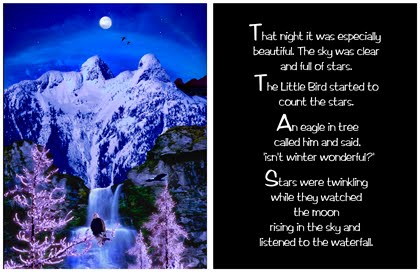 © Douglas Mesney 2010
 © Douglas Mesney 2010
 © Douglas Mesney 2010
 © Douglas Mesney 2010
 © Douglas Mesney 2010
Fun read, eh? ...And a bargain at $24.95.
Be the first on your block to have a copy, etc....
Let me know you read about it here and The Little Bird will sign your copy.