
Wednesday, July 21, 2010

Color Matching 101: Viewing Masks Add Accuracy


Color correction is part of a day's work for a giclée prepress artist. Clients bring you all sorts of files with all sorts of intentions. Some files can be printed almost 'as is' but others may require a bit more work. Such was the case when Brian Fisher (www.brianfisherart.com) brought us Helen II for a giclée... but not just any giclée.

This giclée had to match a 'Monotype' print original as closely as possible because the collector purchasing the giclée of Helen II also had another original from the same series. Not only that,, he was acquiring the giclée as a memento for a loved one who had recently passed away.

"The monotype print, (“single print“, “1/1“) although regarded as a form of printmaking yields only one strong impression and a weak second, (or “ghost”)", explains Brian. Basically, a the image is painted onto a smooth plate then the ink painting then is squeezed into the paper using a simple roller press.


An important thing to keep in mind is that the inks used in the Monotype print are totally different than giclée inks. The best we can do with a giclée is to match the original colors as closely as possible. Given enough tweaking and testing that can be very close indeed because the giclée printing process gives you the widest dynamic tone range of any printing process.

Vashon Island Imaging prides itself on custom work and the best prepress in town. But the fact that the giclée's future owner also had an original of the series really put the pressure on to get the colors right. The client showed us a giclée previously printed elsewhere as an example of what he didn't want ... off colors. So now it was my giclée against 'theirs' (whoever 'they' are).

The challenge continued when I discovered that Hahnemuhle had slightly changed their stocks and that the paper that the first giclée was printed on was no longer available. We selected the closest match, Photo Rag Ultra Smooth and got results that the client is pleased with.


At the studio we use daylight for viewing art whenever possible. 'Possible' means overcast, and we get a lot of that in the Seattle area where Vashon Island is located. The color of the light should be between 5200° and 5500° Kelvin and on a cloudy day on Vashon Island we get a nominal 5600°. (There is much more about viewing photographing art in my book, Giclée Prepress - The Art of Giclée.)

Mid-way through the color correction process I realized that I had forgotten to 'equalize' the color perception experience. It's an easy thing to overlook but it can make your color corrections more difficult and less accurate if you forget to isolate the section being color-matched with white or a neutral color.


Peter's original is surrounded with a beautifully cut mat and backing board, both of which are 'cream colored' not white. On my monitor I was seeing the colors against neutral and white backgrounds. The difference in backgrounds was enough to throw off my judgement. That might have been what happened when the first giclée was made... its bluish cast in particular greens would explain an over-correction for 'creaminess'.


A test strip from two sections of Helen II revealed that an adjustment was needed to one specific shade of greens. We print the test strip along one edge of the same sheet that will later be used for the 1st proof print. The proof shows the result of the changes made from the test strip. You may need to make several test strips before printing a proof of the whole image. We were lucky with this one... or maybe the extra accuracy of using white masks throughout the color evaluation process helped a little, eh?


To make the adjustment all those particular greens were separated onto their own layer so they could be individually controlled.


The resulting correction was the addition of 30 points of red to the mid tones of those greens... duly noted in the Layer Properties.

For more precise color adjustments use white paper masks for the original artwork and a white background in PhotoShop®. Neutral gray or black masking is also OK, especially for dark pictures. Whichever you choose, use the same mask color at every stage of your color matching.

Tuesday, July 20, 2010

'Face Time' Beats Facebook


There's nothing like a face-to-face meeting to generate new business, and nothing like a self-liquidating promotion to stretch your promotional dollars.

For many businesses, Web-based 'social networking' has all but replaced real 'face time' as a way of 'meeting' and persuading prospective customers. I too found myself believing that the power of the Internet is the be-all and end-all for business communications. Last weekend proved otherwise when Pam and I participated in the Vashon Strawberry Festival with a stand promoting our printing company, Vashon Island Imaging.


The Strawberry Festival stand turned out to be the best thing that we've ever done in terms of PR and promotion. Better than the Vashon Art Studio Tour... better than the thousand-plus dollars spent last year advertising in the local papers... better even than 6-months of high-exposure display time at a local bank and a 48X48-inch sign at Vashon Print & Design. Why? Simple. We were able to reach most of the community with a high-impact presentation.

Only community events like fairs and festivals offer a chance to meet everyone all at once. Other communications media and methods are not nearly as broad spectrum as community events. For example, not everyone reads the local papers, or uses the internet. All other advertising techniques reach only small segments of the total community... whereas the whole town turns out for a big event like Vashon's annual Strawberry Festival.

When you advertise using traditional media and methods your impact is limited to the size and position of your ad as well as the audience segment of the media. Signs are mostly ignored by people, so they are of little help really. And internet promotions are like the new direct mail... quickly deleted. In the end it's really about 'word-of-mouth' and as it turns out 'face time' beats Facebook without question because there is no substitute for personal contact.

From my earlier blogs you know that I am a big proponent of art shows. We participate in the Vashon Island Art Studio Tour every December and May because it is a great opportunity to do market research. We use the Tour to test our pricing, promote Vashon Island Imaging, and gauge customer reactions to my new illustrations. As it turns out the Strawberry Festival was an even better market research tool because it provided a broader audience. The Vashon Art Studio Tour and art shows in galleries only draw people already interested in art and who are more interested in originals than giclée prints. Shows in restaurants and other non-gallery locations tend to be ignored because people are focused on eating or shopping, not on art.

Since the whole town turns out at events like strawberry festivals and country fairs your work gets seen by the widest spectrum of people. What we discovered was that there was a huge segment of the Vashon Island community that didn't know we existed despite all those other promotional efforts... but there they were, at our stand learning all about our giclée and laser printing services.


Our entire stand was trimmed with giclée work... the signs, the pictures, even the raffle-ticket box. Pamela Swanson showed her new 'Shadow Boxes by Pam' which combine giclée and laser prints of her pictures with origami work.


We decided not to sell anything. Instead we made our stand into a display of what can be done with giclée. Brochures described our range of services and for those especially interested we had 'value coupons' which offered a 20% discount. The coupons featured 'my' likeness as a smiling President on the face on a $50 bill.


To discover who likes my illustrations I decided to have a good old-fashioned raffle. We sold chances for just $1.00 and sold more than a hundred tickets which covered the costs of the 20 X 30 prize giclée.


Glen Bishop (left), a psychic who is part of Vashon Intuitive Arts helped us out by reaching into the raffle box to choose the winner. (The VIA studio was right across the street from our stand and 20 of my illustrations were on display there, so it was a good tie-in.)


In the raffle, my latest piece entitled 'Evening Light' (left) was pitted against a known winner called 'Vashon Christmas Tree' (right). The Christmas tree piece had earlier sold out its first edition so it made a good foil for the new piece in this test. When as many people chose the illustration of Point Robinson Lighthouse (a Vashon Island landmark), my confidence in the new piece to sell well in the future was boosted.

As an interesting aside, the raffle once again proved that 'new media' art is only accepted by people under 45 years of age. People over 50 generally shun new media in favor of traditional media like oils, pastels and watercolors. That is why my own illustrations are aimed at 'kids'.

The raffle gave us a chance to do some post-event follow-up PR and publicity sending pictures of the drawing and an announcement of the winner to the local press. Plus, now we have the contact information for about 100 people that we know like those pictures... how great is that?

Speaking of costs, we did the whole thing on a shoestring budget of about $400. We built the stand from parts gotten at Home Depot... a canopy reinforced with a frame of 2X2's from which we hung the art and signs. The frame was connected with U-bolts. Pam and I got the thing up in less than 3 hours (including two trips to-and-from the studio hauling the stuff). It packed out even faster.

'Good, cheap, fast...choose any two' is how it usually goes but this promotional event was total win on all counts from the git-go. Next year we'll be back at the Vashon Strawberry Festival with a stand that's twice as big and a smile on our face that's twice as wide.

Facebook may reach millions, but I prefer face time with just a few.

Sunday, July 11, 2010

ASMP Misses the Point


Photographers may be sharp shooters individually, but collectively their point of view is out of focus. That said, be forewarned that this blog is a bit of a rant.

I don't take kindly to those who obstruct the very mission they claim to be on whether intentionally or inadvertently. Although that may seem off target for this blog, it isn't at all when it comes to the 'Zen' of education about digital imaging and pixel perfect printing, which is what this blog is all about.

The back-story is that an ASMP'er broadcast a request for help over the ASMP email network. The shooter wanted to know about stitching software because the one he was using wasn't working in his opinion. His back-up was a 4X5 camera, so I knew that this was a 'real' photographer. That meant he probably didn't live in PhotoShop®, as I do. Fair enough... I have no first-hand knowledge of 4X5 swing-and-tilt cameras either and have huge respect for those who do. I conjure images of Ansel Adams trooping a big rig over hill and dale. Anyway...

His assignment required him to shoot a large group of people from a very short distance. Normally you would use a wide angle lens to do the job, but extremely wide angle lenses on 4X5 cameras distort people in an unflattering way... and there is nothing quite like a large group of distorted people, eh? So he thought about shooting the group in sections and stitching together the results... that would enable him to use a longer lens as you normally would photographing portraiture and small groups. The problem was that his current digital darkroom skills for assembling the sections weren't up to snuff and he was looking for a software solution.

Usually what happens in the ASMP network is that one member poses a question or issue and then others chime in. The discussion is moderated by an editor who approves the content to be broadcast through the system. It works pretty well and in the past I've picked up some useful tips, tools and teachers. But I was in store for a counter-intuitive surprise.
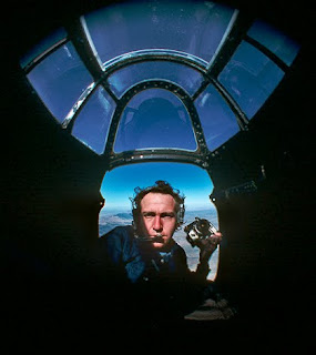

I first joined ASMP back in the 1960's when the organization's roots found fertile soil at Life Magazine and look-alike pictorial magazines like 'Look'. The market for photography was vibrant then and ASMP accomplished a lot for its editorial-photographer membership by negotiating terms with publishers and helping set in place uniform standards and practices. The Association's large membership gave it strength of a 'guild' in terms of setting higher rates. All was good until technology made professional photographers largely irrelevant.

There is still tremendous value in what ASMP, ADC (the Art Directors Club) and the Graphic Artists Guild do but they all have gotten 'slower' as they get larger... slower to react to changes in a world that moves faster all the time. The time lag diminishes the relevancy of what they do. Operating in a time warp how can you effectively respond to the 'here and now' needs of members? Other times people just don't seem to 'get it' and maybe this is one of those situations.

I decided to respond because I had a valid answer to this man's question. Also, I knew that he would get a lot of leads from colleagues about their various software preferences, creating a further conundrum for the poor fellow who couldn't possibly try them all... he's a photographer after all. More importantly, all the suggestions in the world wouldn't change the fact that there is no perfect stitching program. In my opinion, most don't even come close to what can be done manually.

At Vashon Island Imaging, my fine-arts giclée printing and publishing company, we pride ourselves on delivering the finest printing that money can buy because we understand prepress. Additionally, I have been a photo-illustrator for five decades (yikes) and have done 'stitching' since before there were sewing machines.
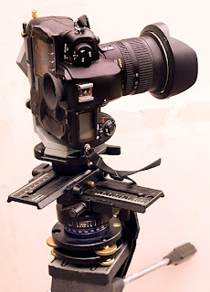

'Stitching' as we know it today has its roots in the 'Virtual Reality' (VR) shots of 360-degree environments that became popular in the 1990's as software wizards developed '.gui' interfaces for assembling panoramas from overlapping individual frames. Those VR shots were done using very specific lenses and super-precision tripod mounts set to provide the correct amount of frame overlap to facilitate accurate software stitching.
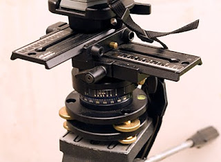

Stitching software has improved as it evolved during the last 20 years. Nonetheless, a fair amount of precision is still needed and basic optical rules must be followed because even if the stitching is perfect the picture may look weird anyway.

Most people forget about the 'rules' of optics. More specifically the ones concerning perspective. The reason the ASMP'er wasn't succeeding may be the result of multiple center points. This problem is accentuated with wide-angle lenses and can make stitching software behave badly. If you have ever tried to line-up multiple projectors on a single screen to create a panoramic image, you know all about these kinds of problems.

Every picture has a unique center point upon which pivots the perspective within the frame. The wider the lens the sharper the angles in the lines of perspective.
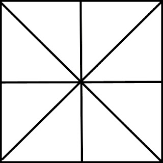

If the group photograph is shot with a wide angle lens there is one central point with all perspective points radiating out from it.
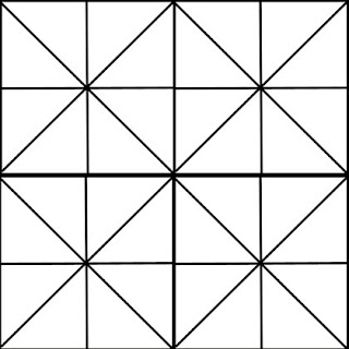

If it is shot in sections then each section has it's own center point.
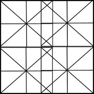

Trying to overlap frames with multiple center points creates a 'wavy' effect which is accentuated in relation to the depth of the scene in the frame. The wider the shooting lens, the 'deeper' the waves. Short lenses give results with shallow waves... but even 'flat field' lenses wave somewhat when the frames are overlapped.

The wavy effect creates areas of 'confusion' where the perspective lines in two or more frames conflict with one another instead of meshing together. In those areas something's gotta give. Forcing the join is always possible but the resulting look still has more than one center point giving it the perspective of an 'altered reality'. Is that good? Beauty is in the eye of the beholder.

2-dimensional art shot in sections remains relatively undistorted and looks 'right' whereas a 3-dimensional scene will look wrong in relation to the length of the lens used to shoot the frames. The longer the lens the better.

When I am shooting landscape panoramas I try to use my old Nikkor AF-S VR 70-200mm 1:2.8G. It is as good as a flat field lens with little barrel and pincushion distortion. Optical distortions always make stitching more difficult. For shorter distances I try to stay with prime lenses because zoom lenses always have more of those distortion problems. The old, glass 55mm 'Micro' Nikkor is a favorite as is the original, glass 105mm 'Medical' Micro-Nikkor, which is hard to find these days but a great lens when rectilinear capture counts.

The point I wanted to make for the inquisitive lensman was that instead of simply 'stitching' together 'slices' think more in 'jig-saw puzzle' terms. Trying to make slices fit together is a Procrustean approach for the reasons outlined above... the multiple center-points problem prevents the pieces from a perfect fit because their perspectives don't match.
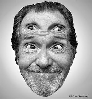

To see a four-section shot 'correctly' you'd need four eyes ... one for each section... with each eye looking for its own center point.

Thinking in jigsaw puzzle terms frees you from the laws of perspective to the extent that you get away from things rectilinear. To shoot and stitch the group shot in this example, use a flat-field lens like a Micro-Nikkor 55mm or 105mm lens.

First, shoot the group in a single frame using a wide-angle lens. That wide-angle shot is your reference frame and background upon which to assemble your jigsaw puzzle... it shows what the jigsaw puzzle will look like when done.

It doesn't matter that a wide angle shot has a different pixel density than the puzzle pieces because that difference can be used to advantage, creating a 'selective' focus effect that actually makes people in groups look better. Anyway... the primary purpose of the wide angle shot is to provide the master matrix for the perspective in the shot... a 'schematic'.

Switch lenses and shoot each group member individually. Later, using the software of your choice, cut out these individuals and put them in place over the matrix master, blending them in appropriately. What is appropriate? That is way to lengthy to go into here but it's fully described in my book (Giclée Prepress - The Art of Giclée).

The 'jigsaw' approach is also the key to successful prepress work, which is so important for pixel perfect printing. The whole idea in prepress is to cut out the parts that need fixing, fix them, and put them back into the matrix.

But my email'd advice was rejected by the ASMP list moderator because I am not an active member. Huh? Hang on... what does that matter if I have something valid to contribute?

I am a member of the Graphic Artists Guild, however that may not count in the eyes of ASMP or at least the Seattle Chapter. Funny because that is exactly the opposite of what we are trying to do at the Guild. In a recent Board meeting of the Seattle chapter of the Graphic Arts Guild the very subject of 'reaching out to ASMP' was discussed in detail. It was decided unanimously that it was in everyone's best interests to co-mingle, that in this so-called 'New Economy' our common interests now overlap and make it a good mix. We don't have moderators and I hope we never do.

The world is so changed. People don't work for companies anymore. They work for themselves. They are like the survivors of a ship that has sunk, bobbing about in life jackets, a few in lifeboats. Help is needed in two sizes, large and small. Both benefit from a CO-OP approach. Big ticket items like health care get better as the group size increases. Small ticket stuff like the kind of advice I had to offer is pushed into the information pipeline instead of being rejected. Give me one reason, please, to reject helpful information.

Maybe this advice will somehow get to the photographer who posted his query. If I am stricken from the ASMP list that would be a clue that someone in the group read this and passed it up the chain of command. But I hope for the opposite effect.

ASMP still casts a long shadow of influence so it is my hope that this blog gets read by someone at ASMP who agrees that it doesn't make sense to bar members from receiving valuable information and that a policy of cooperation among brother and sister trade organizations makes more sense than the current paradigm of being a 'secret society'.
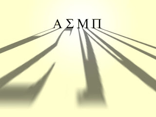

Closed societies are the result of closed mindedness... a kind of blindness. Hardly what you would expect from people supposed to be visionaries, or at least the creators of visionary images.

So that's my rant. I am satisfied for now and will get back to the real subject of this blog -- how to print better -- real soon. Until then, consider that blogs are more than information, they are editorial as well. You get a sense of the writer as much as the information. Blogs, like their creators, have 'personalities'. (I wouldn't be surprised if in the near future we don't see a TV show like 'American Blogger' wherein superstar bloggers vie for 'analytics'.)

If you follow this blog you know that I am a big promoter of education about giclée printing and publication. At my giclée art production company, Vashon Island Imaging, I give seminars for $5 an hour. People think I am crazy but I explain that my mission is to help people get better looking printing results. As the world class hairdresser Vidal Sassoon once said, 'If you don't look good, I don't look good.'

The seminars and my experiences teaching PhotoShop® briefly at BCIT in Vancouver are what led to writing the book (Giclée Prepress - The Art of Giclée)... and the book is what led to this blog.

The blog provides an opportunity to constantly update the book, and also proves a soapbox function that a book cannot. Since I am in the giclée art production business I work with all aspects of giclée printing and finishing all day long every day. You could say I know a thing or two about printing and especially prepress, the art of adjusting pictures to look their best when printed. That is what I do and what I teach. If people get better printing results they will print more. If they are dissatisfied they will print less. Pavlov was right on target. ASMP (or at least their moderator) misses the point.

Friday, July 9, 2010

MOAB Road Test


It was only a coincidence that we chose the hottest day of the year to road test 'Desert Varnish' by MOAB®. It was 93° in the shade... pushing the limits when it comes to spraying coatings onto giclées. But that is what road tests are all about, pushing things -- but hopefully not off the cliff.

Desert Varnish is MOAB®'s contender in the giclée coatings wars. Until recently there weren't many choices but now there are several. I've already reviewed two others -- Clear Shield by Clearstar® and Premier® ECO Print Shield -- in previous blogs.

Secretly, I was hoping that the MOAB® product would do well because it is readily available here in Seattle at Glazer's Camera. The other products are gotten either online or at Tricera Imaging in Vancouver, Canada ...each equally inconvenient. Moreover, I had met MOAB's Seattle product rep, Tom York, at the NW Photo Festival and he seemed like a nice guy. I was there selling my book, Giclée Prepress - The Art of Giclée and Tom was nice enough to put a copy on the table at his stand for Legion Papers® and MOAB®.

When purchasing Desert Shield at Glazer's Camera (three 1-pint bottles) I initially was surprised to learn that the product is lower priced than its competitors on a volume basis ($40 quart vs $60 or more). Things like that make me smile. The smile broadened when I discovered an absolutely clean filter in the funnel after pouring through the Desert Varnish.


After diluting the stock solution 20% with water and shaking the mixing bottle the spray-ready coating fluid slid down the sides leaving no residue whatsoever. Wunderbar!, as they say in Sweden.


I chose a 10-foot-long giclée for the test... a sign for Vashon Island Imaging's booth at the Vashon Strawberry Festival coming up on July 17th and 18th. It was printed on Epson® matte canvas and would be stretched after coating. I reckoned that if the sign didn't survive the test it was no great loss.

It was more difficult to get a smooth even coating with Desert Varnish than with either Clear Shield or ECO Print Shield. Possibly the temperature had something to do with that... faster drying does affect the 'wet edge' you need to maintain when doing spray applications.


However after five coats there were still problems as you can see in the picture above. The other two products both required only five coats for an even surface. Desert Varnish required nine.


The results on the sign were good even if it did take extra coating, so I moved onto the next piece in line... another 10-footer, this one of a picture called Olympic Mountains Vista. It has primarily dark tones of blue and requires good dmax. We had made an eight-foot version a week earlier and sprayed it with Premier ECO Print Shield gloss coating. It looks just the way it should... sensational... and so would make a great comparison for the MOAB® Desert Shield coating test.

After laying on six coats a weird spray anomaly occurred. I couldn't take a picture of it because it had to be gotten off the print right away as Desert Varnish sets up fast, especially on hot days. After considerable deliberation I determined that it was a prepubescent 'string'... a string that hadn't fully coagulated. That fear was confirmed when I poured the solution in the spray gun back through the filter. You can see the results in the picture below.


I recognized the problem from my days of rolling on coatings of Clear Shield and these are described in detail in the book. Basically what happens is that when you cut the stock solution with water the coating starts setting up in slow motion. You have to use the working solution fast to avoid any coagulation resulting from the slow curing in the container. The problem had never occurred before while spraying, probably because the other coating solutions require fewer coats so you are finished before the coagulation gets problematic. But when you have nine coats to deal with, the solution is in the sprayer container for nearly twice as long... long enough for the strings to start forming. You can tell something is wrong if your sprayer spits out even one little bit of crap... that is the tip off, or so I learned. However, I don't expect to be using Desert Varnish after my one remaining pint is used up so the problem shouldn't reoccur. Until then I'll know to filter the working solution more frequently during the spraying process.

The MOAB® coating goes through the sprayer with minimal gunk build-up. ECO Print Shield was the worst in that regard, requiring continually alternating coating with water to keep the tip of the sprayer clean. Desert Varnish behaves like Clear Shield. You get the normal back-spray to peel off the flat part of the gun tip, but no build-up in the spray gun needle seating.


Anything sprayed through a gun creates a 'back spray' that builds up on the flat portion of the shooting tip. You can see that I have scratched some away in the picture above. This needs to be removed frequently. While the coating is still wet it is easy to clean off the tip with a cotton swab 'Q-Tip®' wet with water. After it is dry you can peel it off with a fingernail.


When you pull back the spray gun trigger the hole in the center of the tip, which seats the flow-control needle, should be absolutely clean as seen in the picture above. To clean out any gunk in the seat hole use a toothpick. For persistent crap use a thin sewing needle. As mentioned, both Desert Varnish and Clear Shield both run clean, whereas ECO Print Shield left so much crap in the needle seating that I almost took the hammer to it.

The problem with Desert Varnish is that you need so much of it that it starts to build up a visible 'haze' over the giclée image (see picture at end of blog). The haze is actually the particulate matter that reduces the gloss of a coating. More particulates means more matte... and less dmax. All 'satin' and 'matte' finish coatings have these particulates but usually you don't need as much thickness so the dmax doesn't suffer as badly as with Desert Varnish. This whole subject and why matte finishes act as they do is fully described in the book.

You can avoid the dmax problems and uneven surfaces by spraying the stuff on really lightly... but protection suffers as a consequence of the thin coating. Since we are a commercial giclée printing shop at Vashon Island Imaging, I want the coating we use to be as bullet proof as possible... they have to at least stand the Windex® test, which is a wipe down with a Windex® drenched paper towel or a wipe with a wet sponge. If you can do that to your giclée the coating is thick enough.


Curling edges are another way to tell if the thickness is sufficient. As the liquid laminate coatings cure they shrink. Because the shrinkage is on only one side of the giclée, curl happens.


You can see in the picture above that the giclée of Olympic Mountains Vista coated with Desert Varnish (right) has suffered much more dmax loss than the same picture coated with Premier ECO Print Shield gloss coating (left). The Desert Varnish coated print will need to get re-coated with a good clear gloss coating to try to restore some dmax and contrast by eliminating the scatter light caused by the MOAB coating... for which we'll be using Clear Shield.

In fairness to the MOAB® product, it looks just fine on light-toned pictures and 'normal' ones. However, Desert Varnish is inappropriate for any work that requires good dmax. The fact that there is only one kind limits the use. With the competitors products you seal the giclée with gloss and then adjust the surface using either satin or matte or both in varying degrees. But with Desert Varnish no such tweaking is possible.

Cost wise Desert Varnish turned out to be more expensive than its competitors, because of all the extra coating you have to use to get an even looking surface. The two 10-foot by 17-inch giclées tested used up just under a quart. That means that $40 in product covered roughly 30 square feet... for a cost of $1.33 per square foot. That compares with about 60¢ per foot for Clear Shield and Premier ECO Print Shield, making Desert Varnish twice as costly to use. I don't mind paying twice as much when the results are too... but two times the cost for one-half the quality? I don't think so.

Legion Paper® has built a slick website for their MOAB® products, including Desert Sjield. They have plenty of blogs and other programs about how to print. My hat's off to Andy Biggs and the efforts of all those at the company who support education as I do here at Vashon Island Imaging. However, a slick website doesn't gloss over a dull product.

Staple Product?


The Arrow® Powershot® stapler is one product to avoid if you do a lot of giclée or other canvas stretching. The picture above shows what happened to mine this afternoon after I hammered it to death. I had to do it because I was so furious. Why so mad? It was the third one in as many years that crapped out.


The Powershot® is more ergonomic than its predecessor, the trusty T-50 model. The one pictured above I've used on three continents for more than 30 years. However, because the handle of the Powershot® model is reversed it is easier use. With this model you push forward rather than backward which makes it much more comfortable and accurate. However, the Powershot® is a piece of junk that just can't stand up to professional use.

I have a short fuse when it comes to equipment or tools that turn out to be junk and I get revenge by hammering them to death. It is a way a venting my anger... anger with the manufacturer for fooling me into thinking they had a good product, and anger with myself for being fooled.

The hammering 'tradition' started back in 1975. I had bought an audiovisual programming machine from Audio Visual Laboratories. It was so fluky and frustrating that one evening when the product rep was visiting my studio I threw it out the window down three stories onto the concrete pavement below where it smashed into a million pieces. Fortunately he had a good sense of humor. We packed the pieces into a box and returned them to the manufacturer with a note explaining that the machine didn't seem to be working very well.

In my book, Giclée Prepress - The Art of Giclée, I recommend the Powershot® stapler but now rescind that recommendation.

I will henceforth use 'hammers' as a rating system for crappy gear that I write about in this blog. The more hammers, the crappier the product. Thus the Arrow® Powershot® has the dubious distinction of receiving the very first triple-hammer rating.


Power to the people!

Art Shows: Beacons In the New Economy


These have been dark days in the art world. Artists everywhere are trying to find some limelight. For these artists as well as their patrons, art shows are like beacons shining in the night.

Art shows are the only times that the public can see artists' works other than at museums and peoples homes or offices. For artists, shows are such critically important marketing tools that many artists on Vashon Island often ask me for advice when it comes time for their own shows. They know that I have a 'global' perspective on the art market based on my own experiences as an illustrator selling limited edition giclée prints in galleries, and as the proprietor of Vashon Island Imaging, a fine-arts printing and publishing company. Their questions generally fall into three categories:

1.) What to show
2.) How to show it
3.) What to charge

What to show is probably the easiest question to answer... only show your very best. A show is a strong as its weakest picture. Better to show only a few than to load it up with less than your best (a common mistake).

Go through the show space and plan your work selection to coincide with the physical possibilities and any special opportunities. Size your pieces to fit into specific spots on the walls. Here on Vashon I just finished a show at a Books By The Way, which featured extra-wide panoramas over the book cases. However our current show at the Vashon Intuitive Arts center is 90% verticals because of their unique room layouts with lots of old-fashioned windows chopping up the wall space.

If your show is in a special location try to find subject matter that coincides. Last year I had a show at an Indian restaurant and at it presented only illustrations of India.

Try to have a variety of colors. I always include a picture that is primarily blue, and others that are red/yellow, orange and green. That is because some people like one color and others another and most want their art to 'go with the couch'.

From research at Ikea (where I was 'allowed' into their sales computer for 1/2 hour last year) I discovered that the two most popular sizes are 30 X 50 centimeters (about 12 X 18 inches) and 50 X 70 centimeters ( roughly 20 X 30 inches). The most popular subjects are landscapes, seascapes, flowers, abstracts and monuments like the Eiffel Tower and Statue of Liberty.

The Ikea statistics are geared to Ikea customers, of course... young people starting new households. They are a great target audience because older people have already collected so much art they have no wall space left (for them, think miniatures).

Half of my own illustration work is aimed at urbane. My target buyer has a 1,000 square foot condo in Vancouver's, is between 30 and 45 and on the way up, and drives a Tesla or other hot car. These people have money to burn and they fully embrace artworks made from 'New Media'.

The other half of my artwork is aimed at the local Vashon market, which is entirely different. My style and giclée art in general doesn't sell well on Vashon actually because there are so many traditionalists who have a grudge against New Media anything. In their mindset these (generally old) people feel that if it isn't made with traditional media (oils, pastels, watercolors, etc.) it isn't art. However they are a dying breed being replaced by young retirees with a more modern take on art. For those more enlightened patrons I produce works that bear the Vashon brand in one way or another... a flower picture includes a local landmark in the background, for example. Localizing scenes really helps sell pieces. Every local has it's equivalent on the Empire State Building. Here on Vashon we have our Point Robinson Light House (pictured above).

To summarize, the work you show should be your best work which is appropriate to the locale where it is being shown and the intended audience.

How to show your art is of course dependent on your esthetic and the ability of your prospective patrons to buy and show it. We'd all love to have big framed versions of our work hanging in shows but that may not be the best way to go these days.

At Vashon Island Imaging the most popular presentation is called 'gallery wrap' which most people know has the picture wrapping around the edges of the canvas stretcher, stapled on the back side instead of the edges. This presentation style does not require frames which saves the typical customer a small fortune. I have always found it ironic that frames often cost more than the art they contain.

That said, frames can add a lot to the total look and value of a piece. However a related problem is frame style. As the artist you have your own ideas about what is 'right' ...but your customers will probably not agree. Why do you think there are so many frame-type samples at framing shops? People spend hours agonizing over which frame to choose... seems harder than choosing the art sometimes.

Gallery wrap stretching techniques are just one of the thirteen steps to producing giclée art that are described in my book Giclée Prepress - The Art of Giclée.

Although frequently less expensive than framing, canvas stretching can still be costly. I am amazed at how much frame shops charge for this most elementary of services.

We have a customer in Alberta, Canada who ordered two very large giclées of my illustrations. One was a 60 X 40 and the other a 96 X 18. We sent the canvases rolled for local stretching (at the customer's request). Then a desperate email arrived asking for help... the local frame shop in Canada wanted $350 to stretch one and even more for the other. 'Wow', I said to myself... 'I better move back to Canada if I want to get rich'. At Vashon Island Imaging we charge $5.00 a linear foot so the most expensive of those two would have cost $95 (96 X 18 = 19 linear feet). We make money on that price so you can imagine the profit at that Alberta frame shop!

The other 'problem' with gallery wrap is that it requires a more considerable portion of the picture and canvas to be 'wasted' for the wrap. Further, many artists don't take the wrap into consideration when making their pictures. If it's a giant print there's probably enough picture to make the wrap without impinging on the total image in a significant way. But smaller pieces can suffer badly giving up picture area for gallery wrapping. For these situations we offer 'Faux Wrap' at Vashon Island Imaging. A sliver of the picture area is copied and stretched to fill the wrap zone. How this is done is described in detail in the book. I do it all the time with my own work, especially older pieces that I made long before the giclée printing process ever existed.

Obviously you can't really 'wrap' paper giclée prints... so you are back to framing, or mounting on any number of substrates. These methods are also described in the book but are also familiar to most artists already so I won't bother going into them here and now.

However one way of presenting paper or canvas giclées that is popular and relatively inexpensive is done by using large bulldog clips to attach the giclées to Foamcore ®, Astrofoam ®, Gator Board ®, Sintra ® and/or other substrates. The picture below called Stargazers shows how the clip arrangement looks.


The way we hang them is to tack two very thin brads to the ceiling molding. From those the piece is hung by two 'mono- filament' (invisible) fishing lines (we use 20lb.test fishing line unless it is a much heavier piece like a 10-footer for which we'd up the test to 50-pound strength).

It's a clean and simple look that presents the canvas (or paper print) and places the decision about how to stretch or frame the art in the hands of the customer, where it belongs.

Size is another consideration. Remember that at IKEA the top selling sizes are 12 X 18 and 20 X 24 inches. Makes sense since most buyers there live in smaller homes, condos or apartments. More affluent shoppers with larger digs don't dig IKEA. Who are your customers? Here on Vashon most artists are making 'miniatures' and shows of these little masterpieces are very popular at the Blue Heron Art Center, Heron's Nest, Silverwood Gallery and other galleries here on Vashon Island.

On the other hand, knowing that giclées are considered 'second class citizens' in the Vashon art world I go to the other extreme and concentrate on making big ones that will only fit in rich peoples' homes. I am not interested in small money when it comes to my own illustrations... I get enough of that at the printing company. That said, my prices are lower than most... so my patrons get nice big pieces at even nicer small prices. The question you should ask yourself is, 'how much wall space do my customers have and what sizes will fit?'

If you are making a limited edition, consider creating an 'S' class for 'Special' sizes. My own editions are made up of five or six 'standard sizes' and an open class that allows customers to order pictures in the sizes they want but still 'fit' in a limited edition.

The size of the edition impacts the perceived value in the eyes of shoppers. Make your edition sizes as small as possible to get the money you need out of the picture. An edition of 6 pieces is way better than 16 or 60.The best marketing tool is a sold out edition! That pushes demand and sales for your other work. In my case editions are set at 44 and these days 23 of those are reserves for the 'S' class. Furthermore, sizes below 20 inches on the long side are generally left out of the edition.

Finally, what to write on the little labile next to each piece that states its name and price. The name of the piece is easy... finding the right price may be harder. Here are some suggestions and a little theory to boot:

As artists we always over-value our work. What matters is the value perceived by the intended customer.

When I make a new illustration I unceremoniously leave a print of it on display in the studio and wait to see if it catches peoples' eyes. Those who notice it are asked, 'how much would you like to pay for it?'. Opinions don't involve money so most folks will be 'kind' to you and give you a figure that is too high... about 33% too high usually.

You have to ask yourself, 'do I really want to sell this?' Many artists say they do but really don't and one way to succeed at that is to keep your prices high. But if you really want to sell you have to go for the values that customers perceive in your work.

To establish a 'floor' for your pricing, consider your living costs. Every business and household has an annual operating cost. You need to get that amount of money within the year to survive. Now, how many pieces can you make during the year? By doing the math you will eventually come up with an hourly 'fee' that your work needs to earn to keep you afloat financially. The realism you apply to this math is important for you (and your customers).

Let's say you need to earn $50 an hour and a piece takes you 10 hours... that piece needs to generate $500 to pay its way. Depending on where you live, $500 might be a lot for a typical customer... it sure is here on Vashon Island despite the million dollar haciendas you see going up all over.


The picture called Vashon Christmas Snow (above) provides an example. By itself it generates lots of interest on the Island just because of its subject... the annual Christmas Tree in the Village Square. I featured it at our studio open house during the Vashon Island Art Studio Tour, which we participate in every December and May. A gallery-wrapped 20X20-inch giclée was on positioned on a display tripod with pride of place in the showroom. Discounting the price-opinion polling results by 33% (most people said $150 when asked) arrived at a selling price of $95. At that low price we thought prints would fly out the door. How wrong we were. In the end I reduced the price to $75 and sold three.

Since we are the printing company we could sell Vashon Christmas Snow at that low price because we can produce it extra cheap. In fact, these days I sell my own illustrations at printing cost + 25%. If I need to make $500 from a piece, I turn it into a limited edition of 5 at $100 each. It is easier to find five $100 customers than one $500 buyer. Even though you may not print your own work, you can still apply these principles.

Next time you decide to shine some light on your work at an art show, a little 'due diligence' in the way of market and location research can pay for itself in extra sales. It's a question of showing the right thing to the right people at the right time... giving them something they desire at a price that is compatible with their own perception of your work's value.

Saturday, July 3, 2010

Lost and Found Department


One day not so long ago a referral client walked in with a big black plastic garbage bag, you know, the giant Costco type. From the bag, she pulled a flattened cardboard box onto which was taped a ripped-up and badly faded old pencil illustration. The client had heard about our restoration work at Vashon Island Imaging and she was asking for help with this one. I found myself in a conundrum. We love new business but this was going to be quite an undertaking and it was clear that the client could not afford the work that needed to be done.

Using a medical paradigm I tried to explain it in terms she might understand... that this patient needed a quintuple bypass and multiple organ replacement. She got the idea. But what to do?

In the end I took on the job... as a challenge because to be honest, I wasn't sure myself if I could pull it off. Now I am happy to have a new portfolio piece, thanks to Lucrezia.


The job took 14 hours which was roughly divided in half by the two primary repairs... replacing paper rips and missing pieces with parts fabricated from cannibalized bits of the original... and then lifting the faded image out by carefully controlling the highlights and dark tones in a repetitive process that gradually creates (recreates) tones where seemingly none exist.

The process hearkens back to film processing and print making and is described in my book Giclée Prepress - The Art of Giclée. Any photographer who has ever printed an extremely underexposed negative will be familiar with what has to happen. Using a series of contrast masks the image is coaxed out of 'latency' into visibility.

All the work was done at 150% scale... the original is 17 X 27 and so I worked at a size of 24 X 38 (based on 240dpi which is the preferred resolution for the Epson giclée printer we would eventually output to.

After the rip work and general clean-up and before tone building the image was sharpened at settings of 2.2 / 222 / 0. After tone building it was brought down to repro size (17 X 27) and sharpened again (same settings).

A very fine cross-hatch effect was applied to mask the 'blotchiness' of the image caused by surface abrasion of the illustration paper texture... the paper's surface was unevenly rubbed off in many places. The result was a sort of extremely blotchy graininess. A light touch of cross-hatch on a separate layer, blended in 'just so' helped create a new 'patina' that was more appealing.

I decided not to do the paper outside the area of the bust because the contrast between the lost and found parts of the image are so striking that it aids in the telling of the story behind the picture. It turns out that it is a portrait of an elderly migrant masseuse... a modern day hobo, when he was a young man in New Orleans. He travels with a fold-up massage table and a small suitcase and no more. People take him in and help him along his ambling trail. Lucrezia is one of those generous people.

After Lucrezia got to know the man, he one day showed her this tattered treasure, the only thing left from his faded past... the illustration Lucrezia brought to us in pieces for salvage. He had carried it with him through the years, taped to the bottom of the massage table. As I held the picture in my hands I could not begin to imagine the karma it possessed. If water has memory then surely illustrations and artworks do as well. And if this illustrated bust could speak, imagine the stories it could tell... of things in life that are lost and found.