Wednesday, June 30, 2010
Premier Road Test
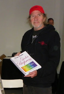
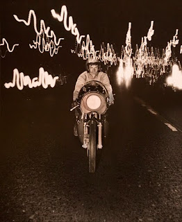
A good road test sees how a motorcycle or car performs when it hits a few bumps in the road. That's something I learned first hand photographing Jess Thomas (above) who was then the technical editor for Cycle Magazine. He'd push gear until it would nearly (and in some cases really) break... and so it goes with the Zen of giclée.
This blog will begin reviewing various products and services that relate to the art of giclée. We'll be road testing them at Vashon Island Imaging, my giclée art printing and publishing company. We're located on Vashon Island, which is known as an artists enclave. As a result we get all kinds of requests to do odd-ball stuff. Our studio is like a science project because we do everything from file capture all the way through mounting, stretching and displaying giclée art. We're 'under the hood' all the time, partly because I am a tinkerer and a perfectionist... like Jess.
Being a wordsmith as well I find it particularly fitting that our 'premier' road test is about a 'Premier' product... Premier Eco Shield, a liquid laminate coating system made especially for giclée prints (http://www.ecoprintshield.com).
Being a perfectionist, I am happy that our premier road test will be about a product whose manufacturer has done an excellent job in terms of education and training... something near to my heart. Their website goes into great detail with slides and videos not only about their products, but also about stretching canvas giclée art.
The first clue that these people 'get it' is their test kit. For about $50 you get a box with three product samples... and a paint-roller kit with the tools needed to apply it. Imagine that, a manufacturer giving you everything you need. What a concept. The company's literature and website instructions are complete, thorough and professionally presented.
Up until now we've been using Clear Shield (http://www.clearstarcorp.com) and have been very happy with it. I explain all about it in detail in my book, Giclée Prepress - The Art of Giclée (ISBN 9780-9865-75112). The book also provides much more detail about coatings in general and a lot more about stretching canvas than you find at the ECO site.
To my mind what you look for in a giclée coating is similar to what you look for in food wrap. For example, if you wrap a peeled onion it is usually for two reasons... to keep the food from going bad and to keep your fridge from stinking of onion. If you can smell the onion then the wrapper isn't really doing a complete job... it's just slowing things down. Is that what you want in a giclée coating? Most people want 'permanence' when they seal their giclée art with a coating or frame it under glass. They want permanent protection from UV light and air pollutants (including moisture and dust). But what is a 'liquid laminate'? ...or even a 'laminate'.
Flooring and drivers' licenses come to mind when thinking about 'laminates'. This durable type of coating is also applied to photos and giclées and is the absolute best protection in the view of this author. However good laminates are, that goodness is offset by their (high) cost which is too much for most artists and photographers.
Until recently coating choices were limited to glass framing, laminating, varnishing or 'spray fixative'. But thanks to the wonders of chemistry we now have 'synthetic' materials which claim to be as durable as the silica and tree sap that glass and varnish are made from. Certainly experience with things like flooring and ID cards has taught us to trust 'laminates' in general.
Lamination works by bonding a plastic coating onto a photograph or giclée. Traditional lamination uses rolls of relatively thick plastic film (2-6 mil and thicker). The lamination 'sandwich' has three layers: the picture, the adhesive, and the coating film. These are bonded together under terrific force through polished steel rollers, sometimes with heat (hot rolled vs cold rolled). Sometimes another two layers -- a substrate and adhesive layer -- are added to the sandwich. As a chain is as strong as it's weakest link, a lamination is only as good as the bonding material. Enter liquid lamination technology.
Liquid lamination is a chemical marvel. The ingredients necessary to make plastic film are dissolved in water. The liquid seeps into the microscopically small 'crevices' across the surface of the picture, depositing the film ingredients to the very 'pores' of the piece. As the water evaporates, the film ingredients 'cure' to form a new substance... the plastic film coating. With Clear Shield the result is something akin to Saran Wrap, as you can see from this picture.
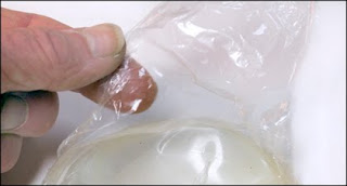
Whether ECO Print Shield is like Clear Shield remains to be seen... I have left a spoonful to cure in a yogurt container (to duplicate the way the pictured Clear Shield sample in the picture above was made) and we should see the result in a few days.
For the record, the manufacturer says that the product is: "...a unique combination of acrylic resins with a new cross-linking technology which seals the print, prevents cracking when stretching canvas and will never go brittle. Compatible with dye, pigment and eco-solvent inkjet inks." They say it will never yellow... time will tell.
The two products smell quite different and ECO Print Shield gunks up the sprayer much faster than Clear Shield. Since the folks at ECO say you can use brush cleaner to clean-up dried coating that suggests that their product is more like an acrylic paint. Whether or not that is correct or 'better' I cannot say... but I'll bet that either will outlive me.
You might ask, if we're so happy with Clear Shield then why change? Well, we were once happy with varnish but found matte finishes difficult to do without spraying... and spraying releases too much solvent into the air for my liking. Then there's the Zen of coatings... the 'creative' part... fun with finishing.
I am very much into customized coatings and creative coating effects. These are described in my book in detail, as is how the dynamic tone range of a picture is affected by the type of coating that is applied. The more glossy a coating the deeper the blacks. Matte coatings move the black point right off the histogram... the darkest tones are shades of gray not black. By blending you can customize the coating to enhance a picture's total look rather than 'fight' it. That is, you wouldn't want to put a matte coating on a picture of a coal mine.
ECO Print Shield comes in three types: Matte, Satin and Gloss. According to the manufacturer two coats of gloss are always laid down first then the final look is made with either of the other two or some blend of them as a third coat. A certain thickness must be achieved and at the ECO website you'll find their simple test (be forwarned that it involves 'cracking' your canvas).
The reason for the double dip of gloss first is to maintain dmax in the blacks. If you really want matte matte you can skip one or both of the gloss coats and replace them with either satin or matte, as we do with Clear Shield all the time.
As much as we appreciate the roller set included in the sample pack at Vashon Island Imaging we spray liquid lamination. We used to use rollers and perfected ways to do so that involve no clean-up. Say what? You heard right... it's all in the book. But nothing can beat spray for a nice even look... that is if you use a good sprayer and not the little cans that are like hair spray... you will never get an even coating on a big print with those unless you're doing wallet-sized prints.
From a cost perspective, Clear Shield and ECO Print Shield are 'comparable' with Clear Shield being slightly more expensive. Be sure to compare apples with apples when shopping for Clear Shield because it comes in many flavors and only Type 'C' is for giclée prints. With ECO Print Shield the situation is far less confusing because there aren't as many types to choose from.
As with Clear Shield, the ECO products spray on with a 'milky' look if the coating is just right, as seen above. This is a tricky business because you want a good coating but it's easy to apply too much and flood the canvas. If that happens the solution will 'pool' if the canvas is flat or drip if it is on angle or vertical (as I prefer to shoot). Better to under-do it than over-do it. ECO Print Shield instructions call for a minimum of three coats. I found that for a good even gloss I needed to shoot five coats... but I may be spraying thinner than they specify.
Spraying procedures are the same for both Clear Shield and ECO Print Shield. The first (gloss) coat is sprayed on 'thin'... the giclée should still be able to 'breath'. Let that coat dry thoroughly (up to an hour depending on the humidity). The next (gloss) coat can be a bit heavier but not as heavy as the finish coats. The purpose of these initial coats is to seal the giclée. The final coats will create the look.
For the test I selected four 20 X 30 pieces. Two were printed on Epson Satin Canvas and the other two on Epson Matte Canvas. One The satin canvas giclées received two base coats of gloss, the matte-canvas ones got only one gloss base coat. Then one of the satin-canvas pieces got 3 more coats of gloss and the oher 3 coats of satin ECO Print Shield. One of the matte-canvas pieces similarly got 3 coats of satin whereas the other was finished with three coats of matte. My 8-ounce tester bottle of ECO Print Shield gloss provided sufficient coverage to shoot 6 thinner base layers and four heavier finish coats. That coverage would have been enough for two 20 X 30's if both were finished gloss... that is, two base coats and three finish coats each. That translates into eight 20 X 30's per quart, or about $2.50 each, based on $80/gallon... or about 60¢ per square foot.
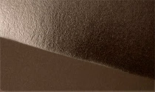
Matte ECO Print Shield completely destroys dmax... much more so than Clear Shield matte. I quit after only two finish coats on the print I was shooting it on. Then I went back over the parts that needed dmax with some satin and blended that in, which helped a lo to bring back some of the blacks a bit. Clear Shield matte turns blacks into a 90% gray. ECO Print Shield turns them into something like 70% gray by comparison. We will probably not use much of that one. The gloss is nice and glossy, as it should be.
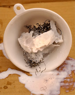
Satin ECO Print Shield almost never made it into the road test because of the crap that poured out of the container... huge chunks of cured solution got caught in in the funnel filter.
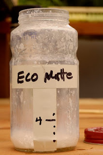
The residue on the mixing bottle (above) looked so awful that I was afraid to run it through my gun, but in the end I did. The fact that its container was the only one of the three that had an extra seal should have been a clue that it was different than the other two. To be fair, the results look good... although I did have to fish some tittle white bits from the prayed surface using a toothpick while the coating was still wet.
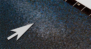
I started to run out of the satin and started diluting it more than they say to which is 20%. It's hard for me to say what dilution ratio I hit but I did over-do it. To prevent runs and drips I had to quickly lay the print down (I was shooting it vertically). The picture above shows what the satin coating looks like when the stuff is too thinned out... you can see it 'pooling' in the deeper parts of the canvas weave.
I eased off the trigger and by very lightly spraying the thinned out coating I was able to squeak through the road test. Total cost for the test was $55 for the starter kit. Divvied up between four 20 X 30's that's 12.50 each... you can calculate your own testing costs based on that coverage.
At the bottom of the last page of the roller-coating instructions there is a caveat that seems to warn about letting two coated giclées come into contact with one another for fear of bonding between the coated surfaces. It is unclear whether that means before they are totally cured or (forever) after. If forever, what a disappointment. It was for such problems that we've more or less switched away from varnish in favor of liquid laminates. We have had no problems with Clear Shield coated giclées sticking together. Whether we will encounter the sticking issues with fully cured Eco Print Shield remains to be seen. Stay tuned.
Footnote: it turns out that you can teach an old dog new tricks after all. From the ECO site I earned that it is a good idea to coat your wooden stretcher bars with either a pre-wrap of canvas or a sealer. This protective covering prevents wood acids from penetrating the giclée canvas, shortening it's life. Makes sense. Of course, I'm not sure I would use super-expensive sealers like ECO Print Shield and Clear Shield for that... I'd probably opt for any cheap primer.
Friday, June 25, 2010
Sign of The Times
Finding custom fine-arts printing and publishing services just got easier because the new Vashon Island Imaging sign is now proudly on display.
Vashon Island isn't a very big place so you'll eventually drive by and now you'll know when you've arrived at our giclée and laser printing company. It's also where I print my book about pixel perfect printing, Giclée Prepress - The Art of Giclée (ISBN 9780-9865-75112, 272 pages, 477 pictures).
Vashon Island Imaging specializes in fine quality laser and giclée printing. Services encompass everything needed for giclée artwork production including copying and scanning, prepress, printing, coating, and either stretching or mounting. Laser printing is geared toward high-end applications like posters, brochures, mailers, and book publishing.
Education and training are an important part of our offerings. Digital imaging seminars are held periodically on a group basis and 'on demand' for individual tutorials. The cost is $5 an hour for groups. That's right, $5. No I have not lost my mind because my goal is to help people get more out of their printing, whether they print their own work or send it out to companies like Vashon Island Imaging. If people get better results they will be happier. If they are happier, they will come back for more.
There is nothing more frustrating than having a disappointing print emerge from your super-duper printing machine. To be honest I have to admit that these days you can get a pretty good print 'at the touch of a button'. But believe me you are only getting average results... because that's what digital imaging devices do, they average. My book explains this problem in detail and so do some of my other blogs. In a nutshell every device has limitations as to the number of colors it can produce and the 'character' of those colors. No one picture file can look good on all devices because each renders the file with different luminance and chromatic qualities. Original picture files therefore need to be adjusted to look their best on a given media or display. That is called 'prepress'.
People mistakenly think that when they use the latest version of PhotoShop® or equivalent together with fancy printing machines that they've got printing covered. Since the results look pretty good, it is difficult for people to imagine that there could be more... but there can be... a lot more.
Printing is like driving. A Ferrari's performance is as good as its driver. Similarly a giclée or laser printing machine output is only as good as the prepress artist's efforts.
Makes sense so far, right? Then explain to me why 90% of our new clients at Vashon Island Imaging are unaware of what prepress is and why just as many are clueless about the meaning of 'giclée' (or how to say it).
If I earned a dime every time I explained the meaning of giclée I wouldn't have to print for a living, or so it seems. What started as a 'spiel' has become a litany. I've got it down to almost '25 words or less'... giclée is a French word that translates as 'spray'... it is a process works by spraying dots instead of 'contact printing' them... resulting in the widest dynamic tone range and most detail of any printing process. (OK, 36 words.)
If I still have their attention then I explain that the quality of our printing at Vashon Island Imaging derives from our prepress, which is a house specialty and what I teach at the seminars and in my book.
If my clients can do the basic prepress then I can concentrate on the finishing touches and the result will be even better. And if they are printing themselves or somewhere else, they will get better results than if no prepress work had been done at all... and guess what, most other print shops don't do any prepress to speak about.
At Vashon Island Imaging we include a fair amount of prepress because we don't want any bad looking prints out there. Remember what hair stylist Vidal Sassoon said? 'If you don't look good, we don't look good'. So it goes in giclée. We target the high end of the market. There is already a good business oriented printing shop on the Island (Vashon Print and Design). Vashon Island Imaging picks it up from the high end of their spectrum and takes it to the quality levels needed for fine-arts reproduction and publication... all the way through finishing and display.
We have time to do it right because time passes more slowly on Vashon Island. When people come here for a visit I remind them to turn their clocks back 5 or 10 minutes. Good things take time (and care). That's part of the Zen of giclée and what you'll find behind our new sign.
If you can't make it to the studio visit us at www.vashonislandimaging.com where you are welcome 24/7.
Wednesday, June 23, 2010
The Art of Giving
Sandra Noel (www.noeldesigninterp.com) is one of several Vashon artists with a mission that illustrates how artists can make significant charitable contributions without spending much cash. She, together with Clare Bronson and others help out an Indonesian organization called Alliance for Tompotika Conservation (www.tompotika.org). Marcy Summers is the Director for the organization in the USA. One part of the organization's extensive program of conservation efforts is bringing art supplies to Tomptika village on the island of Sulawesi and teaching talented high school kids how to draw. It is a hit and the best drawings become a calendar like the one above.
The artists also teach the Indonesians about larger issues with deft subtlety. They make illustrations for posters themed on messages that are important for the community. This time it was Sandra's turn to make a poster illustration, about litter and recycling (shown below).
Sandra came to Vashon Island Imaging to have a printing file made of her pen-and-ink and watercolor illustration. The image file was going to be incorporated into a poster design file, then have a pdf made to send away for lithographic printing. She had heard from Clare Bronson that we make good 'scans' at Vashon Island Imaging.
Actually, we don't scan at all... we prepare art files using traditional photo-mechanical methods with a digital twist. There are many reasons why this results in better printing than a real 'scan' (unless the scan is made by bazillion-dollar scanners like the Tango drum scanning service available from Dick Buscher at Cosgrove Editions in Seattle. However, getting super-high-quality drum scans is an expensive proposition so not many artists can afford it. They don't need it either because we get superb quality from digital cameras and proper shooting techniques.
The reasons and techniques are spelled out in my book about pixel perfect printing, Giclée Prepress - The Art of Giclée (ISBN 9780-9865-75112, 272 pages, 477 pictures). Basically, the sensors in good digital cameras do a better job than scanner sensors. Scanners are better for business graphics and the like because they deliver a crisp accuracy and a 'look' that is more 'electronic' than a camera image. Camera algorithms produce a 'faux film' look. That is accomplished with more dithering and antialiasing which make a softer look (that can be sharpened). The softer look of camera pixels is like the softer look delivered by a good giclée printer.
Lithographic printing dots are hard edged, like the top row in the illustration above. Giclée dots are sprayed and look more like the soft dots in the second row. In giclée printing, one lithographic dot is rendered as up to 2880 sprayed microdots. The microdots support super-fine detail. They also support a much wider dynamic tone range because where the spray pattern overlaps additional colors are produced. These 'rare' tones are what give giclée prints a richness and luster unmatched by any other printing process. But Sandra came to us for lithography prepress, not giclée.
Compared to giclée, lithography has a narrower dynamic tone range meaning fewer colors. Fewer colors mean tones that are closer to primaries (ie., less pastel). Narrower gamuts also mean greater contrast. That combination could mean a washed out look if the picture wasn't prepressed to account for the lithographic shortcomings.
The illustration was shot one stop underexposed moving the white point into the gray zone. Don't worry, it is easier and better to drag light tones out of an underexposed picture than it is to restore blown out highlights. Remember, the press is going to make things look 'weaker' because there is a lot of white space between lithographic printing dots, compared to zero white space between the 'dots' in a giclée.
The underexposed picture is restored to proper brightness using levels. Slowly move the white point and watch the image brighten up. Stop when the whitest point in the picture has about 6% ink of any or all CMYK colors (combined). Even the whitest parts of printed images should have some small amount of ink.
The artwork should be shot in daylight at about 5500° to 5600° Kelvin. Here in Seattle our overcast skies are perfect and at Vashon Island Imaging we have a purpose built outdoor-light studio to capture images of artwork. How to shoot artwork is explained in detail in the book.
If you put an 18% photo gray card in the capture (see gray patch in lower left corner of capture above), click the neutral sampler of curves on the gray card in the shot. That will bring the color balance as near to perfect as possible.
With the image brightened it is given the first of two sharpening steps. At this stage the file was still at camera res and it was sharpened using 222 and 2.2 for the settings (threshold zero). Then it was brought up to a 300 dpi image with 24 X 17 inch dimensions, per client specifications... which about doubled the camera res.
The brightened, sharpened and enlarged image was labeled as 'Original' and a duplicate was made of that to play with (labeled 'Color').
The saturation of the Color layer was bumped by 33 points. Then the color balance was adjusted by increasing red in the shadows by 22 point, yellow in the mid-tones by 11 points and blue in the highlights by 11 points. This increases color contrast. Did you know that there are seven kinds of contrast? Read all about it in my book.
After getting the color roughly right various parts took some burning and dodging to get the ink levels right, then the Color layer was duplicated and labeled 'Sharpen' and sharpened a second time...same settings. At this point there was a three layer file... original, colorized, and sharpened.
Usually when you sharpen 'enough' the image will appear a tad lighter. That is because sharpening works by 'outlining' color areas with two-tone borders. Each border is made lighter on the light side and darker on the dark side. The lightening effect is more visible than the darkening. To compensate for that you need to reduce the highlight density (again). You can burn the highlights with about 11% opacity, make a highlight control mask (described in an earlier blog) or simply reduce the opacity of the sharpened layer so that the un-sharpened layer below shows through. Again, the effect is more visible in the highlights. A common setting for giclée printing would be about 50-50, that is the top layer (sharpened) is set for about 50% opacity. However, for lithography you want a sharper image so your setting might be 80% opacity for the sharpened layer. (For AV use the sharpened layer and darken it until it looks good on your display or projection screen.)
By keeping the sharpened layer on top you also facilitate custom adjustments by the next user of the file. That user can control the total look by adjusting the opacity of the colorized and sharpened layers atop the 'original'.
We were glad to help out at Vashon Island Imaging because I have a special bonding with Indonesia and Malaysia after several years producing audiovisuals and images for Malaysia Airlines and Swedish Match (who make cigars in Java).
"I do all work for AlTo for free because of the incredible work they do to conserve the planet specifically in Sulawesi, Indonesia, one of the most ecologically important rainforest and coral reef areas," says Sandra.
You could say that Sandra's artwork keeps on giving even at the lithography shop because by sending along such an 'adjustable' file life will be easier for their prepress artist... (and Sandra will rest assured that her image will print well thanks to good prepress).
Sandra Noel, Clare Bronson and Marcy Summers take the art of giving to the level of 'Zen'. If all artists made similar contributions our world would be even more beautiful than it already is.
Who Owns Your Printing File?
Lately, the thread in ASMP's Seattle email 'forum' is about rights... who owns what. This has been the subject of endless discussion ever since I first joined ASMP back in the 1960's. Just when they thought they had worked things out, along came the digital era. Now who owns what has become almost moot and whether or not there is any real justice is debatable. Here's the latest twist:
The question was posed about who owns the rights to the digital file made of an 'intellectual property' like a picture. If you make your own images that's a no-brainer. But if you are a giclée printing company like Vashon Island Imaging the question comes up regularly (just like at ASMP).
I've been in the business for 50 years and have worn a lot of hats in those five decades... shooter, editor, buyer, seller, artist, printer and now author. Looking at the issues from one perspective doesn't always fill the needs/demands of another. Despite copyright law the 'rules of the road' are not well understood and so the issue remains a murky one misunderstood by many. You know how it goes, ask 10 lawyers and get 10 different opinions. No matter, they make their money no matter what happens to you.
At Vashon Island Imaging we create files and make giclée prints of other artists' work all the time. Our policies are as follows:
1.) We will not print a picture that does not belong to the party requesting the job. Fortunately, we rarely get requests like that.
2.) The intellectual property (picture) belongs to the artist or bonafide representative of the artist.
3.) Film positives, negatives and/or digital 'captures,' scans and printing files of the picture belong to the maker of those things. A lithographer's plate making negatives belong to the lithographer, if not by law then by common law. A copy negative made of a picture belongs to the person who made it. It doesn't need to be more complicated than that.
4.) The prints we sell belong to the buyer. (Duh... who else?)
To keep things clear and simple our charges reflect these policies. We charge separately for 'capture', prepress, printing, and file storage. A typical client will bring us an original artwork from which they want either a file they can use on their computer or a giclée print of the picture.
The making of an image file for printing requires an 'artistry' of its own, as any prepress artist can tell you. There is so much more to it than meets the eye... enough for me to write a 272-page book about it.
People don't generally realize that although they may be getting good results without prepress, they could be getting superb results with prepress. Yet most people think of it working like an office copier... files on demand at the touch of a button. Not yet.
So it can be argued that the digital printing file made of a picture by a prepress artist is a work of art in its own right that should belong to the prepress artist (or their employer) for the same reasons that the original art belongs to its creator.
But then we, the image file creators at Vashon Island Imaging, either 'work for hire' and/or sell the file as if it were a tube of toothpaste... a 'product'. The glory goes with the product into the hands of a new owner. 'Work for hire' means that while you are working for me the stuff you do for me belongs to me, not you. If you paint a 'Mona Lisa' while working for hire, the rights belong to your client.
A curious approach was floated on the ASMP forum by a printing company that made prints for a client who later asked for the files so they could print them themselves (or take them elsewhere to be printed). That company is considering charging a 'usage' fee along the lines of licensing images from stock houses. Good luck. Many others won't follow suit so you will be the expensive one.
We make files for people to take to other printers all the time at Vashon Island Imaging... it's our specialty. Instead of wining about not getting a printing job, we make money selling our knowledge of what is needed to maximize the quality of printed pictures. It is all in my book, Giclée Prepress - The Art of Giclée (ISBN 9780-9865-75112, 272 pages, 477 pictures). But in a nutshell you could equate it with consulting.
We are 'image printing consultants' and make money that way at Vashon Island Imaging. A typical client comes to us with a printing problem and we solve the it with our prepress work for an hourly fee, just like other consultants. In our case the 'consultation' is about how to get the best possible reproduction of the clients picture. Our 'product' is the knowledge contained in the particular adjustments to the image file that we make to get pixel perfect printing. It is a form of intellectual property. You too can become a printing expert and sell your services as a prepress artist cum consultant... just read my book (hint hint).
Who owns what? Who cares? You just made money where you wouldn't have otherwise... and your client is smiling instead of thinking badly of you for being 'petty' about a silly little file.
These days it is especially important to maintain a good profile and that takes considerable PR work and attention to solving customers' problems. Look for ways to help clients who begin printing their own pictures. Training them can generate money that wasn't possible to earn from them before. Your prospect list is colossal. Think about it.
Never before have so many people been involved in printing pictures. Epson and other printer manufacturers have brought pricing down to be within reach of prosumers and advanced amateurs. We are seeing the results of that on Vashon Island where about 10% of last year's printing customers have become prepress students at the seminars I give at the studio about pixel perfect printing. We may have lost their small-format printing business but we pick-up some of the lost money by teaching those clients how to get the most out of the printing machines they invested in. That also keeps them on board for the times when they will want to print something larger than their (usually) smaller machine is capable of printing.
You may actually earn more money doing prepress than making prints... you won't lose money, that's for sure. So does it really matter who owns the printing file? Another one can be made 'on demand' after all.
Speaking of PR, how many times have you been asked by a client for a copy of your printing file for their website? If a client has just given us a nice print job, instead of discounting the money we provide extra value by including a 'basic' internet file at no cost. That opens the door to discuss possible additional prepress to maximize picture quality for the web.
A good giclée printing file won't look as good as it could on the Web... just as a Web picture doesn't make a good giclée print. So there's an opportunity to tack on $5 or $10 dollars to your sale... and every little bit helps these days, eh?
Let the legal Beagles rant on about rights. They are barking up the wrong tree. Arguing about who owns what isn't part of the Zen of giclée.
They say 'expect nothing and you won't be disappointed'. That is easily rephrased to 'own nothing and there's nothing to steal'. You can't enjoy our work if you feel that you are being taken advantage of... so after the 'just do it' part is done, just let it go. You'll feel much lighter as the scales of life tip in your favor.
Monday, June 21, 2010
Outré® Giclée Entré
Outré® has made their entré at Vashon Island Imaging. We tried their ACM222410 polyester canvas for a job brought in by artist illustrator Carol McCloud (http://www.galacticalchemy.com). She is interested in the Zen of the Mayan calendar and makes illustrations whose themes derive from that ancient culture. She came to us to make canvas giclées for display at a Prophets Conference in Vancouver, BC... and she brought her own canvas.
Although Carol thought she was doing everyone a favor, I was dubious about using an unknown media especially one with a French name (France gets a lot of bad press in the States). She said that a friend had sent it to her, which didn't make me any more confident. I explained how giclée prints needed a special kind of canvas, one with a ground to accept the ink, and while opening the package started carrying on about color management and all that. However when I pulled out the canvas roll it was obvious that it was prepared for giclée printing. I thought to myself, 'giclée and Outré are both French words... maybe that is a good thing'.
If you are a professional giclée printer as I am you know that it usually takes some time and trouble to get things right with any new media, despite the current state of color management. We use Epson technology and like to stay in their range of media wherever possible in order to get the most out of our machinery. Like using 'genuine Ford parts' in your Ford. But we are known as a custom shop so we took on Carol's job ...and her Outré canvas made its entré for a giclée at Vashon Island Imaging.
Clients come to Vashon Island Imaging because our prepress work insures the highest quality printed output. We do our 'due diligence' and put in the time to get things right. I've even written a book on the subject called Giclée Prepress - The Art of Giclée (ISBN 9780-9865-75112, 272 pages, 477 pictures). So I made a quick Internet check and quickly found Outré ACM222410 canvas at www.myoutre.com in their Aqueous Inkjet Signage category. How unglamorous of them I thought. Inkjet signage doesn't sound very artistic even if it is aqueous. Anyway... there I found the specifications which are as follows:
Outré 22 Mil Poly-Cotton Water Resistant Matte Canvas is a bright white water resistant canvas composed of a 65/35 polyester/cotton base giving it a uniform non-glare surface. The basis weight range is 430-470 Grams/m2; caliper range is 20.7 to 22.3(mil); opacity is 96-97%; gloss (@60°) is 2; and fabric weave is Oxford 2 over 1. All that code language means that it's a lot like Epson's Premium Matte Canvas except more white and bright... like a canvas version of Epson Enhanced Matte paper. I love the whiteness of Enhanced Matte so the new Outré canvas looked good to my eye.
After getting Carol's job set-up in PhotoShop® I turned to the Internet and downloaded the profiles offered for our printer at the Outré site. Eagerly, I installed the profiles and printed a test strip. Whoa... there were some missing colors (see #2 below)! Back at the Outré site I double checked the profile... hmmmmm.
As a cross check I decided to try some Epson profiles. A good trick I learned from Devan Burnett at Tricera Imaging in Vancouver BC is to switch profiles to get better results. In other words, the recommended profiles might not do as good a job as the profile for another media. What is 'good' or 'better' is up to you and your printer. For example, we use the profile for Epson Velvet Fine Arts Paper when printing on Premier Canvas Matte and Premier Canvas Satin and get stronger color. It made sense that the VFAP profile might work on this remarkably similar product. Presto! Worked like a charm (see #3 above). No missing colors and a superb look... the extra brightness of the canvas made the colors really pop.
For comparison I tried using the Epson default canvas profile with the Outré canvas and that looked as bad as the Outré profile but more cyan in the blues compared to the heavy magenta delivered by the Outré profile (see #1, above).
Finally I ran a print on Epson Premium Canvas Matte with the VFAP profile. As would be expected, the coloration was identical to the Outré canvas version, but darker and less contrasty by virtue of the lower visual white point (see #4 above).
To be fair, the Epson canvas version looks a bit 'dull' compared to the Outré canvas rendition. That doesn't mean that Outré is perfect for all images but for those who like zokko color, Outré could be a welcome entré for a new look in giclée. Eh?
Sunday, June 20, 2010
Stretching Adhesive Dollars
Mounting large giclée prints can be a sticky issue. Large size usually means big mounting costs. But you can stretch your mounting dollars by using contact cement.
The best type of mounting in my opinion is hot-rolled lamination with a thick film (6-mil or more). But there are size limitations and it is expensive as hell.
Then there's 3-M Repositionable Mounting Tissue which I discuss in another blog. It is tricky to work with and also very expensive. Moreover the word 'repositionable' is code language for 'doesn't stick very well'.
That brings us to the subject of this blog, using LePage Contact Cement and similar brush-on / roll-on liquid adhesives. LePage is supposedly water soluble which we like at Vashon Island Imaging because we are located on an island and our aquifer is precious (as is all water). We are surrounded by Nature here and hate to use solvents or chemicals of any type. However giclées have to be coated with something to be protected and they need to be mounted so some chemistry is inevitable. 'Supposedly' is code language for 'not really'. But we'll come to that later.
Before you begin, understand that it is very unlikely that your mounted giclée will have a totally flat and smooth surface if you use liquid contact cement. It doesn't level well so brush and roller stokes are unavoidable. The best you can do it to work the strokes with the picture, like carving with the grain instead of against it. You could spray it... but you'd have to clean the sprayer with acetone later (yikes!).
If total smoothness is not an issue, or you want to save a bundle of bucks, or you have an industrial strength application like an outdoor sign or display, then LePage Contact Cement is a good adhesive solution. (Can't resist those puns, sorry.)
On some prepared wood-product surfaces the stuff doesn't want to stick. It beads up like water on a waxed car and you really have to work it in with your brush as it starts to set-up. The result looks like the picture below.
After the first coat is dry you can go over it with a second coat but it won't buy you anything really and cause even more nits to pluck out with tweezers. Nits are bits of this and that, mostly little balls of the glue itself that magically appear especially as you keep working the glue after it has started curing.
Apply the glue as evenly as you can to both surfaces, the giclée and the mounting substrate. Let the adhesive dry thoroughly... a few hours at least and overnight if possible. At the studio here we have wood-stove heating and ceiling fans which really help drying in the cooler months. In the warmer ones we dry things outside if the air is calm and the humidity low enough. Here in Seattle that hasn't been very often this year.
Use a slip sheet when preparing to bond the giclée to the mounting substrate. Bonding is quick and fast when the two adhesive surfaces touch each other... then the only way to separate them is with LePage Contact Cement Cleaner which if it isn't acetone is a good imitation... nasty stuff (use gloves). Keep the slip sheet between the two adhesive surfaces while positioning the giclée. Carefully reveal 1/4 inch of the giclée to the substrate. Touch it with your gloved fingertips gently and smooth it from the center out. If the alignment is OK then reveal a little more and repeat. Don't be tempted to pull the slip sheet... one ripple is all you need to spoil your day and the giclée.
After the slip sheet is out check to see that it has no nits on it and place it over the giclée then rub hard all over with your fist. The slip sheet prevents any scuffing or rubbing marks to show. (Remember the giclée is still un-coated and un-protected.) Follow the fist-rub with a further pressing using a small, hard roller. Now the giclée is ready for coating.
The coating system we use here at Vashon Island Imaging is a liquid laminate called Clear Shield. (We'll be trying out the Moab line of liquid laminates in the near future and will be reporting on that in a future blog.) The laminate liquid is aqueous and if you apply too much the giclée may start to 'bubble' or otherwise become unglued. A few thin coats is better than one or two thick ones because you don't want to saturate the giclée.
For outdoor applications we apply a few coats of Golden MSP Varnish to seal the giclée and substrate with a non-aqueous coating that makes it doubly water resistant.
When the final coating is thoroughly dried re-rolling is a good idea as the giclée was significantly moistened during the coating procedures.
Like anything else there's a learning curve attached even to this seemingly brainless mounting method. Try a few tests and don't get discouraged. With a little 'stick-to-it-tivity' you'll soon bond to this inexpensive and effective solution for mounting large-sized giclée prints.
There are many ways to mount and display giclées discussed in Giclée Prepress - The Art of Giclée (ISBN 9780-9865-75112). It's the only book about printing written by a printer... moi.
Saturday, June 19, 2010
Ebony and Ivory
Epson's introduction of white ink may mean that Stevie Wonder's song 'Ebony and Ivory' can soon be sung about giclée inks. News of the new ink was recently released and I had a chance to talk about it with Robert Simpson, Epson's Western Regional Field Engineer, at the NW Photo Festival.
Painters using oils and acrylics have long enjoyed the luxury of blending white with colors to create pastels and highlights. Watercolorists and giclée printers are segregated from that option because there is no such thing as white ink for them. Instead, they depend on the color of the substrate for their white point.
How a picture is perceived depends on many things of course but the white and black points are two important ones as they establish the extreme ends of the dynamic tone range. It is easy to understand that a picture will look different printed on yellow or pink paper than it would on white. That is exactly what happens when you use different types of paper to print your giclées. The substrates available for giclée printing come in a range of 'white' shades. Some are more white than others. The ones that are especially white are actually light blue. I'm old enough to remember when Mom put 'bluing' in the wash to make Dad's white shirts whiter.
Deciding which shade of white makes a picture look best is a very personal matter. For artists and photographers the salient issue is that prepress will be required for each specific media to make the picture look 'right'. My book, Giclée Prepress - The Art of Giclée explains all this in great detail (www.gicleeprepress.com).
The white ink introduced by Epson is for flexography and gravure printing which are a very specialized types of printing that generally use solvent-based (non-aqueous) inks to print on the kinds of foils and films that are used in packaging (chips bags and the like). Using an Epson WT7900 packaging proofs can be easily made to work out designs and colors inexpensively in an office environment instead of on an enormous production printing press.
According to Epson the new ink is designed specifically for proofing flexographic and gravure print jobs that require the color white. Also required is the new Epson Stylus Pro WT7900 (above) which incorporates the breakthrough Epson UltraChrome™ HDR White Ink. The ink uses 'Organic Hollow Resin Particle Technology', which forces light to randomly scatter, producing the illusion of seeing the color white. Importantly, it is an aqueous ink containing no known carcinogens.
As a professional giclée printer I look forward to the day when the flexographic inks will be come generally available throughout the Epson giclée printing machine range. What that will do for us is provide even greater color management and an even wider dynamic tone range. The result will further improve on a printing process that already provides more colors and details than any other. That is what I like about Epson, they are never satisfied and continually push to improve giclée image quality. That is the same as our philosophy at Vashon Island Imaging, my fine-arts printing and publishing company (www.vashonislandimaging.com).
Many of our customers at Vashon Island Imaging art artists like 'natural' papers. One problem with the color of natural paper is that it is beige not white. The paper itself is fab but snow scenes look awful on it. With white ink that would no longer be a problem. In fact, if my hunch is right, white ink would essentially mean that a picture's color could be more consistently achieved on any media substrate. For my own illustration work I think it will be sensational to be able to print colors that are lighter than the substrates. My work relies on strong colors and looks best on very white media (you can see examples in the Fine Arts section of www.mesney.com). The need for bright white has limited the range of stocks that I can use. My favorite is Epson's Enhanced Matte which is a super-bright, super-white paper. It has a high cotton fiber content so that it glows under ultraviolet (UV) 'black' light... a feature I use to make moonlight magic in night scenes.
Providing control of white as well as black Epson technology will fully 'integrate' the dynamic tone range of giclée printing when that capability becomes available in the hopefully near future.
Friday, June 18, 2010
Paper and the Zen of Giclée
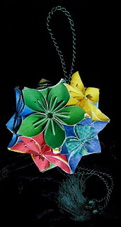
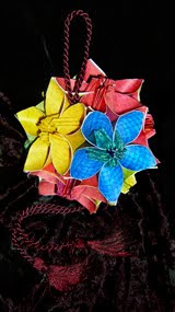
Origami is the art of folding paper, like the 'Kusudama' shown above made by my wife, Pamela Swanson. (Kusudamas are ancient Japanese medicine balls each made of 300-600 folds. There's more about origami artwork at her website www.poetpam.com).
Watching Pam spend endless hours folding I came to appreciate paper in a new way and from her learned that all papers are not created equal. Some papers fold better than others. Some will last and others crumble away. And so it goes in the art of giclée. Papers make or break pictures in more ways than one.
There is much confusion about printing papers in general. The general public has never needed to know anything much about paper. Even today most people only have a vague awareness of 'good' versus 'cheap' quality paper... art books versus paperbacks and such. Only the people who make or collect images are concerned about printing. That used to be only a small percentage of the population. But digital imaging changed all that and now there is a new class of printing professionals and semi-pros. My own company and life as a giclée maker are perfect examples.
Running a fine-arts printing company life is a paper chase. At Vashon Island Imaging most of our customers are artists or artsy photographers... those trying to avoid the commonplace in favor of new looks. They come to us because we are a custom shop willing to take on giclée projects that involve more than just printing, that also involve finishing work like coatings, stretching and mounting. So it's always nice to be able to offer something new to generate a little excitement. Epson has provided just such an opportunity with the introduction of their new Hot and Cold Pressed Fine Arts Media.
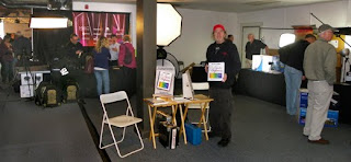
Pam and I saw the new Epson papers at the NW Photo Festival held by Glazer's Camera in Seattle to celebrate their 75th anniversary. We were participating in the event, promoting Giclée Prepress - The Art of Giclée my new book about pixel perfect printing (www.gicleeprepress.com). Naturally, we positioned ourselves politely close to the Epson stand.
I've had years of experience in the trade show business but I was usually on the other side of the curtain, literally. My specialty was grandiose slide shows using up to 100 projectors. That's it's own story which you can read about at www.incredibleimages.com (my audiovisual arts company). AV frustrates me. You spend long hours making content and after the show have nothing to 'show' for your efforts. Print work is so much more satisfying because there is an object you can hold in your hands and put on the wall... Like Pam's origami Kusudamas.
It's the feeling of touch and quality that people want in paper, just as much as a good look. They also want paper to be archival... The term 'archival' is itself a source of major confusion, but that too is another story. Archival isn't important until you get older. I am old enough to have seen my own artworks disintegrate, so archival now has meaning. As important as lasting value may seem to one, it is of no consequence to others who are so confused about 'archival' that they just assume that when a paper maker says something, its true... they are more concerned with the touchy-feely part of paper.
Until recently the choices for giclée printing were limited in comparison to the universe of art papers and canvases out there. The limitations are set by the need for a 'ground' that the ink can grab. The papers and canvas media supplied by Epson (and other companies making giclée media) is quite different from normal art papers canvases. They are made with a ground to accept aqueous inks.
You can put a ground on almost any media that you can run through your giclée printing machine and a good one is available from Golden (who also make great finishing varnishes). What stops a lot of people from doing that is the need to create a custom profile for some semblance of color management. Whenever you hear the word 'custom profile' it is code language for fiddling around until you find colors you like. Generally, you can find one amongst the long lists of profiles already out there. Sure, some experimentation is involved, but not everyone has a small fortune for a colorimeter, spectrometer and all the other gack necessary for custom profiling (or the fees to pay someone to do it). That's why many giclée printing companies stick with a few known paper types, usually the ones of the printing machine manufacturer. For example, as an Epson shop we try to stay in the Epson range to insure the best color management... code for picture quality and faithfulness to original colors. That is why we looked forward to be able to see, feel and touch the new Epson Fine Arts Papers.
There are four kinds. Cold Pressed which has a toothy feel like watercolor paper and Hot Pressed which is smooth. Each type comes in two colors, 'Natural' which is a beigy off-white and 'White' which has optical brighteners. Each passes the test for quality art paper and that is great because now there is an alternative to other popular art papers within the Epson range. They had to be making these new papers to do just that, as the art paper market for giclée printing is expanding exponentially. I was amazed at the number of offerings that I saw at the NW Festival and frankly seduced by a couple of them... more on that later. It takes a lot for me to stray from Epson but I do when it is what the customer wants. At Vashon Island Imaging we don't use code language... custom is still custom, and the customer is still always right.
To do right by our customers we therefore work with a variety of stocks including Hahnemuhle, Arches and Moab (so far). These companies provide profiles which are easily harvested from the Web, some better than others. For my own work I have also found that using Epson profiles with some other papers gets stronger color, which I prefer. Remember, all devices average and aim for mid-tones... your work may need extra help in the highlights or dark tones. That 'adjustment' can only come from changing the profile or by proper prepress work. Changing the profile changes the flow of ink and so does prepress adjustment... prepress with greater precision. It would be like dialing in the color on your TV instead of correctly lighting the scene being shown on the TV.
Prepress is something that many people -- dare I say most -- are totally unaware of. That is what we learned (again) at our little stand during the NW Photo Festival.
At the Festival yours truly and Pam shared a little spot across from the Epson stand. You can see that there was plenty of action at the Epson stand and there was equal action at all five paper manufacturers' stands. But 99% of those prospects walked right past us, even though our signs pointed out that ours is the only book about printing written by a printer. That made me wonder. So I changed my sales pitch and started talking with folks after they'd visited Epson or one of the paper stands. Once I told them what prepress was all about they were suddenly interested. Especially when I explained that they would need prepress to get the full benefit from the expensive art papers they would be printing on soon.
A bit more disconcerting was another (re) discovery made yesterday evening at a social mixer sponsored by the Seattle Graphic Arts Guild. At my table was an interesting mix that included a college teacher of PhotoShop® and two recent college grads expanding their network into the professional mainstream. Neither of the grads knew what either 'giclée' or 'prepress' means (!). That is astounding to me. I can understand the gray-hair crowd not knowing the terms, but also young people? Wow, the disconnect between people and printing is more widespread than I thought. But then the teacher pointed out that printing is not taught in schools. I added that it isn't taught in any other book except mine, Giclée Prepress - The Art of Giclée. Isn't it amazing that digital imaging education ends before the images are printed? Ok, some books go into it a bit, but they aren't written from the standpoint of a printer because those authors are photographers mostly, or technical writers... they aren't professional printers. That is like Stevie Wonder writing a book about how to draw. So from that standpoint the ignorance of people is understandable albeit very lamentable.
Everyone wants their pictures to be the best they can be. They spend a lot of time perfecting them and a lot of money printing them. No matter who prints them, if the files have been properly prepressed the output will be outstanding. Without prepress the results will still be good, but not the very best. The differences between prepressed and non-prepressed pictures can be dramatic. You can see numerous examples in the book (there are color 477 pictures and illustrations).
Epson's new papers are a welcome addition for our customers who are really into the art of giclée. Pixel perfect printing requires control and precision. The media range offered by the manufacturer of your printing machine is going to give you the best overall color management and therefore the best possible dynamic tone range. These are papers made by a giclée printing machine company specifically for their inks. Other art papers are made by paper companies who have in some cases 'adapted' their product lines to the needs of the giclée industry. Which is better? That's up to you... beauty is in the eye of the beholder (and so is quality).
Best of all is the growing variety of papers, canvases and films made specifically for the rapidly expanding giclée market. Zen is all about finding perfection. Pam is into the Zen of origami and prints her own pictures onto papers that she will fold into artful objects. In the world of giclée we do the same thing but in reverse, selecting the perfect media upon which to giclée our images. Now with a greater range of fine arts papers to choose from the Zen of giclée is enhanced. For an old darkroom dog like me, its fun to watch the future of printing unfold.
Wednesday, June 16, 2010
'A Little Dab'll Do Y'a'
Thomas Kinkaid is the world's most successful giclée producer. His collections of cozy cottages in pastoral Victorian settings sell in the gazillions. A small edition for Kinkaid is 5,000 copies, each an ornately framed, signed piece. They are even sold on TV where their claim to fame is the 'artist's touch' that brings out 'magic' highlights that seem to glow in the dark as the lights are dimmed. The magic is that people believe it enough that they flock in droves to buy his stuff.
If you are in the giclée business as I am you can see the P.T. Barnum in Kinkaid's come-on. Anyone in art knows that dimming the lights suppresses blues and greens and favors warm tones and highlights... but most people fall for this trick, believe it or not. No matter.
What matters to the customer is that the Kinkaid 'painting' they bought is not simply a 'print'. Customers believe that prints are cheap and easy. That's hard for a dedicated giclée prepress artist to accept because we known how much time and effort is put into squeezing every last drop of image quality out of our inks and media. People have no idea how much giclée printing is like custom darkroom work where the deft skills of master printers can make or break a picture.
There is no question about the quality of the Kinkaid product line. Theirs are masterfully printed pieces and not all of them are easy pieces print. But no matter how good a print is it's still 'just a print' in the mind of the customer. That is where the 'artist's touch' comes in and why it is so important. Simply by adding a dab of paint here and there changes the picture from a print to a 'real' piece of art, as far as many customers are concerned. Each of those dabs adds more value... value for you as well as your customers.
If you are an artist 'a little dab will do ya' as the Brylcreem® folks used to advertise. Your pictures can be as 'slick' as their hair by simply applying a little dab of 'real paint' instead of their cream. It doesn't matter whose hand applies the paint as long as the giclée customer thinks it's the artist's. As far as business is concerned, the 'artist's touch' is the Midas touch.
Some artists actually use giclée as a base for a totally 'original' work whereas others like Kinkaid just dab a bit here and there. The more you dab the closer you come to being an 'original'... the Holy Grail of Art.
Limited-edition art producers can benefit from the Kinkaid technique. I have done it myself on some of my own illustrations, and complimented the dabs with 'creative varnish' that adds even more value. These are described in detail in my book Giclée Prepress - The Art of Giclée (www,gicleeprepress.com).
If you have a giclée printing company like my own shop, Vashon Island Imaging, you can offer your artist customers an additional service... call it 'Dabs of Value' or whatever you like. Remember 'Bowling for Dollars?" How about 'Dabbing for Dollars'. Laugh if you want but it's those add-on items that provide profit in the printing business. Busy artists appreciate it, too. Who wants to spend all their time dabbing in something when they can be out there making new originals to expand their limited-edition collections?
Those dabs of value can also earn you money doing retouching work and super-fine finishing on giclée prints for yourself or your most demanding customers. We use primarily oils and 'pigmented' watercolors (Doctor Martin's dyes) for such work at Vashon Island Imaging.
Working on an un-coated giclée is a tricky business and I don't recommend it. The inks are water based (with glycerin). We use Epson technology so I can only speak from experience about their inks but I am reasonably sure that any water-glycol ink system is 'fragile'. The ink pigments lie on top of a 'ground' applied to canvas or paper, inside of being 'inside' of the coating like in a photograph. The colors are also water soluble and even though manufacturers like Epson try to make them 'water resistant' they damage easily when hit with a brush loaded with watercolor dyes. One solution is to add some neutral tempera paint with transparent water-based dyes like Easter Egg colors to make a 'paste'. Here too, 'a little dab'll do ya'. The idea is to have a semi-opaque paint in the exact hue and shade required for the touch-up. You get one shot because there's no going back to 'find' the right color by blending, as there is with oils and acrylics.
Oils are the colors of choice for many artists and acrylics rank second. Both allow artists to work up the right colors by 'brush-blending' right on their canvases. Water-colorists use on-media blending with an entire different effect, one that would be disastrous on an un-coated giclée. Although you can use oils right on a giclée, at Vashon Island Imaging we put on a 'ground' of varnish or liquid laminate and then do the retouching or dabbing on top of that before applying the finish coats of varnish or laminate. Oils must be allowed to fully dry before the finish coats are applied and that can take some time. Acrylics dry faster and are great on the liquid-lam surfaces and not so great on varnish. The water-color 'paste' paint described earlier works on lam surfaces but not on varnish.
Let the retouching and/or dabbing dry thoroughly and apply the first topping layer of coating carefully so as not to disturb the work you have put in so far. Spraying is the best application method, but rollers work well too. It's all described in detail in the book and fully illustrated with more than 477 color pictures.
'A little dab'll do ya'. Maybe I'll adopt that as my motto for this blog.
Get Behind the Eight Ball
Geeks know that image file numbers divisible by 8 are easier for computers to process because of the 'architecture' are digital imaging. Just consider all the important numbers in digital image display to get an idea... all are divisible by eight.
When you are making digital images in PhotoShop® you can reduce or avoid invoking the kinds of anomalies created by averaging algorithms if you stick to numbers that your system likes... those divisible by eight.
The anomalies are spelled out in my book Giclée Prepress - The Art of Giclée (www.gicleeprepress.com) but it essentially boils down to avoiding 'odd' situations.
There are no 'odd' numbers in computer math. Digital imaging devices measure even numbers. If you give such a device less than the needed number of pixels the image must be scaled up to fit. If there are too few pixels, it must be scaled down. If the scaling involves numbers divisible by eight, everything 'fits'. But what if one number is an odd one?
Odd numbers force averaging that increases the odds that colors will shift farther from their original hues and shades. Suppose we have two pixels, one black and one white. If we scale up 100% and double that number to four pixels, the result is two black ones and two white. But suppose we scaled up to three pixels, what color would the odd pixel be? Gray... a color that did not exist in the original.
Although the best numbers for working in PhotoShop ® are divisible by eight, the best ones for your Epson printer are divisible by six. That is, when you set the resolution for the image the number should be divisible by six. Therefore, 240 is better than 220, 300 is better than 310, 360 is better than 380.
Creating originals with printing resolution in mind will help maintain the intended dynamic tone range and detail throughout the giclée production process. Similarly, setting the image for the correct printing resolution should be one of the first things done by the giclée prepress artist. Otherwise your printer may end up at 'sixes and sevens'.
Tuesday, June 8, 2010
Art Copy for Giclée Printing
We get calls at Vashon Island Imaging from artists who ask if we can make scans of their oil and watercolor originals. I always say yes and then when they arrive with their work explain to them how we really do it, which is the old fashioned way, with a camera. Some actually say with words what nearly everyone's eyes say which is, 'I could do that!' To which I reply, yes indeed you can and it is easy to do with almost any camera. The entire process is explained in my book, Giclée Prepress - The Art of Giclée (ISBN 9780-9865-75112, 272 pages, 477 pictures). But here's a quick synopsis:
First, work outdoors on an overcast day. When the sky is a bright dome of gray you have the perfect light for copying flat and dimensional artwork. The Kelvin temperature of light on an overcast day is 5600° (at the longitude if Seattle & Vancouver BC) which is just a tad cooler than perfect (5500°). It's shadowless light as well, so if the original has thick oils with high profiles you won't have bothersome brushstroke or palette knife texture shadows.
At the Vashon studio we have a purpose built outdoor studio which is essentially a deck covered with clear polystyrene Sun Shield panels on a framework of 2X4s.
If your camera is set for daylight (or if you use daylight film) the resulting colors in the capture will be almost acceptable as is. However, by inserting a an 18% gray card in the shot you can get even closer to the 'correct' colors.
When the image is open in PhotoShop® use the neutral 'eyedropper' tool to sample the gray card in the shot. At an instant, the colors will 'click' right in. Try clicking in a few different spots across the gray card. At Vashon Island Imaging we sometimes put gray cards on two sides and sample both. You will usually see some small differences in the resulting colors. Choose the one that you like best to be your basic image file for prepress work.
The pictures in this article were all taken with a Nikon digital camera set for Kelvin 6950° (Shade). That results in pictures that are warmer (more red) than if the Kelvin was set for 5500°. I prefer warmer tones and therefore have always shot with warming filters. When shooting film I leave an 81A or 81B filter on the lens at all times. Shooting digitally I set the camera for 6800° (sunny days) to 7300° (stormy days). Later I usually pull back on the warmth if needed. Generally I have found that the colors are better if I shoot with too much warmth and then cool it down, rather than vice versa. (Your preferences, devices and systems may be different than mine.) Anyway, the pictures you see here will probably look warm to your eye and that is why. I have not doctored them in any way.
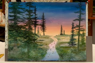
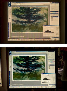
In another blog entitled 'Monitor Blindness' I explain how and why we use both CRT and LCD monitors at my giclée printing company. What follows are comparisons of what you see on these two monitors when the image capture of Jacqui Lown's watercolor painting 'Guided Steps' is prepressed for both giclée printing and for the Web. Notice that if it looks good on one it will not look good on the other. This demonstrates the need to prepress a master image for each individual type of output. This particular picture will grace the cover of a new book by Aimée Cartier entitled 'Getting Answers Using Your Intuition to Discover Your Best Life' (www.spreadingblessing.com) and so we delivered three image files to the client: one for giclée printing and other output using the Adobe 1998 profile, another one for sRGB profile printing and AV output, and a third specifically for Web-centric output like LCD displays and video projection.
After snapping in the correct colors by clicking on the gray cards next to the lower left and right corners of the Jacqui Lown painting, the next basic prepress adjustment is Levels. In the above picture, Levels have been set using the CRT monitor and the adjustment is made while viewing the original artwork in daylight that is 5500°. The monitor itself should be profiled and set for a temperature as close to 5500° as possible.
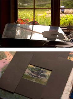
Mask the artwork to show only the same part you are examining on the monitor screen. Select a part of the picture that shows the black point and make the necessary Levels adjustment. Next look for the white point. There may be no white point, as is the case in this watercolor. But there is a while point on the board to which the painting is clipped, as well as the table top. Finally, find an area of 'dominant' coloration in mid tones and set Levels accordingly.
When giclée prepress work is completed on the CRT the resulting image will look quite 'flat' and lifeless but that is intentional because the dynamic tone range of the image has been compressed to 'fit' into the CMYK color space of the giclée printing machine. The same adjustments look lousy on the LCD display. That is why it is not a great idea to do giclée prepress work on an LCD monitor. Notice also that the blues in the LCD are way stronger than the CRT. That is because most LCDs come factory preset for a 'cool' display (Kelvin 9000° or 6500°), so we leave our's set at 6500° to see the 'blue' version of the image that Web surfers will see, and adjust accordingly (see pix at last part of article).
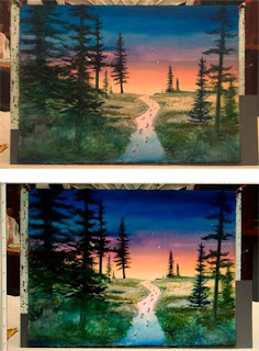
After the basic image work we make a version with punched-up colors that look good in the sRGB color space that many publishing companies want to receive, especially the new print-on-demand shops which use the ink-jet process to make short runs of paperback books. To make that file the prepressed giclée-printing version was copied twice. One had the color adjusted for the reds and oranges in the midsection of the picture. In this case the adjustment was 22 points of red and 22 points of yellow in the 'Shadows' using Image>Adjust>Color Balance. The other had 11 points of blue added to the 'Shadows'. The layer for reds was placed on top of the layer for blues and combined using a center-oriented gradient layer mask. The result can be seen above. You'll have to take my word for it that the CRT version (top) is closer to the original than the LCD.
Finally, to make a version for the Web the CRT is disregarded and adjustments are made to the picture to make it look better on LCD's set for 6500°. Because LCDs are inherently more saturated and contrasty due to their smaller color space, the look of pictures is improved by lowering the contrast. In this case I used Image>Adjust>Brightness and Contrast to lower the contrast by 22 points.
Now it is even easier to see why you should not prepress for giclée using an LCD. When the watercolor looks good on the LCD, check out what it looks like on the CRT (above). Use LCDs to prepress for Web and CRTs to prepress for giclée and other fine printing. For giclée work in the Adobe 1998 color space (if you work RGB) and for most self-publishing work in sRGB. If you usually output only to print, then you should probably be working in CMYK.
Although it's nice to have a fully equipped studio with professional photographic strobes and Gretag-Macbeth controlled-lighting for viewing artwork, such expensive equipment is not necessary for making first class copies of flat and dimensional artwork. Working with natural daylight will work just as well and save you a bundle.
Subscribe to:
Posts (Atom)