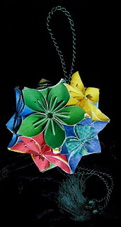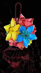
Origami is the art of folding paper, like the 'Kusudama' shown above made by my wife, Pamela Swanson. (Kusudamas are ancient Japanese medicine balls each made of 300-600 folds. There's more about origami artwork at her website www.poetpam.com).
Watching Pam spend endless hours folding I came to appreciate paper in a new way and from her learned that all papers are not created equal. Some papers fold better than others. Some will last and others crumble away. And so it goes in the art of giclée. Papers make or break pictures in more ways than one.
There is much confusion about printing papers in general. The general public has never needed to know anything much about paper. Even today most people only have a vague awareness of 'good' versus 'cheap' quality paper... art books versus paperbacks and such. Only the people who make or collect images are concerned about printing. That used to be only a small percentage of the population. But digital imaging changed all that and now there is a new class of printing professionals and semi-pros. My own company and life as a giclée maker are perfect examples.
Running a fine-arts printing company life is a paper chase. At Vashon Island Imaging most of our customers are artists or artsy photographers... those trying to avoid the commonplace in favor of new looks. They come to us because we are a custom shop willing to take on giclée projects that involve more than just printing, that also involve finishing work like coatings, stretching and mounting. So it's always nice to be able to offer something new to generate a little excitement. Epson has provided just such an opportunity with the introduction of their new Hot and Cold Pressed Fine Arts Media.
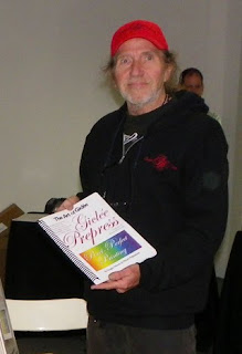
Pam and I saw the new Epson papers at the NW Photo Festival held by Glazer's Camera in Seattle to celebrate their 75th anniversary. We were participating in the event, promoting Giclée Prepress - The Art of Giclée my new book about pixel perfect printing (www.gicleeprepress.com). Naturally, we positioned ourselves politely close to the Epson stand.
I've had years of experience in the trade show business but I was usually on the other side of the curtain, literally. My specialty was grandiose slide shows using up to 100 projectors. That's it's own story which you can read about at www.incredibleimages.com (my audiovisual arts company). AV frustrates me. You spend long hours making content and after the show have nothing to 'show' for your efforts. Print work is so much more satisfying because there is an object you can hold in your hands and put on the wall... Like Pam's origami Kusudamas.
It's the feeling of touch and quality that people want in paper, just as much as a good look. They also want paper to be archival... The term 'archival' is itself a source of major confusion, but that too is another story. Archival isn't important until you get older. I am old enough to have seen my own artworks disintegrate, so archival now has meaning. As important as lasting value may seem to one, it is of no consequence to others who are so confused about 'archival' that they just assume that when a paper maker says something, its true... they are more concerned with the touchy-feely part of paper.
Until recently the choices for giclée printing were limited in comparison to the universe of art papers and canvases out there. The limitations are set by the need for a 'ground' that the ink can grab. The papers and canvas media supplied by Epson (and other companies making giclée media) is quite different from normal art papers canvases. They are made with a ground to accept aqueous inks.
You can put a ground on almost any media that you can run through your giclée printing machine and a good one is available from Golden (who also make great finishing varnishes). What stops a lot of people from doing that is the need to create a custom profile for some semblance of color management. Whenever you hear the word 'custom profile' it is code language for fiddling around until you find colors you like. Generally, you can find one amongst the long lists of profiles already out there. Sure, some experimentation is involved, but not everyone has a small fortune for a colorimeter, spectrometer and all the other gack necessary for custom profiling (or the fees to pay someone to do it). That's why many giclée printing companies stick with a few known paper types, usually the ones of the printing machine manufacturer. For example, as an Epson shop we try to stay in the Epson range to insure the best color management... code for picture quality and faithfulness to original colors. That is why we looked forward to be able to see, feel and touch the new Epson Fine Arts Papers.
There are four kinds. Cold Pressed which has a toothy feel like watercolor paper and Hot Pressed which is smooth. Each type comes in two colors, 'Natural' which is a beigy off-white and 'White' which has optical brighteners. Each passes the test for quality art paper and that is great because now there is an alternative to other popular art papers within the Epson range. They had to be making these new papers to do just that, as the art paper market for giclée printing is expanding exponentially. I was amazed at the number of offerings that I saw at the NW Festival and frankly seduced by a couple of them... more on that later. It takes a lot for me to stray from Epson but I do when it is what the customer wants. At Vashon Island Imaging we don't use code language... custom is still custom, and the customer is still always right.
To do right by our customers we therefore work with a variety of stocks including Hahnemuhle, Arches and Moab (so far). These companies provide profiles which are easily harvested from the Web, some better than others. For my own work I have also found that using Epson profiles with some other papers gets stronger color, which I prefer. Remember, all devices average and aim for mid-tones... your work may need extra help in the highlights or dark tones. That 'adjustment' can only come from changing the profile or by proper prepress work. Changing the profile changes the flow of ink and so does prepress adjustment... prepress with greater precision. It would be like dialing in the color on your TV instead of correctly lighting the scene being shown on the TV.
Prepress is something that many people -- dare I say most -- are totally unaware of. That is what we learned (again) at our little stand during the NW Photo Festival.

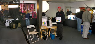
At the Festival yours truly and Pam shared a little spot across from the Epson stand. You can see that there was plenty of action at the Epson stand and there was equal action at all five paper manufacturers' stands. But 99% of those prospects walked right past us, even though our signs pointed out that ours is the only book about printing written by a printer. That made me wonder. So I changed my sales pitch and started talking with folks after they'd visited Epson or one of the paper stands. Once I told them what prepress was all about they were suddenly interested. Especially when I explained that they would need prepress to get the full benefit from the expensive art papers they would be printing on soon.

A bit more disconcerting was another (re) discovery made yesterday evening at a social mixer sponsored by the Seattle Graphic Arts Guild. At my table was an interesting mix that included a college teacher of PhotoShop® and two recent college grads expanding their network into the professional mainstream. Neither of the grads knew what either 'giclée' or 'prepress' means (!). That is astounding to me. I can understand the gray-hair crowd not knowing the terms, but also young people? Wow, the disconnect between people and printing is more widespread than I thought. But then the teacher pointed out that printing is not taught in schools. I added that it isn't taught in any other book except mine, Giclée Prepress - The Art of Giclée. Isn't it amazing that digital imaging education ends before the images are printed? Ok, some books go into it a bit, but they aren't written from the standpoint of a printer because those authors are photographers mostly, or technical writers... they aren't professional printers. That is like Stevie Wonder writing a book about how to draw. So from that standpoint the ignorance of people is understandable albeit very lamentable.
Everyone wants their pictures to be the best they can be. They spend a lot of time perfecting them and a lot of money printing them. No matter who prints them, if the files have been properly prepressed the output will be outstanding. Without prepress the results will still be good, but not the very best. The differences between prepressed and non-prepressed pictures can be dramatic. You can see numerous examples in the book (there are color 477 pictures and illustrations).
Epson's new papers are a welcome addition for our customers who are really into the art of giclée. Pixel perfect printing requires control and precision. The media range offered by the manufacturer of your printing machine is going to give you the best overall color management and therefore the best possible dynamic tone range. These are papers made by a giclée printing machine company specifically for their inks. Other art papers are made by paper companies who have in some cases 'adapted' their product lines to the needs of the giclée industry. Which is better? That's up to you... beauty is in the eye of the beholder (and so is quality).
Best of all is the growing variety of papers, canvases and films made specifically for the rapidly expanding giclée market. Zen is all about finding perfection. Pam is into the Zen of origami and prints her own pictures onto papers that she will fold into artful objects. In the world of giclée we do the same thing but in reverse, selecting the perfect media upon which to giclée our images. Now with a greater range of fine arts papers to choose from the Zen of giclée is enhanced. For an old darkroom dog like me, its fun to watch the future of printing unfold.


No comments:
Post a Comment