Monday, August 30, 2010

Giclée Prepress Identity Crisis


A friend stopped me the other day and said he was surprised to see I was still driving my 1992 Isuzu® Rodeo. I told him it still ran like a clock (and so do I, touchwood)... over a hundred thousand miles and going strong.

But he said it hand nothing to do with that... he just thought I would have been a millionaire by now selling my book Giclée Prepress - The Art of Giclée. It was he after all who had helped persuade me to write the book by pointing out that there are so many millions of PhotoShop® users that just statistically it should be a winner. Ah that it was so when actually the reverse has been the case. So I decided to do some 'reverse market research'.

Reverse market research is the kind you do to figure out what went wrong. In this case I wanted to know why the response rate wasn't up to our expectations. What I discovered was that the book has three fatal errors that will make it a collector's edition for those who own a copy.

1.) Bad title
2.) Unperceived benefit
3.) Unwanted format

The title is the first sales killer. Very few people have ever heard of 'giclée'. A quick poll I did at the local supermarket involved asking a dozen people what the word 'giclée' means. Depending on which aisle I was standing in people had a different idea about what 'giclee' means. Responses included: a.) sugary glaze for pastries, b.) a type of French mushroom, c.) a type of sauce, and d.) a method of finely chopping vegetables. Not one person associated the French word with printing or art... Ohhh la la.

Even fewer had a clue about the word 'prepress'. Most thought it was a cooking step to extract liquids or essences for one reason or another as in, 'prepress the orange rind in the usual manner and then....'

Worse yet, when I asked media professionals the same questions none under 40 years old and only a few south of 60 knew the correct answers. So consider yourself lucky, dear reader. You know that 'prepress' involves the adjustment of images for optimum printing results and that your high-end ink jet printer is a giclée machine.

People don't buy books about things they don't know. You can understand then why a book with a title like Giclée Prepress - The Art of Giclée is an instant collector item - for all the wrong reasons. You can't be interested in something that you don't know exists.

People also don't know that their giclée prints may be lacking and so the promise of the book -- to improve one's printing -- is lost because the benefit is unperceived. That fact is a testament to the good people at Adobe® and color management professionals in general as well as to the astoundingly good quality delivered by Epson® giclée print heads. At the push of a button you can get excellent quality prints. They could be better, but most people are satisfied enough with what they get without any prepress work.

Prepress is only necessary for perfectionists. It is not the stuff of 'pedestrian' printing. It is only for those who want the finest quality printing available, which is what the giclée printing process is all about.

'Giclée' means spray in French and that is the characteristic that separates this printing process from all others. Traditional printing presses transfer ink to paper by physical contact. The giclée printing process sprays the ink onto the substrate with no physical contact.

For many reasons described in the book, the spray process delivers the widest dynamic tone range (more colors) and most detail of any printing process. That is why giclée prints are favored for fine arts reproductions with archival qualities that have gallery and museum approval.

Those superb results are what the giclée printing process is capable of delivering in the hands of an experienced prepress artist. The prepress work makes or breaks the picture. The giclée-printing machine will faithfully render what you give it. The press operator can't improve what's not there. Remember the phrase 'garbage in / garbage out'?

It is the same with cars. A Ferrari® may be one of the world's finest cars but how it performs is limited to the skills of its driver.

Once you finish the picture in PhotoShop® it needs to be adjusted to look its best when output onto media or an electronic display. Making a giclée print is only one kind of output. The same picture might be printed in a magazine, appear on a website or in a video. You can understand that one single PhotoShop® file can't service all those different needs.

Each output media has its own specific 'look' that stems from very individualized technical needs and capabilities. A back-lit LCD or CRT monitor (like the one you are watching right now) makes a picture look different than it would in a giclée print, for example. Although today's color management generally makes everything look acceptably good, that's not good enough for perfectionists. Would you let the local mechanic tune that Ferrari?

When I have the opportunity to explain all this to PhotoShop® users who are artists and photographers they get it. In those cases 4 out of 10 agree that a book about how to make better giclée prints (or laser and traditional printing like offset and rotogravure, for that matter) is something they could be interested in learning more about... as you are, dear reader. But they (and you) may not want an actual book.... and that simple fact is the third and most fatal sales killer for Giclée Prepress - The Art of Giclée.

Paper books have gone out of favor. People want E-books now that the Kindle® and iPad® are on the scene. This is an almost universal feeling among young picture professionals... my target audience. Even though the subject matter of the book may be of interest, the presentation format of the information is not. They want it online and that is something Giclée Prepress - The Art of Giclée will never be. Nor was it ever intended to be electronic.

Electronic media are primarily used for purposes other than those of Giclée Prepress - The Art of Giclée. People go online in search of specific answers to specific problems they are trying to overcome on a 'right here right now' basis. They Google® the problem and a list of resources appears, many of them not even written words but rather YouTube® videos. Once the solution is found they move on.

Those people do not need Giclée Prepress - The Art of Giclée. My book is intended more as 'bedtime' reading. In fact a reader's wife recently complained that she wasn't getting as much evening attention any more since her husband got his copy of the book.

Giclée Prepress - The Art of Giclée is meant to supplement the how to with the 'why to'. Let me use a food paradigm to further explain:

Harold McGee wrote a book entitled On Food and Cooking. It is an 800+ page book with not one recipe inside. If you want to make your own mayonnaise you won't find those instructions per se, but you will learn a lot about the science of suspensions and emulsions which are why the oils and water in 'mayo' hang together. McGee's book is a companion to cook books like The Joy of Cooking (which is full of recipes). Giclée Prepress is a companion to PhotoShop® manuals and shares a common purpose and 'philosophy' with McGee's book, that being to provide the stuff for those who want to know more about the 'strategies' for fine quality cooking, or in my case fine giclée printing.

What it all boils down to is that you, dear reader are in an elite group of professionals who are perfectionists. You are endowed with:

- A wider vocabulary than most
- An understanding that prepress is necessary for fine printing
- An ego secure enough to admit that you may knot know everything
- An interest in pixel perfect printing that approaches Zen

If that is you, Giclée Prepress - The Art of Giclée should be on your lap, not in your laptop. Don't wait for the electronic version because folks will have moved on to holograms by then. Instead, you can have the real thing for $39.95 instead of the usual $49.95. To get that special price you need to email me directly (douglas@gicleeprepress.com) for instructions. Please mention this blog when writing to avoid any, well... identity crisis.

Sunday, August 29, 2010

How To Stretch Canvas Giclées

Stretching canvas is something akin to baking bread. Anyone can do it if they have some time and don't want to 'loaf' around. Frame shops make a lot of 'bread' stretching canvas... so much that many artists do it themselves. Whether you want to or not is another question but if you do make your first one about 16 X 20 inches. That size is the most 'comfortable' for beginners. Canvas giclées that are much larger or smaller are more difficult proportional to their size. It can be just as hard to stretch a 2 X 3-inch giclée as it is doing one that is 2 X 3 feet.
20 X 20 canvas giclée with a larger piece of black Kraft paper under it.

What follows is pretty much verbatim from Section Two: Giclee Work Flow - Step Twelve in my book, Giclée Prepress - The Art of Giclée. There are updates in my blogs about the Arrow® Power Shot and staplers in general.

[New readers please note that the purpose of this blog is to provide updates on the book Giclée Prepress - The Art of Giclée (www.gicleeprepress.com) as well as expand its scope and contents.]

Stretching Canvas

Plenty of room is needed to stretch canvases; more than you think. Flipping, swinging and turning them every which way can take a lot of airspace if you are working on an 8-foot panorama.

Work surfaces should be white or black so you can see things. Not only your tools, but also odd bits of scrap like rogue staples and blade tips that can mar the surface of a giclée. The work surface should sweep or blow clean easily.

Some prefer a carpet surface, but I like matte board as it can be readily cut into and it easily replaceable when it gets too ratty. Under the matte board are two layers of 1/2 –inch Foamcore board and under all that the tabletop. In this way I keep a sharp blade tip longer while doing serious mat-knife work on stuff like Gator Board. Polypropylene cutting boards are terrific, but also terrifically expensive. Glass is best for fine and delicate cutting work using thin materials with razor blades or Exacto® knives.

The 2-inch borders of this giclée have rulers and 1 1/2 inches of 'Faux Wrap' border. A caption text with the picture's identification can be seen in white.

Trim the giclée to the outer edges of the rulers. Step Four in the book has more information about adding rulers and 'wrapped' borders to giclées. At Vashon Island Imaging (www.vashonislandimaging.com)we always put rulers around the edges of our giclées to make even staple spacing easier.

The rulers and giclée border wrap should be two inches if you are using 'normal' stretcher bars and three or four inches if you are using heavy duty stretcher bars.


Lay the giclée face down on a piece of Kraft paper that is at least six inches larger. Center the assembled stretcher on the back of the giclée.

Home-made 'ruler' made of a paint stick is easier to see and faster to use when centering stretcher on back of giclée.


Tack down three sides (top, bottom, right) in their centers. These staples will soon be removed so set them in on an angle, leaving an edge to grab with fine-nose pliers.

Fine-nose pliers with curved tips make staple removal easier.

'Tack' staple is shot on angle for easy removal.

Use 1/4-inch staples as deeper ones are harder to remove. The Arrow® front-oriented PowerShot staple gun is easier to use than the traditional type. Of course, power tools are nice but not needed.

Double check now that the orientation of stretcher to the picture is correct... that 'up' is up for both the canvas and stretcher. From now on, backward steps are painful.


Stretch and staple down the left side working out from the center, one staple per inch. Staple spacing is why the rulers are there.

Use only moderate force wrapping the canvas around this first side, but be firm. You’ll see uneven stretching if you pull too hard. It’s important that this side goes down straight and even. Don’t try to pull it too tightly because it is only single-tacked on the three other sides. Those three tack staples were put in to give you 'just enough' anchoring to staple down the fourth side. Getting this first side down straight is your goal.

The opposite (right) side is next. Pull out the tack staple on the right side. Stretch the canvas with some added pressure and apply the first staple dead center.

Some people use special gripping tools, but I use my thumbs to do the work. If you do a lot of stretching, you’ll want to invest in a stretching machine. (You’ll need to do a lot of stretching to pay for it.)

A note of warning to those who stretch a lot of canvas: I have developed occasional problems with thumb splits possibly caused by prolonged contact with varnish while stretching canvases over a period of six years. The skin just splits and the wound is slow to heal. Be careful.

What is tight?

Using your thumbs as I do, there’s a limit to how much pressure you can exert, and that’s probably just enough. If it isn’t enough that will be obvious because the canvas won’t be tight enough.

Your thumbs can’t match a stretching tool or machine, which can stretch giclées almost as tight as a drum skin. However, I find the stretching tool awkward and don’t do enough to justify the costs of a machine (yet).

My advice is that you get to be friends with the stretching tool if you’re going to be doing a lot of stretching. If you stretch occasionally, thumbs will be OK... if you are strong enough. My wife would not be able to get a canvas tight enough using her thumbs and possibly you can’t either.

Whether with your thumbs or a tool, work from the center out. Don’t apply maximum force to the first few staples. Instead, build up the force rapidly reaching full force by the 5th staple.

Work back and forth left to right, one staple every inch. At the 7th staple, pull out the top and bottom tack staples using fine nosed pliers. (They are the ones to the left and right of the side you are working on, side two).

'Full force' does not mean as hard as you can. It means that 'moderate' is less forceful. The idea is to gradually increase the stretching pressure as you work outwards.

With the left and right sides stapled down, fold a variation of 'hospital corners'.

Modified 'hospital corner' folding. The upper flap folds up and back instead of down.


First step of 'hospital corner' folding procedure.


Second step of 'hospital corner' folding procedure – upper flap back and tacked.

Using a modified 'hospital-corner' folding technique, the upper-corner folds up and back instead of down. Tack it temporarily into position.

After getting the corners tacked, fold up and staple down that side, starting in the center and working out in the usual manner. Use moderate force on this third side. Save full force for the fourth side, where you will see how much 'full' should be.

By the time you begin the fourth side you should already see that things are going well. If they aren’t stop now and go fix what’s wrong. Continuing will make things worse, guaranteed. Assuming things are OK, use the force necessary to get the canvas as drum-like as you can. You may not be able to use it for your bongo practice, but that’s OK if it looks nice and flat with no stretch marks.

Ready to stretch last (top) edge.

Remove corner tack staples when you are two inches away.

Two inches from the corner pull out the staples tacking the upper folds and finish the modified hospital corners. Pulled staples should be put into a little container and not left on the work surface where they can escape and become 'rogues of ruin'.

Modified 'hospital corners' completed.

Some people cut out wedges from the corners to avoid bulging. These make cleaner corners that are more squared, fitting into frames better.


Finish with pads on the bottom corners (or all four) to prevent any staples from scratching wall surfaces or table tops.

The larger the picture the more important it is to work from the center outwards. Going back and forth left to right and right to left gets boring, to be sure. Think Zen.

Going too far in any one-direction risks uneven pressures which will show up later. If stretch marks show up, you’ll need to pull all the staples out of the offending side(s) and start over.

Removing staples is a chore. Stretchers made of softwood allow the staples to really sink deep and there’s not enough edge to grasp with needle-nose pliers.

Those staples need to be dug out from under using a small, flat-head screwdriver. Push the flat head under the center of the staple and lever the staple upwards enough to grab it with the pliers. This procedure requiring a deft hand to avoid puncturing the canvas with the screwdriver.

Hardwood stretchers can be infuriating for exactly the opposite reason… staples seem to bounce off instead of sinking in. (The Arrow® PowerShot Pro model does the best job with hardwood stretchers like the ones sold under the Jack Richeson® brand name.

Those must be nailed down with a little hammer. To avoid surface marring during the nailing procedure, place the giclée on a piece of felt or thin, hard carpet.

Now you know why frame shops charge a lot for stretching. There's nothing to it, but it does take time and a certain amount of 'technique' will be learned. The more you stretch, the faster and better you'll get.

There's even more you can find in the book (www.gicleeprepress.com). For now, I think this blog has 'stretched' on long enough.

Wednesday, August 25, 2010

To Frame or Not To Frame?


For a picture this can be an existential question. Frames can make or break a picture and/or the sale of the picture. It's a question I've wrestled with for my entire life and which came to the forefront of my attention again recently when one of our East Coast clients inquired about frames for her work.

Janet is putting together a show and wondered whether the giclée prints we make of her photographs should be framed for presentation. Writing an answer I found myself stumped, which is odd for me because I usually have too much advice not too little.

Janet had seen a show at a gallery in Cape Cod where the pictures had thin frames with a brushed gold finish. Her question was whether I thought such frames would add to the 'look' of the pictures in her show. In my mind's eye I could just see her pictures in such frames and they would be a good combo. But that's a unique situation both in terms of the frames used in that show and that they should have caught both our client's eye and my imagination.

Usually I tell our clients to avoid framing their work or if they do to keep it dead simple, a thin black frame or something like that. But Janet's question got me thinking... and now several days later I am still thinking about it.

The framing conundrum is nothing new for me. I have been in the picture business for fifty years so you can imagine how many times I have sliced my finger cutting mat boards and trimming prints for framing. Through the years I have tried so many combination that I can't remember them all. Even with that perspective I cannot offer any simple answers.

Frames are as personal as the pictures they contain. Together with the picture they become something new. The picture is protected by the frame and the style of the frame gives the picture a now look. The question is, how does that new look (and higher price) affect the work's chances for sale?

Price is such an issue these days that I encourage all our artist clients to keep the sales prices as low as possible. Frames add cost and there are many ways to display pictures without frames. Our most popular at Vashon Island Imaging is the 'gallery wrap' in which the canvas giclée wraps around the sides of stretcher bars (or around the edges of a thick substrate if wrapping paper giclée prints). There is a lot about how to do gallery wraps in my book and in a previous blog.

Another popular look is mounting giclées on wood. One of our clients uses MDS, an artificially made wood product which we don't recommend as it retains considerable moisture. However, any fine wood looks and feels great. Personally, I like Teak wood and use that a lot. Teak and other hard woods are associated with quality. Others use aluminum, Plexiglas® or high quality illustration boards. Paper and canvas giclées can be dry mounted with a hot press or glued to the substrate.

Whether any of these frame-less solutions are more cost effective depends on what you spend on a frame... and there are a bazillion choices. There are plently of cheap frames available online and some of them are great values. For another of our clients we found plastic frames that looked even better than wood ones. The color permeates the plastic so there chips and scratches are virtually invisible. Plus they are lighter weight and less expensive than wood. Of course there's a bias against plastic in the Art world, which I find odd in this case.

Suppose I told you that I had a new frame material that was virtually unbreakable, lasted forever, didn't show chips or scratches, was lighter weight although stronger, and less expensive to boot. What would you say to that? You'd likely go for it. Well that stuff exists and it's called plastic. But I digress...

At the higher end of the Art scale, in galleries with snob appeal, you find giclées framed with a sizable white matte and a simple black 'strip' frame. They want nothing to 'take away' from the picture. However, at commercially successful galleries, with popular appeal, pictures often have enormous fancy frames that are distinctly part of the total art package being offered for sale. Then there's everything in between everywhere else.

Here's the dilemma... have you ever seen a 'trend' in framing? I haven't. Every home or office I have every visited has pictures framed in different styles. A trip to the local frame shop will further demonstrate the point... they have scores of samples. One shop I know in Vancouver boasts '999' kinds.

I posed this question to Donna at Frame of Mind, Vashon Island's best frame shop: 'What type of frames do photographers generally choose for their gallery displays?' Donna's black stare answered my question before her delayed words. After a long pause she said that each is different. Even as we spoke a couple was mulling over fame sample selections and obviously having a hard time making up their minds.

What Donna and I both agree on is that people buy a 'total package' and that a frame takes the picture into a new visual space by giving it a new look. That being the case the 'KISS' principle is supported... 'Keep It Simple, Stupid'.

People have a hard enough time choosing which picture they like from the vast ocean of images that is drowning the art market. They have less money now too. Why risk driving away a sale by adding a decision-complicating factor that raises the price?

Let the customer choose their own frame. That is unless you, the artist, feel that a particular frame is what your work needs to be 'complete'. In that case you are dismissed from reading this blog and may get back to work now... as I probably should too.

Sunday, August 22, 2010

Tip Sheet #3 - Card/Text Stock Weights & Measures

If your printer's 'platen gap' isn't set for the correct paper thickness you will get less than perfect results and may even damage the machine. This applies to both giclée and laser printing machines. To avoid that, clip and save these two handy reference charts.

CARD STOCKS (Cover Stocks & Pasteboard)

Card stock weight (also called 'grammage') is the weight of 500 sheets of 20 by 26 inch (508 by 660 mm) paper.

Card stock thickness is measured in thousandths of an inch and referred to as 'points' or 'mils'. For example, 10 pt. card stock is 0.010 in (0.254 mm) thick (approximate weight = 250 g/m2)

Note that there is no absolute conversion from points (pt) to pounds or grams per square meter (g/m²) because paper densities vary slightly between brands and types.


TEXT STOCKS (Bond, Writing & Letter)

While card stocks are measured by thickness, text stocks are measured by their weight calculated one of two ways:

1.) weight of a ream of untrimmed paper ('basis weight')
2.) grammage of 500 sheets of 25 by 38 in (635 by 965 mm) paper

This chart shows conversions for 17" x 22" paper. These are are not necessarily accurate and should be used only as a guide because the densities of papers vary slightly.


Caliper is measured in 'micrometres' (µm) and also in 'mils.' (1 mil = 0.001 inch = 25.4 µm)

Friday, August 20, 2010

Tip Sheet #2 -- Retouching Varnish Cracks


If your stretcher bars have edges that are too sharp you may get cracks at the edges when you stretch a varnished giclée. Cracks also happen if the varnish is too hard and brittle.

If this happens you can fix the problem using Q-Tips® or other cotton swabs with transparent watercolor dyes like the Dr. P.Hh.Martin® brand (Easter-egg or cake icing colors also work well).

Using colors that are close to and slightly darker than those surrounding the cracks, work the color into the cracks with the cotton swab and your finger tips.

The water-color dyes only absorb into the cracks where the canvas paper is exposed. The varnished parts repel watercolors. If you want to touch-up the varnished parts, use oil-based colors or acrylics.

At Vashon Island Imaging we apply an additional two coats of varnished over the stretched giclée after the color has been added to the cracks to seal them so there are no breaks in the surface that might allow ingress of air pollutants and moisture.

Tip Sheet #1 -- Multiple Test Strips


At Vashon Island Imaging we do a lot of test strips to get color right for our clients, many of whom are artists and photographers. The strips can be as annoying as they are helpful if there's a bunch of them floating around. They require labeling and are easily misplaced because of their odd shapes. That's why we like to print test strips on the same sheet that the client's picture will print on, and not trim the strip(s) off until the job is done. That way everything is together on the same sheet.


Logic would tell you to print your way down the sheet from top to bottom... but that would be wrong because your printing machine probably won't let you do it that way.

Many printers can sense that something has already been printed on the sheet. It is part of the routine the machine goes through when you insert the paper. Presumably this is thought to be helpful but that is debatable. Suppose you want to print multiple test strips sequentially, not all at once? Or what if you want to 'double print' one thing on top of another? Then you have to out fox the machine.


Fool the machine by working from the center out. Using the illustration above, print the test strips in the order shown. You may not need three test strips or you may need more. The dimensions of the picture itself will determine how much page real estate is available for test strips, and what size(s) they can be.

Thursday, August 19, 2010

Road Test #5 - Get A Grip On Staplers

A couple of months ago I wrote a scathing criticism of the Arrow® PowerShot stapler (see the picture below and you'll get the gist).


I gave up on that model after several of them bit the dust in short order, unable to keep up with the demands of our canvas-stretching department (me) at Vashon Island Imaging (www.vashonislandimaging.com).


I went back to my old Arrow® Model 405 (shown above) which had served me well for 30 years. That model is much less comfortable to use because the way you squeeze the trigger is counter-ergonomic. Anyway I don't have to worry about that because it gave up the ghost too.

Maybe the Arrow Stapler Company read my blog because on the shelf in the stapler department at the hardware store was the new Arrow® PowerShot Pro ...at the same price as an original model.


Uh huh. I figured that if the nice folks at Arrow were kind enough to fix the problems with the PowerShot, they deserved another try... so I bought one, but not before taking a close look at everything in the range and noticing an electric model, the Arrow® ETF50BN .


Well, I couldn't resist that... no more squeezing, or so I thought.

What tipped the scales in the electric model's favor was the ongoing battle with Jack Richeson stretcher bars, the subject of another recent blog. Staples, even nails, just bounce right off some of their bars because the wood is so hard. Great quality, but use it for frames not stretchers.


Possibly, I thought, the electric model would be an effective weapon able to shoot staples with sufficient power to penetrate the occasional 'hard as nails' stretcher bars you run into that bend staples out of shape (as shown below). However, I would be wrong.


Not only do electrically propelled staples bounce right off Jack Richeson stretchers, the bounce creates quite a recoil 'kick' in the gun, like a rifle kick. The first time the electric staple gun recoiled it nearly 'jumped' off the edge of the stretcher onto the live canvas where it could have done some damage. Boy was I surprised... and then dismayed... ...and then surprised again when the PowerShop Pro did the job quite handily. The new Pro model powers those staples right in (slightly mangled). So my hat is off to Arrow but I am holding the nod for now. The new model packs a bigger punch than its electrified cousin but time will tell if the PowerShot Pro has a longer life span than its predecessor.

Actually, the electric ETF50BN stapler has some kick normally, probably because with the manual model you are really pushing down hard to get a good squeeze. With the electric model the tendency is to simply rest the tip on the canvas and shoot... then you get maximum recoil. If you press the tip down hard enough (not that hard) you kill the recoil.

The electric Arrow® ETF50BN has become my favorite but can only be used with stretchers made of soft enough wood. With good wood you can just motor along and it is amazing how much time is saved by not having to squeeze. However, the convenience is tempered by two annoyances.


The first annoyance is the trigger safety mechanism that is under that white tape (above). It is a 'safety' switch that you simply push in to activate. The problem is that the way it is placed you inadvertently block the trigger over and over... until you tape it off.


Then there's the short little 6-inch plug pigtail that manages to hang-up on everything, especially the edges of the worktable and even the canvas stretcher bars. The hang-ups unplug the stapler frequently enough to make you grit your teeth. Arrow, could you afford another foot of electrical cord?

Maybe I am making a mountain of a molehill. The truth is that if these two annoyances are the only problems I run into with the ETF50BN then I will be a happy canvas stretcher indeed.


Without the beneficial regular exercise that manual staplers offer, at no extra cost, the grip of my handshake may not be as tight in the future... unless I get a handle on the situation. However, you could say we've gotten a grip on the stapler situation.

Monday, August 16, 2010

Tin Cup Pricing


Bums still cry 'Hey buddy, have you got a dime?'
And the beat goes on, the beat goes on.
Drums keep pounding a rhythm to the brain...


Sonny & Cher wrote those words in the Vietnam era but they apply today... except today you have to amend the first line to 'Hey Buddy, have you got a buck?'

Now the volume of the beat is being turned up. The doomsayers are at it again, getting us ready for another 'dip' in the economy. Seems weird since many folks here on Vashon Island are actually seeing slight improvements in their lives.

As I wrote in an earlier blog, artists are bellwethers for the economy... first to get hit and first to rebound. Vashon is an artists’ colony and maybe that is why, here at least, things seem to be on the rebound. But maybe not, if that's what the pundits say. I say, damn the torpedoes, full speed ahead!.

Abraham (www.abraham-hicks.com) teaches that you get what you think about and you think about what you want. That's why I think about the next illustration I am going to make and how nice the giclées (and the blackberries) are looking... and what's for dinner.

Pamela Swanson (www.poetpam.com) introduced me to the teachings of Abraham. I felt an immediate affinity and attraction (to both). As the years have passed I have discovered that the laws of attraction are true enough. We are what we think about. That is why the constant drumbeat of the doom-saying pundits eventually percolates into the brains of the populace. The net result is a self-fulfilling prophecy... isn't that what Abraham is saying? But I disgress....

Maybe Vashon Island is weird after all... maybe we're too isolated to hear the drums... maybe its the rain. Whatever it is it's a good thing when a community is optimistic. Optimism facilitates action, which drives movement, which propels things forward... okm backwards sometimes (but what's backward for one is forward for another).

It doesn't really matter why, although it is fun to speculate about that. In my opinion it's three things:

1.) Adaptation to a new reality
2.) Re-set of values
3.) Suspension of disbelief.

Its everyone's' need to survive that's at the root of these three causative factors.

They say that people eventually learn to become happy with things they can't change. Duh... they 'adapt'. It's an evolutionary thing of sorts. Life is a continual process of weeding out things that turn us off, striving for things we want. Like weeding a garden. Now, the 'new economy' isn't so new anymore and has turned into the new reality.

At my giclée printing company, Vashon Island Imaging (www.vashonislandimaging.com), this is reflected in the acceptance of giclée by more and more artists.

Anyone into new-media art is totally aware of the bias against them by the conventional art world. There is a distinct discrimination, as if 'digital art' were an oxymoron. Speaking of morons...

Any artist that still clings to yesterdays pricing is probably either near death or soon will be. The ship is sinking... we are in the last part of a 'Titanic' saga when the tail of the ship rises for the final descent. Geez, you'd never believe I am optimist with a statement like that. But you see it doesn't matter whether the ship sinks or not because fundamentally nothing will change... only the numbers will get smaller.

You remember the ride up during the 90's and early part of this century? I don't know about yours, but everything in my life stayed more or less the same while the numbers kept getting higher and higher. We climbed that mountain and now we are on our way down off of it... into the valley. But hey, valleys are where civilization started... that's where the rivers flow and things grow.

There has been a fundamental reset of values, which more and more people are realizing. Not just monetary values but personal ones too. People who used to hang at the Mall are the only real losers in this... the rug was pulled out from under them. But artists have two feet on the ground even if their heads are in the sky. Artists are survivors. Why? Probably because they are doing what they like to do and can do nothing other, they accept downward mobility and realize that we are all serfs of the king(s).

It's the downward mobility that has led to the reset in personal values. If you can't take that cruise around the world, the world around you looks better and better.

More and more people are releasing their denial of the new reality. Their disbelief that things have permanently changed is being suspended. Perhaps that is why the pundits are all talking about further calamity. Authorities need fear. For those who govern, fear is a good thing, especially if they are associated with relief from fear. Polls create problems so they have things to fix. The whole fixing process is what half the world's commerce is all about.

I'll concede that sometimes fear is a good thing. It's a great motivator. For example I am so afraid of not being able to be a professional giclée printer that I give my customers fantastic deals on the best work in town. I want them to succeed because if their canoes tip over the waves might tip mine.

Hmmmmm, 'tip-a-canoe' ...reminds me of another old song called 'Tippecanoe and Tyler too!' based on a slogan from the presidential election of 1840. “Tippecanoe” was presidential candidate William Henry Harrison, who was a Battle of Tippecanoe hero in 1811. John Tyler was his vice presidential candidate. The song was written by Alexander Coffman Ross to the tune of the song, "Little Pigs". It sang Harrison into the presidency.

In 1840 the big issue was a reaction to the Panic of 1837 which was a financial crisis in the United States built on a speculative fever. The bubble burst on May 10, 1837 in New York. Banks began to only accept payment in gold and silver coins. It was based on the widespread assumption that Andrew Jackson's government was selling land for state bank notes of questionable value. The Panic was followed by a five-year depression, with the failure of banks and record-high unemployment levels.

'And the beat goes on...'

Sunday, August 15, 2010

Highlights of A Wedding


Reportage-style wedding photography looks more natural than 'produced' styles lit by strobes. Shooting available light also allows you more mobility and maneuverability. You can get angles and points-of-view that would be difficult or impossible to light in the tight timing constraints of a wedding. But there's a price... way more post-production and prepress work.

Shooting available light is a constant decision making process involving which part of the scene you are prepared to lose... the shadows or the highlights, because you can't have both. Why? The dynamic tone range of most naturally lit scenes exceeds the camera's capabilities.

Whether film or digital every camera system has physical limitations on what it can record. The range of tones that it can record is called it's latitude. The latitude of one camera might be 6 f-stops while another might be able to record a wider range of 8 or more f-stops. However many naturally lit scenes have a range of many more f-stops than that. So something's gotta give.

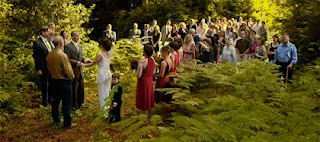
That was exactly the situation when I made this picture. It's a 'grab' shot because I wasn't there to shoot the wedding... I was the host! When Pete Bjordahl and Chloe Swain decided to marry they asked if they could stage the ceremony and reception at my Vashon Island studio home. So I was the 'chief cook and bottle washer' for a 100-person reception. I was running like a chicken without a head and made it out to the 'yard' just in time to shoot the last part of the ceremony. Click click, done... back to the kitchen.

You can see that the left half the picture is in the shadows of the trees in the woods while the right side is in a brightly back-lit open clearing. The exposure differences between the two zones were far beyond the latitude of my camera. Getting one zone right would sacrifice the the other but the exposure was determined by the position of the bride and groom under the trees. So it was goodbye highlights on the right side. No worries, I thought to myself, we'll just fix it in post.

Fortunately I've had a lifetime of experience with blown out highlights and underexposed shadows. Life Magazine photographer Ted Russell and his darkroom wizard Arthur Tcholak mentored me during the 1960's. Ted taught me how to shoot with available light, and Arthur taught me how to print the resulting negatives. Life and the German magazine Twen set the style for photography back then in the pre-strobe age, and the most popular look was available light reportage.

Printing pictures shot in available light is no easy task. I learned pleanty of special techniques to nurse details out of underexposed and overexposed negatives. Film actually has an edge over digital for recording such details. No matter how overexposed film highlights are they can nearly always be burned in sufficiently to get some details. Not so with digital capture. Once a pixel hits 255 it's hit the wall... no details are in there to coax out.

If you're reading this you know the highlight problem is double trouble. It's bad enough not to have highlight details, but the blown highlight areas show as white which 'dilutes' the overall coloration, making the picture look 'washed out'. There are a few ways to deal with these situations spelled out in my book, Giclée Prepress - The Art of Giclée and in an earlier blog.

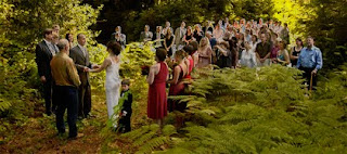
Prepress for this picture involved balancing the left and right sides and then adding 'golden sunshine' to washed out highlights, especially on the right hand side.


Balancing the two sides started with making two duplicate layers of the picture. One was adjusted to look good in the dark part and the other was made as good as possible in the lighter area. The layer adjusted for the forest looked totally lousy in the clearing area, but no worries. By putting the forest layer on top I was able to erase away the blown out parts to reveal the improved light tones on the layer underneath. Erasing with different brushes set for different opacity and 'flow' rates did the trick. Overall the result looked good but lacked 'magic'.

Magic is the way people remember things...they remember things the way they wanted them to be, they way they wanted them to look and not necessarily the way they actually were. The way things look in peoples' memories is usually better than in their snapshots.

'Magic' for this picture involved adding a kiss of gold to the sunlight on the right hand side and to the blown out highlights. Selectively adding some yellow takes away the washed-out look. This is done by adding two new layers:

- Highlight control mask
- Yellow highlight fill

You can't manipulate any pixels that are '0' or '255' on the histogram because there is no information to work with. Some density has to be added to the highlights in order to be able to add color. That is the purpose of the highlight control mask. After there is some density color can be added to the pixels.

Highlight-Control Mask


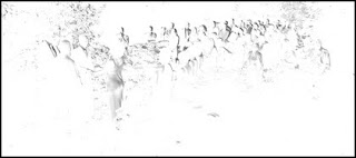
Make the highlight-control mask by duplicating the master picture layer, inverting it and de-saturating it to make it into a black-and-white negative (as above).

Use a combination of brightness and contrast to wash out all but the darkest tones of the negative, which are the highlights of the picture. You can also burn and dodge, erase and use whatever other tools you want to isolate the darkest parts of the negative.

Place the highlight-control mask layer above the master picture layer. Set the blending options for the highlight-control mask to darken and then adjust the mask layer's opacity to something between 5 and 15%.


This is the adjustment that controls the amount of yellow sunshine that you will be able to see when the black-and-yellow high-contrast positive layer is added.

High-Contrast Positive


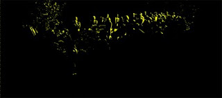
Duplicate the highlight-control mask , invert it to make it a black-and-white positive and separate the tones even more by adjusting the contrast -100% and the contrast +100%. The result should be black and white 'line art' of showing pure white highlights against black.

Select the white color range and fill it with yellow (or whatever color works for your picture highlights).

Blur the black-and-yellow positive using your favorite effect... for this picture it was a touch of 'gaussian' blur. For a more subtle effect first use 'blur' and then 'blur more' as many extra times as needed.

Put the positive layer on top of all others and set the blending options to lighten. Black can't lighten so only the yellow will show, filling in the highlights subdued by the highlight-control mask. Adjusting the opacity of the highlight-control mask underneath it controls the amount of yellow showing.

Using this combination blown out highlights need not be the kiss of death for an otherwise great shot. Just give them a kiss of color and you can kiss that problem goodbye.

Friday, August 13, 2010

QC Probs Stretch On at Jack Richeson Art


Jack Richeson & Company (www.richesonart.com) have taken their name and phone number off their stretcher bars label and I wonder if its because a lot of people are calling to complain about some ongoing quality control problems. Ordinarily I would call but its useless really since we have no other choices here in Seattle or even up in Vancouver, Canada for that matter.

When it comes to stretcher bars for giclée canvas you don't have many choices unless you want to shop online because art supply stores only sell one kind. In Canada it's the DeSerres® line and here in the Seattle area Jack Richeson & Co. have monopolized the market.

Although I enjoy playing Monopoly® my giclée printing company isn't about fun and games and when quality problems creep into the components we use that's, well...creepy. Such has been the case with Richeson stretcher bars.

To be fair, Richeson's are the best pre-fabricated stretcher bars we've ever used. But it's hit or miss with their products. Sometimes the stretcher bars have some real problems that we hope the nice folks at Richeson will attend to after they read this blog.

One annoying problem has to do with the wood they use... it's so strong that nails bounce right out! You can see in the picture below that I had to make six shots to get one nail through. Amazing.


I haven't seen that kind of quality timber in a long time... too bad it has to be wasted on stretcher bars. As the company is based in Wisconsin it's probably Northern Red Oak, Quaking Aspen, Silver Maple or some other 'exotic' hardwood species that would rather become a piece of fine furniture. Not that I'm complaining. I'd much rather have good quality woods than the airy stuff that DeSerres® bars are made of... you know, those 'fast growing' trees. Still, a nice Fir or Hemlock would do.

The super hard woods they use at Richeson also present the user of their stretcher bars with sharp edges that can cause cracks on tightly stretched coated giclée canvas... an issue I reported in an earlier blog about Golden® Polymer Varnish. These edges have to be planed, filed or sanded down until they don't hurt when you press your thumb down hard on them.

Bad fit is the other problem that bedevils us.


The little 12 X 8 stretcher in the picture above is actually what provoked this blog. It took me 10 minutes of fiddling around to get it straight... and when it was one corner sure looked like it wasn't, eh? Anyway 10 minutes is way too long. A small company like my giclée printing firm Vashon Island Imaging (www.vashonislandimaging.com) would have to charge way more if all stretcher bars took that long to assemble. Time is money, eh?

In all fairness, most of the Richeson stretcher bars fit very well, which is why we like them so much. With a few gentle whacks from a big rubber mallet the corners snug-in nicely and it will be 95% square if not ready to go... except sometimes... when the pieces don't fit because the jigs that made them were different.

For a while the problem had to do with Richeson's supplier in China. The company has the stretcher bars made in the USA as well and parts from the two countries didn't work together. The fit was so bad that the stretchers 'torque'd' and wouldn't lie flat. It's hard to fix torque problems but there is a solution and a lot more about this in my book, Giclée Prepress - The Art of Giclée (www.gicleeprepress.com).


Lately however the fit problems are among US made parts, which is disconcerting. It's only stretcher bars, for Pete's sake... basic carpentry... they ought'a be able to get that right, eh?

The problem that really bends me out of shape are the curved stretcher bars that make it through quality inspection. Jack, play straight with us poor giclée stretchers. Sell those to bent ones to rocking horse makers please... not to us.

To say more would be stretching the issue too far. So let's put a 'wrap' to this blog. However, just one more thing... the logo.


Does this guy remind you of someone? That's right... the guy with the cross to bear. This logo will be particularly appropriate if Jack doesn't fix the QC probs. One thing's for sure, he's sure making me cross.

Thursday, August 12, 2010

Living Large with Giant Giclées


There's nothing more satisfying than producing a giant giclée and nothing more nerve wracking than watching it slowly work its way through the printer. Everyone knows that things can go wrong and that can be an expensive proposition when you are printing and finishing very large sizes. Such was the case last week when I set to work on a new illustration of my own called Lavender Moon (shown above).

Lavender Moon is a 48 X 36-inch giclée made to be the centerpiece for an exhibition of my illustrations at the Vashon Island Chamber of Commerce. That show features works from the Vashon Island Collection (which can be seen in the Fine Arts section of my website at www.mesney.com).

The centerpiece of a show should be the dominant picture at the exhibition, the one that pulls people in. Usually it is the biggest picture. Its environment should determine the size of the centerpiece. In this case the 48 X 36-inch print feels huge in the Chamber offices, hanging on a wall that is 12-feet wide, even though that is not a large print in the world of murals.

Shows need centerpieces. They are like billboards, attracting people from a distance. Shows without centerpieces have more passers by because only those close enough to see the pictures are attracted to them. The bigger the pictures (in their environment) the more people they will attract.

Although we print a lot of shows for artists and photographers at Vashon Island Imaging, it is rare to make really big giclées because a.) They are expensive and b.) Few venues have sufficient wall space. So making a 4-foot by 3-foot Lavender Moon was a rare treat... one that re-tested my mettle as an artist and professional giclée printer.

The challenge derived from the viewing situation at the exhibition. Lavender Moon would be viewed up close (from as little as 18-inches away) so it had to be flawless and have plenty of details that viewers who look closely could discover. Details make the pictures more interesting and memorable. For example, in Lavender Moon there is a tiny but complete spider web in one of the flowers (upper right).


It took about a week's worth of 12-hour days to make Lavender Moon. That wasn't intentional but you know how things go when you get interested in something. The process was more painstaking than most because of the detail required to fill the big canvas. At one point the file size was more than 6 gigabytes and my less-than-totally-new 'art' computer was choking. I was on tenterhooks during the super long saves. The slow, painstaking process had side benefits however.

One of the main benefits of the long production cycle was simply getting familiar with the picture. Spending a lot of time with a picture really helps you see its problems. This picture went through three compositional iterations and the third didn't occur until the sixth day. The finished picture is completely different than the one I set out to do. Originally, the picture was to be a 1:3 ratio panorama. Instead it ended up being a 3:4 ratio piece.

The changes occurred as details were added. The details changed the 'importance' of certain key visual elements and upset the balance within the composition. It became harder and harder to maintain the necessary triangulation in the panorama format, so the picture got more and more square.

Details Influence Composition

Working out the 'geometry' of a composition isn't always easy and can frequently change as a picture evolves, as was the case with Lavender Moon. When there are lots of visual elements it becomes more challenging to show them all in a pleasing and harmonious way. A 'circular' scheme based on triangles within triangles works the best.

Good compositions keep the eye moving around within the picture. Pictures with a single point of interest are simple compositions. Pictures with two points of interest produce the 'tennis court' effect as your eye bounces back and forth between them. Three interest points (or more) allow for triangulation, which is in my mind the key to good composition. Triangles create the 'circular' eye movement within the borders of the giclée.

One big difference between the composition of paintings and illustrations compared to photographs has to do with 'focus'. Photographers frequently use soft focus or selective focus to call attention to points of interest. However, paintings and illustrations are generally 'in focus' because it's hard to paint 'out of focus'. As a result the compositional options open to illustrators and painters are limited to subject matter more than technique. (Airbrush artists may consider themselves excused from that assessment.) That was certainly the case for Lavender Moon.

When I was a lad learning how to be a lensman my visions focused on Pete Turner's wide-angle work, Ryszard Horowitz's surrealistic detailia, and Canadian portraitist Yosef Karsh's moody lighting. As my own style emerged from the shadows of those giants it was based on a wide-angle point of view and all the detail that comes with it. Selective focus has never really been my thing.

Working with wide angle lenses makes you work harder to put together a good composition because everything is in focus, so everything is equally important in that sense. Making one thing more important than another becomes a question of its size and position in the picture relative to the other elements, as well as the degree and nature of its illumination in the scene.

Now of course photography has been turned upside down and inside out by digital technology. Many former photographers have evolved into photo-illustrators because it is now so easy to assemble new pictures from pieces of others... a technique called collage work by most and traditionally known as 'photo-assembly' or 'strip-in' work in the printing trades. Just about every illustration I make is a collage and Lavender Moon is a prime example.

Size Matters (The Bigger The Better)

Collage work involves the assembly of pieces from several pictures to make a new one. Lavender Moon is a collage of 44 picture elements. Many of the pieces were other collages to begin with (for example, the Olympic Mountains in the background and the spider web) so the total is well over a hundred elements in the scene.

Photo retouchers and collage artists know that it is best to work large and then reduce back down to repro size in order to minimize the visibility of their assembly work. With that in mind the master image of Lavender Moon was made to print 10-feet wide by 8-feet high at 240 dpi. It is doubtful that anyone would ever want a giclée that big, but the real reason for working so large is to insure high quality at more popular smaller sizes. I try to work at 200% scale. Since the giclée for the exhibition was originally to be 60 X 45, the master was made 120 X 90. (Later we decided that a smaller size would fit better on the Chamber's wall space, so the 48 X 36 for the show is 40% of the master, with incredible sharpness and detail.)

If you've ever tried to do collage work you know that there's more to it than meets the eye. It's kind of like trying to make a new jigsaw puzzle out of pieces from several others. There's a lot about how to do collage work in my book, Giclée Prepress - The Art of Giclée, but the gist of it is that all the pieces need to be made to look like they belong together, sharing similar contrast, color range, grain, 'focus' and detail. Everything starts at the edges.

Getting an Edge on Collage

To get good edges work on a picture that is twice as big as you are planning to print. Assemble all the picture elements on separate layers and scale them up to their new sizes and positions in the composition. Then cut each picture piece out of its background. Do that by selecting the part you want and erasing the rest.

To make the best selections use the Pen tool to make a 'Path' and then convert the path to a 'Selection'. Remember 'connect the dots' pictures? This is just like those except you make the dots too in this case, using the Pen tool. The more points you plot, the smoother and more detailed the path will be... and it follows that the better the path, the better the selection.

The best paths are plotted are large magnifications. Zoom in to an 800% magnification and make path points at least every half-inch on straight lines and gentle curves. On sharp turns use many more points. Consider that at 800% magnification dots that are 1/2 inch apart on your monitor are actually only 1/32nd of an inch apart in the image file.

To be honest I don't always work at 800% but I try not to dip below 500% because if I do it's going show in the edges of the collage pieces. The question is, what level of quality is needed in the edges in order for them to become invisible at viewing distance.

Once the path is complete convert it to a selection then expand the selection it by 1 pixel. In some cases you may be contracting the selection but the idea is to crop a bit further in on the subject. Then feather the selection by 1/2 pixel. Finally, select the inverse and delete it, leaving your picture element isolated on its own layer.

At this point the basic edge work is done. Later, when the piece is in situ you will likely need to do a bit more work, blending certain edges better by using the Eraser or various Blending Options (read on).

Uniform Looks

The various pieces of the new picture must look like they belong together. Here we can take a lesson from school uniforms... each student looks individual when you get close, but from a distance all the students look the same. And so it goes with photo assembly. Uniform visual qualities among all picture elements help pull a collage together. The uniformity is achieved by using these tools:

- Levels (with or without Brightness and Contrast)
- Hue & Saturation
- Color Balance
- Sharpening (or Blurr)
- Noise

For each isolated piece of the picture use Levels to adjust the overall look of each piece to work together with the others. Try to avoid using Brightness and Contrast unless the black or white points need to be moved (making white a shade of gray and pushing dark grays into black).

Then use the various color controls as needed to adjust the color and contrast of each piece so that it fits in with its neighbors. (All this is detailed in the book and is really too complex for a blog like this... for example, did you know there are seven types of contrast?)

Texture and 'focus' are the next issues to deal with. The pieces should all have the same kind of 'grain' and sharpness. If some elements are enlarged much more than others this will be more difficult. However, adding various amounts of noise to different elements can help even them out texturally.

Unsharp Masking and Blur tools helps too in some instances, especially for pieces that have different degrees of enlargement. Try sharpening some and blurring others until you get a more balanced look. (Have you tried 'Surface Blur'?)

Restoring Color 'Density' after Sharpening

Sharpening can start to make a picture element look more pastel because of the white and black edges that the algorithm creates to fake focus. This paleness can be eliminated or at least reduced as follows:

Duplicate the layer before sharpening, then sharpen the lower of the two layers. Adjust the upper (un-sharpened) layer's levels to 1.22 or so and set that layer's blending options for darken. What this does is partially fill the white borders with a pastel of the color that was there before sharpening. This is what I call 'creative sharpening' ... as opposed to the 'technical sharpening' done to an image just before printing it (again, see the book).

A 'Light' Touch for Soft Edges

Soft and wispy edges present special edge-blending challenges. It's hard to get good blends using any of the selection tools or erasers because those edges are actually 'see through' in reality... like smoke, wisps of hair, etceteras.


Edge blends between pieces with such soft edges are improved by doing the following: 1.) Make a duplicate of the offending collage piece and set its layer blending option for 'lighten'. 2.) Position the lighten version on top and erase away the edges of the original version beneath it in the offending areas. The same can be done using the 'darken' blending option on another copy of the piece.

Scratch and Page File Management

When you are working on big pictures the scratch file will keep getting bigger ... the one for Lavender Moon expanded to more than 30 gigabytes while the paging file ascended to more than 2.2 gigabytes. This can really slow things down for you and may make certain operations impossible (even saving!).

To begin with, make sure that you have a nice big partition on your hard drive for the PhotoShop® scratch disk. I usually assign 30 gigabytes for the primary scratch drive partition, with another 20 gigabytes available on a second partition.

The same holds true for the paging file (the Windows® system 'scratch disk'). We run Microsoft® Windows® XP Professional here at Vashon Island Imaging and the paging file is set for maximum (4,095) on its own 8-gigabyte disk partition.

Even with sufficient disk space there can still be problems when you work on giant giclées because there is simply too much information and the system starts choking. There are several things you can do to avoid problems.

1.) Minimize the number of history states (we use 20)
2.) Take periodic 'snapshots'
3.) Periodically save your file and restart PhotoShop®

The last step is the most important even if it is a bit Draconian. However, closing and restarting the application keeps the scratch disks and RAM useage as trimmed as possible. That is because no matter what you do to a picture, PhotoShop® 'remembers' the version you opened. Thus, if you periodically merge layers and save, then reopen with the newer version with fewer layers, PhotoShop® won't bog down.

Printing Management

Once a picture has been finished in PhotoShop® then it is time for prepress... adapting the file for the media and printing machine. To be able to control the image on the printing press you need to be able to control each of the primary colors and and the overall lightness and darkness (ie., the amount of black).

Lavender Moon has three dominant color zones, the orange sky, the blue flowers, and the greenery. These zones need to be individually controlled. Thus, the printing version (15.4) has the following layer arrangement:

Bees
Sun & ray burst
Foreground & background flowers (blues)
Background greenery (green)
Sky (reds)

A series of test prints were made from the original printing version (15.1). The first was a 14 X 18-inch size to determine the overall color and contrast range adjustments (15.2). This print sent me back for more prepress because the blues were printing way too dark... the kiss of death for this picture. The second test print (15.3) was one size up, 20X24. That showed the need for still more color balancing as well as some edge blending work on a few of the key pieces, particularly the lead bees. Some further color work was done to differentiate between the highlight colors of sun-kissed flowers compared to those in the shadows (15.4). Lavender is funny that way... the sun brings out reds that disappear when shadowed.

The chances to work on a picture like Lavender Moon only come once in a blue moon so every moment was relished whether painful or not. As the saying goes, 'no pain no gain'. Another saying is that 'you're only as good as your last picture'. That is why now, for every one, I 'shoot the moon'.