Reportage-style wedding photography looks more natural than 'produced' styles lit by strobes. Shooting available light also allows you more mobility and maneuverability. You can get angles and points-of-view that would be difficult or impossible to light in the tight timing constraints of a wedding. But there's a price... way more post-production and prepress work.
Shooting available light is a constant decision making process involving which part of the scene you are prepared to lose... the shadows or the highlights, because you can't have both. Why? The dynamic tone range of most naturally lit scenes exceeds the camera's capabilities.
Whether film or digital every camera system has physical limitations on what it can record. The range of tones that it can record is called it's latitude. The latitude of one camera might be 6 f-stops while another might be able to record a wider range of 8 or more f-stops. However many naturally lit scenes have a range of many more f-stops than that. So something's gotta give.
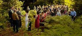
That was exactly the situation when I made this picture. It's a 'grab' shot because I wasn't there to shoot the wedding... I was the host! When Pete Bjordahl and Chloe Swain decided to marry they asked if they could stage the ceremony and reception at my Vashon Island studio home. So I was the 'chief cook and bottle washer' for a 100-person reception. I was running like a chicken without a head and made it out to the 'yard' just in time to shoot the last part of the ceremony. Click click, done... back to the kitchen.
You can see that the left half the picture is in the shadows of the trees in the woods while the right side is in a brightly back-lit open clearing. The exposure differences between the two zones were far beyond the latitude of my camera. Getting one zone right would sacrifice the the other but the exposure was determined by the position of the bride and groom under the trees. So it was goodbye highlights on the right side. No worries, I thought to myself, we'll just fix it in post.
Fortunately I've had a lifetime of experience with blown out highlights and underexposed shadows. Life Magazine photographer Ted Russell and his darkroom wizard Arthur Tcholak mentored me during the 1960's. Ted taught me how to shoot with available light, and Arthur taught me how to print the resulting negatives. Life and the German magazine Twen set the style for photography back then in the pre-strobe age, and the most popular look was available light reportage.
Printing pictures shot in available light is no easy task. I learned pleanty of special techniques to nurse details out of underexposed and overexposed negatives. Film actually has an edge over digital for recording such details. No matter how overexposed film highlights are they can nearly always be burned in sufficiently to get some details. Not so with digital capture. Once a pixel hits 255 it's hit the wall... no details are in there to coax out.
If you're reading this you know the highlight problem is double trouble. It's bad enough not to have highlight details, but the blown highlight areas show as white which 'dilutes' the overall coloration, making the picture look 'washed out'. There are a few ways to deal with these situations spelled out in my book, Giclée Prepress - The Art of Giclée and in an earlier blog.
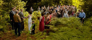
Prepress for this picture involved balancing the left and right sides and then adding 'golden sunshine' to washed out highlights, especially on the right hand side.

Balancing the two sides started with making two duplicate layers of the picture. One was adjusted to look good in the dark part and the other was made as good as possible in the lighter area. The layer adjusted for the forest looked totally lousy in the clearing area, but no worries. By putting the forest layer on top I was able to erase away the blown out parts to reveal the improved light tones on the layer underneath. Erasing with different brushes set for different opacity and 'flow' rates did the trick. Overall the result looked good but lacked 'magic'.
Magic is the way people remember things...they remember things the way they wanted them to be, they way they wanted them to look and not necessarily the way they actually were. The way things look in peoples' memories is usually better than in their snapshots.
'Magic' for this picture involved adding a kiss of gold to the sunlight on the right hand side and to the blown out highlights. Selectively adding some yellow takes away the washed-out look. This is done by adding two new layers:
- Highlight control mask
- Yellow highlight fill
You can't manipulate any pixels that are '0' or '255' on the histogram because there is no information to work with. Some density has to be added to the highlights in order to be able to add color. That is the purpose of the highlight control mask. After there is some density color can be added to the pixels.
Highlight-Control Mask

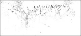
Make the highlight-control mask by duplicating the master picture layer, inverting it and de-saturating it to make it into a black-and-white negative (as above).
Use a combination of brightness and contrast to wash out all but the darkest tones of the negative, which are the highlights of the picture. You can also burn and dodge, erase and use whatever other tools you want to isolate the darkest parts of the negative.
Place the highlight-control mask layer above the master picture layer. Set the blending options for the highlight-control mask to darken and then adjust the mask layer's opacity to something between 5 and 15%.

This is the adjustment that controls the amount of yellow sunshine that you will be able to see when the black-and-yellow high-contrast positive layer is added.
High-Contrast Positive

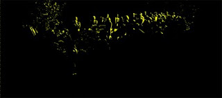
Duplicate the highlight-control mask , invert it to make it a black-and-white positive and separate the tones even more by adjusting the contrast -100% and the contrast +100%. The result should be black and white 'line art' of showing pure white highlights against black.
Select the white color range and fill it with yellow (or whatever color works for your picture highlights).
Blur the black-and-yellow positive using your favorite effect... for this picture it was a touch of 'gaussian' blur. For a more subtle effect first use 'blur' and then 'blur more' as many extra times as needed.
Put the positive layer on top of all others and set the blending options to lighten. Black can't lighten so only the yellow will show, filling in the highlights subdued by the highlight-control mask. Adjusting the opacity of the highlight-control mask underneath it controls the amount of yellow showing.
Using this combination blown out highlights need not be the kiss of death for an otherwise great shot. Just give them a kiss of color and you can kiss that problem goodbye.


No comments:
Post a Comment