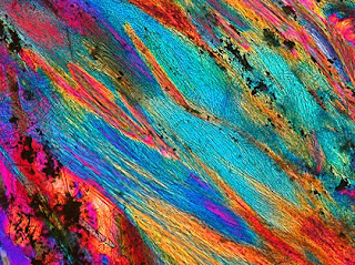
Bernardo Cesare is a 'petrographer' associated with the University of Padova in Italy who came to Vashon Island Imaging online to have giclées made of his work for an upcoming exhibition at the Two Wall Gallery on Vashon Island.
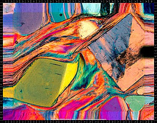
'Petrography' is the study of rocks and Bernardo Cesare (www.microckscopica.org) has been hammering and chipping away at it for two decades. He photographs thin slices of rock through a microscope using polarized light. At first the work was purely scientific and mostly black-and-white. Then he started looking at the subject through the eyes of an artist.
'Through the microscope rocks reveal an unthinkable variety of landscapes, colors and shapes', Bernardo explains. 'This is due to the power of polarized light, enabling "interference colors" to be disclosed', he clarifies.
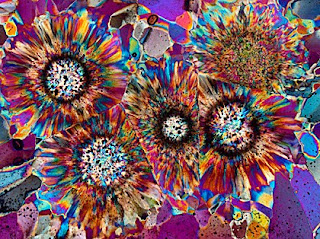
Bernardo's work reminded me of a collection of crystal studies by John Emms which we giclée and publish at Vashon Island Imaging (see next two pictures). Emms also uses the microscope and polarized light combo to produce results that can rival 'modern art'. We are familiar with this type of work and how to make it look good from printing Emm's images, so Bernardo's pictures fit right in with our skill set.
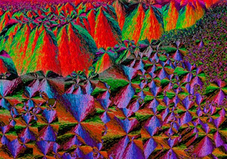
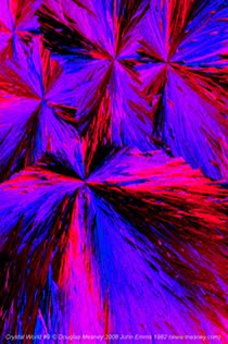
Emm's 10-image 'Crystal World' collection is printed on Epson® Premium Satin Canvas coated with three brushed coats of Golden® MSP Gloss Varnish for a nice shiny surface and strong blacks. (Since then we have switched to Golden® water based Polymer Varnish with UVLS, which we spray on instead of rolling or brushing.) Emm's crystals can be seen at www.mesney.com in the Fine Arts gallery section.
Epson® satin canvas has a higher weave profile than their matte canvas, so if you want the touch and feel of canvas it is your best choice. The matte canvas has a much smoother surface that appears almost paper smooth after a few coats of varnish.
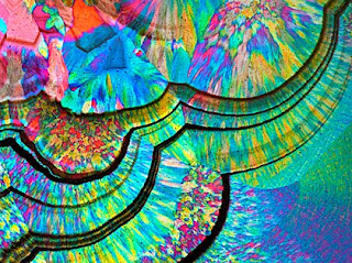
Cesare's photo-micrographs have strong saturated colors and need good dmax to make them sing. We recommended that he stay away from matte anything, which would subdue the colors and reduce the dmax. Upon inquiry Benardo noted that he wanted strong color and a 'real canvas feeling'... just like John Emms.
If it weren't for Bernardo's desire for the touch and feel of woven canvas I would actually have recommended Outré® 22 Mil PolyCotton Water Resistant Gloss Canvas (ACG222410) which is whiter that Epson®, making colors pop even more. However that canvas has an unusually smooth surface and is rather thick and more 'rubbery' which makes stretching a bit more challenging. Their matte canvas (ACM222410) has a more distinct weave and is also super white. (If you decide to try the Outré® canvases -- and I encourage you to do so -- be sure read my blog about them).
Bernardo reckoned that it was more cost efficient to produce the show locally than to ship it half way around the world. However the petrographer was petrified that getting the color right from such distances might be hard as rocks.
Correct color is a conundrum for artists and printers everywhere. In previous blogs and in my book I've gone to great lengths to explain that 'color match' is a dream. However you can get damn close with good color management techniques... and good communications.
At Vashon Island Imaging we go to great lengths to get color right, in this case all the way to Italy. That sounds more impressive than it is because in today's 'global village' virtually everything is done online which makes physical distance irrelevant. Or does it?
Picture professionals that deal with printers know that clients are normally requested to approve color proofs and even attend press runs to OK the color one last time. But that doesn't work online and won't until teleportation is perfected. Until then, there are a few simple thing things you can do to get color right.
Monitors should be profiled but many of our clients haven't done that for various reasons. So when files come in many of them are untagged, as were Bernardo's. Those are assigned our house color space, Adobe 1998. Files that come in with other color spaces are converted to the Adobe space.
There is rarely a job that passes through our giclée department without test strips. We like our clients to OK those test strips, although many forgo the option because they trust our judgement. After all, we have a reputation for getting color right... the result of thorough prepress work to maximize the quality of the giclées. Test strips are the last step in a long chain of events that starts with the image file itself and a consultation with the client about their 'philosophy of color'... part of good communications.
Our online 'consultation' with Bernardo (an email thread) determined that the images for the exhibition would be produced as 20 X 15-inch stretched-canvas giclées. The strong-weave Epson® Premium Satin Canvas was selected, coated with gloss varnish.
Bernardo asked for the giclées to be 'wrapped', which is extending the picture around the edges of the stretcher bars (called 'Gallery Wrap'). However, his pictures would lose too much real estate to the wrap. He was ready to settle for just a color around the edges until we showed him our 'Faux Wrap'. How you make this look is described fully in my book (Giclée Prepress - The Art of Giclée) but the gist of it is to slice off a quarter inch on each side and stretch the pieces (transform scale) to create the wrap, as you can see in the picture below. Note that the apparent black border is actually 1/2-inch-wide rulers placed along the edges of all our giclée prints to facilitate even placement of staples when stretching the canvas and even positioning when mounting.
Besides making the faux-wraps our prepress work primarily involved the color. We asked Bernardo to send the pictures surrounded with a border of 50% gray. In that way we were able to use the neutral sampler tool in Curves to get the basic colors right. Then some basic adjustments were made to Levels, mostly to compensate for the fact that Bernardo was putting together the images with a Mac system and we are a PC operation. Images coming from him look inherently too light and 'flat' to us, and ours going back to him appear darker and contrasty. After that the color work is more interpretive and system specific.
Every printing machine has its own 'sweet' colors and others that need a little help... something only the press operator knows. That is the real task of prepress, to adapt an image file so that the colors print correctly on a specific machine be it a printer, an electronic display or a piece of photographic film or paper.
To be sure I was on the right track, I did some 'interpretive' color adjustments on one of the files and sent it back to him for an online color check and with that approved went on to prepress the others. Nice big files were sent back and forth via ftp. Instead of test strips we made 1/2-scale files of the press-ready images for Bernardo to analyze in his laboratory studio.
In most cases Bernardo approved my color work but on one piece I had to back off. When I sent back his original, Bernardo made some color adjustments of his own which came to us as mixed signals because of the confusing nature of color adjustment in PhotoShop®. Bernardo's instructions were to make the following adjustments to the mid tones of the image:
+ 20 Yellow
+ 20 Magenta
- 40 Cyan
Those familiar with photographic color correction realize that the above filter pack equals an adjustment of +20 Red. His arrangement of the sliders produced the look he wanted even though is was an odd combo. We made the +20R correction and the resulting 'proof' was approved.
The confusing part of the Color Adjustment sliders is that there is no 'minus' even though that's what the numbers say. Each slider goes back and forth between two complementary colors. Complementary colors cancel each other out. That is, mixing two complementary colors produces neutral gray. Minus blue is plus yellow. Minus green is plus magenta, and so on. That is why Bernardo's three adjustments were equal to just one.
+ 20 points of Yellow cancels out 20 points of the Blue component of Magenta, leaving 20 points of Red (Magenta = Red + Blue). Then, that twenty points of Red cancels out 20 points of the -40 Cyan correction. The result is a net adjustment of -20 Cyan, which is actually +20 Red. Confusing, eh?
Bernardo won't be at the exhibition at Two Wall Gallery unfortunately and if his works sell (which I'll put my money on) he'll never see our glorious giclées of his petrographs. We'll just hope that word gets back to him that his colorful artwork rocks in the US of A!.
See more of Bernardo's work at http://www.microckscopica.org


No comments:
Post a Comment