It came as no surprise therefore when Jacquelyn Lown (jacqui.lown@gmail.com) arrived at our doorstep with a dozen and a half new pieces for copying and giclée printing. You remember that cartoon of the laughing guy asking 'You want it when...?!' That could have been me when Jacquelyn said she needed them in done in two days. It would be a tall order even if we charged rush (which we normally don't -- who can afford that anymore?).
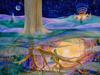 Facing The Light by Jacquelyn Lown. This picture is special for me as it depicts how I feel when I am in my studio making pictures and printing giclées.
 After changing into my "Mister Efficiency' outfit I got the originals organized into size places and got the studio ready to shoot them. Twelve pieces were oils and watercolors that were shot on the outdoor stage. The other six were transparencies that were shot indoors using a copy stand equipped with a light source from an old Super-Chromega® enlarger.
Copying Dimensional Artwork
We do most of our art copy shooting in our outdoor studio. Nothing beats natural light, but you have to control it just as you do artificial lights. The stage should be evenly lit by light that is between 5200° and 5600° degrees Kelvin... called 'Daylight' on many cameras.
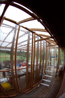 The outdoor studio at Vashon Island Imaging features a transparent ceiling and walls made of rigid plastic. Diffusion material and/or 'flags' (shadow boards) can be stapled to the wood framework wherever needed.
Artwork is shot against a white background and a photographic gray card is included in each shot. I usually tuck the card behind the piece being shot, letting it stick out on one side like a tag. Later, this little patch of gray will be sampled to manage the colors, keeping them 'correct', using Curves in PhotoShop®.
 This art-copy transparency of Jacquelyn Lown's Between the Worlds has a gray scale and color bars included in the frame to aid in color management during reproduction.
If we are preparing files that will be reproduced by others, a gray scale and color bars are also included along one edge of each shot. These facilitate the use of 'Auto Levels' in PhotoShop® to establish precise colors that are closer to those in the original than you usually get with that 'tool'.
Any automated function will work better if you include a gray scale and color bars in the frame so that those algorithms 'see' and recognize things they look for in every picture. Among those things are black, white, 'neutral' gray as well as a range of colors. If the original lacks those, Auto Levels will create them.
When the black and white points in a picture shift the entire tone range is dynamically altered. The result is usually a noticeable contrast kick and stronger color.
Many pictures lack black or white or both. A picture taken on a foggy day comes to mind, like the one below. Such a picture has only mid tones. Stretching that flat tone range to include black and white completely alters the look of the picture, However, that is what Auto Levels does when it can't find black and white points in the shot. Therefore, if you include black and white to begin with, they will act as 'goal posts' throughout the reproduction and printing cycles.
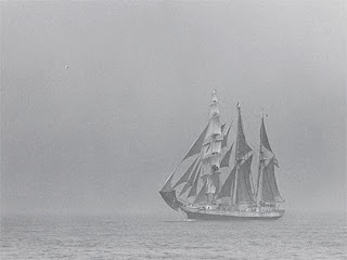 Ghost Ship Albatross was shot in 1965 from the top of the mast of a 56-foot English cutter skippered by the late Van Waring. Wiley Crockett hoisted me up there to shoot pictures of he and the crew from on high. Suddenly the 'ghost ship' appeared out of the fog like an apparition. I shot this picture and then the camera jammed. When the film was developed this was the only shot that came out.
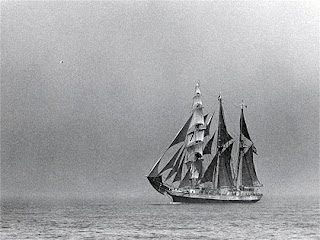 When Auto Levels is applied to the picture the entire dynamic tone range is altered. The original black point was 73 and the white point 235 (in Levels). Auto Levels pulls the black point back to zero and the white point to 255. That impacts the mid tones as well as can be seen clearly.
You might ask, 'If it is such a hassle using Auto Levels, why bother?' Speed and efficiency is the answer. If you set things up so that you can get the Auto Levels tool working for you, instead of against you, you'll be 'in like Flynn' to quote my late progenitor.
But, back to capture...
A Great Capture Looks Awful
Set the camera for the color of the shooting light(s). Simple cameras have settings like 'Daylight' or 'Flash' or 'Indoor'. Sophisticated cameras let you dial in the exact Kelvin temperature, or close to it. There will never be an exact match but get as close as you can.
Find the right exposure by changing it until the white background is white and then underexpose by 1/2 f/stop. That is, if the correct exposure for the white BG is f/11, the correct exposure for the capture is midway between f/11 and f/16, or minus 1/2 stop.
Most cameras allow for half-stop and third-stop 'bracketing'. Bracketing is shooting more than one exposure of a picture. In the old days you bracketed to make sure you got a good one. Now you do it for HDR -- 'High Dynamic Range' -- combining the best parts of exposures made for Highlights, Mid Tones, and Shadows.
Shoot three exposures. One should be the correct white exposure. Then shoot one that is 1/3 or 1/2-stop darker, and a third that is a full f-stop darker. Later, parts of each of these can be isolated and recombined in PhotoShop. The shadow details of the lightest exposure can be combined with the highlights of the center or darkest exposure.
However effective, that is a lot of work ...which can be avoided if you can get friendly with Auto Levels. Being a friend of Auto Levels means giving it what it wants to see.
Begin by getting the basic tone range under control by combining the best parts of the bracketed exposures. The result will still look lousy. Why? Because a good capture should look like your laundry... dirty whites and faded blacks.
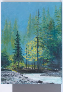 RAW file capture of Jacquelyn Lown's Blessed Day. Notice gray card at bottom of frame. Note also that the white background isn't white... it's light gray due to 1/3 f/stop underexpsoure. However, both the white BG and gray patch are both neutral gray indicating that the color temperature setting was correct (5600° Kelvin).
 Auto Levels brings this picture 90% of the way, and reducing the Brightness by 11 points (below) finishes the basic adjustment work.
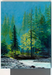
A good capture will have no white and no black. The contrast and colors will look flat and lifeless as a result. The black and white points will be re-created later using Auto Levels, Levels, and/or Brightness and Contrast settings in PhotoShop®.
Black and white are verboten in the capture because neither of those tones has any 'data'. Neither can be adjusted in any way. However, adjustment is needed throughout the reproduction process at every stage of the game. You need to be able to control the flow of black ink (in particular) to maintain the shadow and highlight detail that differentiates a high-quality giclée from an ordinary one.
PhotoShop® Prepress Sequence
Combine the best parts of the bracketed exposures in PhotoShop®. Details about this procedure can be found in my book, Giclée Prepress - The Art of Giclée (www.gicleeprepress.com), and in previous blogs. The gist of it is to put each of the three exposures on its own layer and make a 'Group' of those layers. Isolate and recombine the best parts of each exposure. When you are done , duplicate the group and merge it. Now you have a good capture for further prepress work.
Maybe you are lucky and got everything you need in one shot. It happens, but how can you tell? That is what a Histogram is for, to reveal the pictures tone range. Histograms are the only way to know what you really have... like weighing and measuring the fish once it's in the boat to avoid any misleading 'fish stories'.
If the 'mountains' in the histogram continue beyond the outside limits on the left and right (zero and 255) the total tone range has been clipped. That may not matter, but it is something to pay attention to because the perfect picture's entire 'mountain range' is contained within the zero to 255 histogram scale.
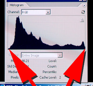
Histogram of a near perfect exposure shows almost the entire 'mountain range' within the limits of zero and 255 (black and white).
 On the left the 'mountain range' stretches beyond the histogram's left edge. On the right, it has moved beyond the histogram's right border.
Checking histograms as you shoot will help you zero in on the perfect exposure or bracketing combination. Capture and contain the entire mountain range by shooting as many exposures are needed, or by adjusting the lighting so that the range from black to white fits within the sensitivity range of your capture device. Making the tone range fit is why Hollywood trucks around lighting crews, to provide fill-in light so that detail in the shadows can be captured together with pristine highlights that aren't blown out by overexposure.
But that extra quality may not be what's wanted. European filmmakers use less artificial lighting, relying more on available light. The look is totally different from Hollywood or Bollywood productions. The shadows are deep and the highlights usually blown out, like good reportage photography in the traditional style of Life magazine.
All pictures are not created equal. Each has a unique look all its own. Remember the fog picture? It is therefore impossible for one set of instructions to work for all pictures. That said, the following basic procedures will establish a starting point for advanced prepress in the worst cases and may well be all that is needed for the rest of your art-copy captures.
Prepress Procedure for Art Copy Captures
1.) Geometry
2.) Cleanliness
3.) Levels (Auto Levels)
4.) Brightness & Contrast
5.) Color Balance
6.) Hue & Saturation
7.) Sharpen
The very first thing to do is make sure that the picture's geometry is correct and that the image is spotlessly clean. There is no sense copying faulty layers to work on, eh?
Most geometry corrections can be made using Skew and/or Perspective controls in Edit / Transform. When using the Skew tool make only one adjustment at a time. If you get one corner right and try to do another it may fight you.
Use the Rubber Stamp tool to clean up dust and scratches. Your digitally shot captures of originals may not be so bad, but film copies will likely need a lot of cleaning, so allow enough time and budget for that tedious opportunity to enjoy the 'Zen' of giclée.
One way to minimize the dust and scratches problem is to use a diffused light source when shooting, like a light box made from 'milk glass' or other diffusion material. (Scanners intensify dust and scratches because of their direct frontal lighting of the subject requiring special algorithms for basic cleaning.)
Label the cleaned and straightened picture as the 'Master'. Duplicate this layer for the next step. Subsequently, after each of the following steps duplicate the layer for the next operation. In the end you should have a nice stack of layers. To avoid confusion, I usually label each layer with the specifics of what was done, for example, Picture_ Name_Brightness+22_Contrast-11. Good labeling enables you to understand what you did even years later.
Levels (Auto Levels) Adjust Tone Range Histogram
Auto Levels should be your next step. You may not agree with its result, but even if you don't you will get a sense of what you might be able to do better using manual controls (Levels and/or Brightness & Contrast).
Auto Levels is a mysterious algorithm. Like so many other unexplainable things, sometimes the magic works and sometimes it doesn't. When it works, Auto Levels will bring a smile to your face as you see the result of the several changes it makes to the picture.
The lightest tone in the picture is stretched all the way to 255, and the darkest tone pushed to zero. That increases contrast and color saturation. But there's more... Auto Levels also removes tints and generally brightens things up... a bit too much in fact, but both of these 'problems' are easily corrected.
After applying Auto Levels sample any white point in the picture using the Eye Dropper. Note the ink numbers for that white area which can be found in the Info panel. You will likely see that RGB is 255 and CMYK is near 100. That is not good. Remember the part about adjustments? The lightest tones should still contain some ink, very little but at least some. That is the mark of a great print.
Info is your friend and if you keep your eye on that panel you can easily keep all your tones under total control. No combined total ink load should ever be at zero or 100%. The most you want to see is 97% on the darkest darks and 3% to 5% on the lightest tones. Your job is to play the field between those two 'goal posts'.
Reduce Brightness 11 Points
If you have used Auto Levels the next thing to do is move the white point from 255 to about 275. Huh? There's no 275 on a histogram, you say? There is, but it is off the chart. That is why whites cannot be dirtied using Levels. White and black points are fixed in Levels. To move the white and black points off the chart use Brightness & Contrast adjustments.
As noted earlier, the Info panel should reveal 3% to 5% ink (CMYK) in the whites. Reducing the Brightness by 11 points will accomplish that when the original whites are at 255 RGB and possibly blown out.
Gray Card Provides Accurate Colors
While working on the above the picture's color has changed and must be brought back to where you like it.
Sample the gray-card patch in the capture with the 'Neutral' Eyedropper in Curves (you can crop out the gray patch after this step). Notice how the colors snap to a more 'correct' look.
If you included a gray scale, click on the black point with the 'Black Point' Eyedropper and then the white patch with the 'White Point' Eyedropper. Be prepared to step backwards and possibly only use the neutral eyedropper if the other two adjustments seem too severe. Or just do them on a separate copy of the layer, if only for comparative purposes as you futz around manually.
While you are using the neutral eyedropper notice that as you sample different gray areas you will get subtly different results, one of which is bound to please or provide a firm foundation for further work using Image / Adjust / Color Balance. Remove or add tints using the same adjustment tools.
Color Balance adjustments are dramatically different depending on whether you apply them to light tones (Highlights) mid tones (Mid Tones) or dark ones (Shadows).
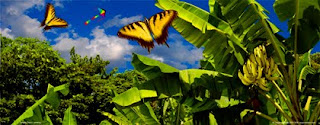 This picture uses a 'cross' in which one color is added to the shadows and its complement to the highlights. In this scene, yellow was to the shadows and blue to the highlights.
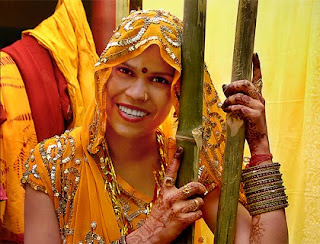 People benefit by beefing up the shadows with red and some yellow. Then, adjust the highlights according to their color in the original. Often that is blue because the light that reflects off things is from the blue sky, not the yellow sun.
Mid-tone adjustments are done last to fine tune the balance you created between the highlights and shadows.
Hue and Saturation are last on the list only because one has to be last so the others aren't. In practice its not quite as sequential as the list, being more of a back and forth thing between the various types of adjustments... they enhance each other's effects in a symbiotic way... especially saturation.
Many Layers Makes Life Easier
There are so many adjustments. As you go through them you will find combos that you'd like to keep. I do that by making more and more layers. The files get enormous but, so what? Memory is cheap.
More layers = more easy. Separate the parts you like from each and recombine them into new groups. Merge those and add more parts as you move on. It's an evolving process as you identify and deal with each major region of the picture.
Build the Soul of the Picture
Just like every picture tells a story, each has a soul. The soul of the picture is its 'look'. Pictures have looks. Artists' styles have looks. People have looks. Everything has a look. Looks are part of something's identity.
The soul of a picture rests in the dark tones. Adding extra color to the dark tones using Color Balance tools can reveal the soul of the picture. But what's dark? In the case of the fog picture you get a more visible result altering the mid tones, although dark tone adjustment will still add extra color depth. Whatever the result, you will know it when you see it... that's the nice thing about pictures.
Art Captures from Slides and Negatives
Capturing images from slides and negatives involves the same rules of the road as shooting originals. However, you'll have an easier time of it because the dynamic tone range has already been flattened by the photo-mechanical reproduction process. All you have to do is find the correct base exposure. After that, almost any slide or negative you shoot will have a perfect or near perfect exposure.
That's great if you are satisfied with what was in the original slide or neg. However, 90% of the time that 'look' can be substantially improved... and that very subject is what my book and this blog are all about.
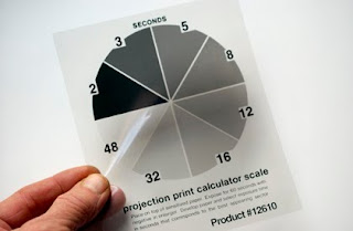 At Vashon Island Imaging we use a basic black-and-white darkroom printing exposure wedge tool. Simply place that on the shooting stage and adjust the exposure (and color balance) until it looks right.
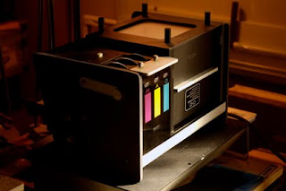
We use a Chromega® dichroic light source from an old enlarger. That allows precise control of the light color. Once upon a time those were the only kinds of color controls. Today, alteration is possible in PhotoShop® so the color of the shooting lights is less important.
One easy way to improve the look of your art-copy captures is to bracket the exposure. Make one exposure to open the shadows and another to trim in the highlights, as outlined earlier in this article. Then segregate the best parts of each exposure and recombine them as a sort of collage. Be sure to include a gray card in your frame, color bars and a gray scale are even better.

 Pictured above are the reference scales from the art-copy transparency of Jacquelyn Lown's Between the Worlds. Notice the loss of detail in dark tones on the right hand side of the gray scale. Clogged shadows and heavy dark tones are a typical problem with artwork copied onto film. Today's digital imaging equipment has a wider exposure latitude that captures more of the dynamic tone range.
Beyond that, all the post processing and prepress work is the same as any other image, following the procedures outlined above.
Environmental Lighting Is Important
During the prepress work, compare your work with the original. Be careful to observe the original art or film with the same color light as your monitor or as close as possible... that means daylight on the cool side (5000° - 6000° Kelvin). Window light is great, but not direct sunlight or 'mottled' light. The closer you stay to a single color light throughout the reproduction process, the better. (You'll never see a cloudy day quite the same way again.)
Similarly, the brightness of the light you use to illuminate the original should be approximately the same as the monitor. Your eyes shouldn't have to adjust for differences in brightness as you glance back and forth between the monitor and the original.
The same applies to the examination of the giclées that eventually emerge from printer. They must be compared to the original artwork and usually some adjustments need to be made to get the colors right. That is because every digital-imaging device has some colors that it reproduces well and others that can be problematic.
Blues 'Blues'
Blue colors are always a problem. Actually, any 'pure' colors present challenges, but especially blue. To get blues right in prints they look way too light on your monitor. That fact makes it almost impossible to get a client to sign off on monitor color... and why you should mentally calculate for an extra test print any time you see a lot of blue.
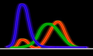 Blue light has a huge amount of energy which throws off image capture and processing devices (as does any primary color).
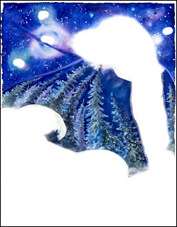
 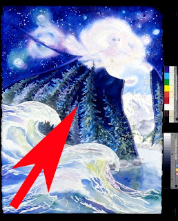 The blues in Jacqui's Between the Worlds are dark and intense. To keep them from clogging up on press, blue tones were isolated on their own layer (below) so they could be individually controlled. Usually, blues need considerable lightening and brightening to appear 'correct' and sometimes need an additional boost with Color Balance and/or Saturation.
 Looking Sharp
Everyone always warns you to do the sharpening last. So it's appropriate to end the blog with this subject, eh?
There are so many ways to use the sharpening tool called Unsharp Mask. There are two major types which I term 'technical' and 'creative' to make their functions obvious.
Creative sharpening is great fun but not part of this particular blog. You can use it to enhance anything crystalline, like ice and snow. It can be used for fab effects, too. The subject is explained in detail in my book and is outlined in some earlier blogs.
Technical sharpening is what you have to do to any digitally captured image to overcome the dithering and anti-aliasing built into the digital imaging process. For reasons too complex to explain here and now some cameras (especially expensive ones) shoot images with edges that appear soft and blurry. They look like you shot them through a Coke®-bottle lens. However, there is a tremendous amount of detail in that blur.
Pictures of distant planets come to mind. Everything we infer comes from what we see, which is so little compared to what actually is. Rather like the shadowy reality described by Plato.
Just as there is more detail in the blurry-looking planet picture than we can see, the blurry edges of digitally captured images can be dissected and their sharpness revealed. That is done with the Unsharp Mask tool.
The amount of sharpening normally applied to my own work is about 10 points per inch of output. Huh?
Unsharp Mask Tool
Three controls comprise the Unsharp Mask tool:
● Amount
● Radius
● Threshold
Amount and Radius are the two principle controls. Threshold has never done anything useful for me, and I therefore pretend that it isn't there.
If you haven't already done so, play with these and watch them closely. Zoom in deep to see the changes at the pixel level. If you do you will see the tool generate lines of contrast between different tones. The more different the neighboring tones, the greater the effect. Eventually, white and black borders separate some tones. Although this can be used as a creative tool, the effect of over-sharpening is to be avoided for most clients' work.
Practically speaking, we apply more sharpening to business graphics and technical drawings than we do to baby pictures. If anything I usually go for a very crisp look for my own illustrations. For client's work I match the amount of sharpening to the look of the original. You know how some pictures are 'crisper' than others? That is what the Unsharp Mask does, it makes things crisper.
Only you know how much is enough, but don't be afraid to step on it. For my own work I always make a final, uppermost layer that is the duplicated and merged sum total of all layers, sharpened individually for each size print. It is the last step before printing. Any earlier sharpening was for the 'creative'. This final sharpening is for the print. The settings I use follow these guidelines:
12 inches: 1.1 / 111
24 inches: 2.2 / 222
36 inches: 3.3 / 333
48 inches: 4.4 / 444
These are 'rules of thumb' and there are many exceptions, especially with large sizes. I haven't gone beyond 48 inches because there are no rules after that. Everything then depends on the viewer distance from the print. You can have a giant print but if people can walk right up to it that severely limits the amount of sharpening you can do. Conversely, I routinely over-sharpen pictures for the Web.
Speaking of the Web, it's time to post this blog. Keep a 'sharp' eye for the next one ;-)


No comments:
Post a Comment