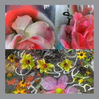
Tom Ridinger is a digital artist whose imaginative works defy their photographic DNA, appearing at first to be watercolors.
Ridinger's illustrations combine gritty city graffiti with
metro blossoms that find their bloom in New York neighborhood gardens.
The series of 20 images is called Rap City In Bloom.
The title puns Rhapsody In Blue a 1924 musical suite by George Gershwin.
metro blossoms that find their bloom in New York neighborhood gardens.
The series of 20 images is called Rap City In Bloom.
The title puns Rhapsody In Blue a 1924 musical suite by George Gershwin.
Tom and I go back all the way to before computers. We are both old dogs of media wars spanning nearly five decades. We met in the Sixties when Tom was an art director at Ziff Davis. Working with Gene Butera, Tom and I brought a European sense of design to Car & Driver magazine feature stories. Many of the pieces we did together were our own version of a photo-journalistic style with roots in Life magazine and the German pictorial Twen. I still have a well worn 1960's copy of that magazine.
"During the years between 1980 and 1999 I spent many hours under Macbeth® lights in printing plants throughout the country," says Ridinger. "I've witnessed 'prima-donna' art directors invade the pressman's territory suggesting and sometimes demanding color moves that did nothing but confuse the issue and make more problems.
"My approach then is the same as now, gain the trust of the printers by letting them do their jobs. What I cared about then was flesh tones and flesh tones only (the exception being corporate brand colors, which were often a fifth color [on a four-color press] so it was never really a big deal).
"It is often a meaningless orthodoxy to try to match colors to the chrome [color transparency or slide] on the printing press when there are frequently too many conflicting issues," the artist concludes.
 A pinnacle point in the collaboration between Tom and I
was an award-winning ad campaign for Motorcycle Industries Council in 1970.
Those were boom years, just before automotive enthusiasm ran out of gas
during the 1973 oil crisis.
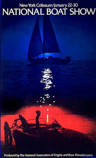
 1972 National Boat Show poster,
for George Rounds at NAEBM,
(National Association of Engine and Boat Manufacturers)
was one of the last projects Tom and I collaborated on.
My current work as a giclée printer has brought us together again... with roles reversed. Now Tom delivers pictures to me, instead of the other way around. Either way, it's great to be working with Tom again and a priviledge to be able to show you his work as a teaching case history for this blog. I am looking forward to printing giclées that make his work blossom.
The Language of Color
My enthusiasm to be working with Tom was tempered by my awareness that printing giclées for long distance clients can present challenges. Many of the traditional ways to talk about color have been become virtually irrelevant in the digital printing environment.
Among other things Pantone® colors viewed by MacBeth® lighting are being supplanted by digital number codes.
Ink-flow that was once controlled by 'taps' on printing traditional printing presses is now controlled with PhotoShop® algorithms like 'Levels, Brightness & Contrast, Hue & Saturation' etc..
The objective remains the same, however: true color that is repeatable.
As it turns out, machines can do better than people when it comes to color control... at least 95% of the time. That leaves only 5% to talk about. That particular 5% is the peak of the giclée pyramid. It is the special 'je ne sait qois' that makes one print great compared to others.
Peak Performance
The other day I was driving back from our Vancouver BC studio and listening to NPR's reportage about a particular violin that was to be auctioned for $18 million... hardly going for a 'song', eh? Anyway...
After chuckling to myself about listening to a 'Strad' (Stradivarius) on an old car radio, I pondered about the instrument and those who its owner (a London collector) might allow to use it.
They played some magnificent bits by maestros playing the violing. That almost got me into the mood for some classical music, but not quite.
I thought about Ferraris (I do that a lot in my trusty little Honda® Civic up and down Interstate 5 between Seattle and Vancouver).
Whatever it is, it's its good as its owner/operator, I thought to myself. For example, me fiddling around with a Strad would be like those million monkeys they talk about. Ibid, the car.
You could have the best giclée machine in the world and still get insufficient results. It's easy... just following the directions.
If you let the machines color manage everything you will get results that are satisfactory for 95% of the people 95% of the time.
But what if that isn't good enough?
Learning to Drive
You can do better if you understand and control what the printer is doing. That, and everything else about giclée, can be discovered in my book, Giclée Prepress - The Art of Giclée as well as in previous (and future) blogs. Meanwhile...
Like violin playing and race-car driving, giclée printing (any printing) is all about nuances. The dynamic tone range of the print can be used to measure the excellence of one print over another.
Traditional photography provides a good comparison. The photo is as good as the print delivered. The print is as good as the darkroom artistry applied during its development. Now of course it's all digital but the same principles apply.
You can read the PhotoShop® manual and your printer's instruction book until the proverbial cows come home but they won't teach you anything about printing. Just as your car manual won't teach you how to drive.
Stradivarius for Dummies hasn't been written yet. Until it is you can trust my book to provide everything you need to know about printing giclées at least. But I digress...
The Music of Color
People talk about the language of color, but can they hear its music?
Instrumentally, how you play your printer will determine whether your prints look flat or sharp. It's all about tuning the picture to the printer. The goal is achieving a dynamic tone range with enough 'rare tones' to provide detail in dark and light tones. It is those areas that are normally deficient. That is, their deficiency has its roots in 'normalization'.
Normalization is my term for the plethora of algorithms that process imagery by averaging.
Averaging is weighted towards mid tones. Tones at the extremes of the histogram are generally sacrificed and must be restored if the giclée is to 'sing'. That restoration is part of the fine-tuning procedures called giclée prepress.
It's All in The Nuances
Great giclée results from a special collaboration between the printer and artist. Their collaboration results in the printer's ability to interpret the artist's intentions. It's all about nuances.
You wouldn't want to accentuate something the artist is sensitive about, would you? Or suppress a key feature? Yikes! Should be -- and can be -- the other way around. As the song goes, ...'you've got to accentuate the positive... eliminate the negative'.
But where to start?
Do You See What I See?
For long distance communications to be effective, it's important that both the artist and printer are looking at the same thing. In the old days viewing the originals and printed proofs under a MacBeth® light system did that, together with PMS® color numbers. People still do that but it's faster and easier to use 50% gray as the common ground.
As you are aware, photographers include an 18% gray card in shots so that users of the pictures can get their colors and tone ranges correct in subsequent reproductions. But what if one of those is missing?
When a good neutral (gray) reference point is not available in the picture, make your own. Case in point, Tom Ridinger's pictures.
 The artwork should be 'floated' over a layer filled with 50% gray.
Use samples of the most potentially problematic parts
and/or areas of importance.
At Vashon Island Imaging (www.vashonislandimaging.com) we ask our long-distance clients to surround their pictures with a 1/4 to 1/2 inch ( cm) of 50% gray.
By using the neutral eyedropper tool in PhotoShop® Curves, and clicking on the 50% gray border, the pictures colors will snap to a correct color tone range.
Using that simple procedure, Tom and I can look at our monitors and talk effectively about what we see... because we are looking at nearly the same thing. Then when I ask him which parts he's sensitive about (if any) he cane tell me and I can prepress accordingly.
From then on its all about making prepress adjustments and test prints that match my monitor (which is a Sun Microsystems® CRT).
There you have it... a short cut for cross-country color management.


No comments:
Post a Comment