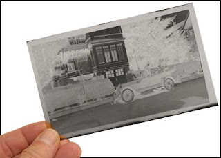
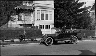
It was déjà vu all over again today as I worked on yet another restoration job. This one involved really old negatives shot on '616', a now defunct roll-film size that once produced large negatives 6 X 3.5 inches (15.24 X 8.89 centimeters). The last time I handled 616 film negs was when I was a junior at Bayside High School in New York. Back then I had a darkroom in the basement of my parents house where I developed film shot with a Rolliflex® (120-size film) and a Minolta SR-2 (a 35mm camera). Word got out that I knew how to develop pictures and one day a customer brought some 616 film for processing.

Yours truly (right) in 1960 with high school classmate Dave Nolte (left). He and I started a photo business in shooting weddings, bar mitzvahs, and portraiture of people and pets.
I remember that the wide 616 film was so flimsy that it buckled easily making it almost impossible to thread onto those old spiral film-processing reels. If you managed to maintain your sanity the resulting negatives produced outstanding prints, however.
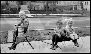
Uneven processing caused by buckling of the film during development results in a mottled appearance that is very difficult to fix, as shown above.
But that was in 1960 at the very tail end of the 616 era, shortly before Kodak® discontinued making films in that size. 35mm format was by then replacing many of the larger old formats, made famous by Life magazine photographers who preferred the 'miniature' size cameras for reportage.
Now good quality prints are often giclées, not photographic prints. To make giclées photo negatives need conversion into digital images.
Photo Copying Vs. Scanning
The process begins with photographing the negatives with a digital camera. This is done with a simple copy stand and light box. The light box light source isn't so important if you are shooting black-and-white negatives. Lining up the camera squarely is important and accuracy when shooting will save you a lot of time later correcting the 'skew' in PhotoShop®.
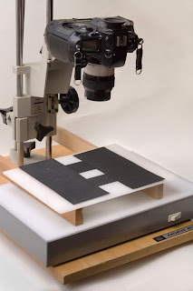
This is the copy stand set-up I use. The light box is swappable. The one pictured is a fluorescent one that I use for copying black-and-white negatives. For color I use the dichroic head from an old Omega® enlarger turned upside down.
You might ask, why not just scan them? Because photocopying delivers a better result than scanning for giclée prints. The reasons for this are detailed in my book, Giclée Prepress the Art of Giclée (www.gicleeprepress.com). There you can also read complete instructions about how to make digital files from film negatives and positives (slides). The gist of it is that good digital cameras have better image-processing algorithms and more precise exposure controls. In addition their dithering is picture oriented. Unless it is a very expensive one, a scanner is best used for business graphics and technical illustrations, like blueprints. The book explains why.
Find the base exposure for an 'average' negative. Use your camera's highlight warning to find the point at which highlights burn out. The highlight warning on my Nikon flashes any blown out picture areas on the preview screen. So I adjust the exposure until the clearest part of the negative film (at the edges) flashes a warning, then back off one third of a f/stop. There should be no 'white' in the digital negative. White should be a shade of light gray (10%-20% depending on the nature of the image).
Once the exposure has been found, I copy all similar average negatives. Negatives that are thinner or thicker than average require some exposure bracketing, but not very much... and eventually the best parts of the bracketed exposures are recombined into a single PhotoShop® layer.
Digital Processing in PhotoShop®
When a picture is first opened in PhotoShop® it is the Background, which is fixed and resists certain adjustments. Right click on the Background and change it into a normal Layer. Label that layer as the original master, copy it (to make a working copy) and then turn it off and forget about it. Then use the working copy for the following PhotoShop® processing sequence:
● Invert
● De-saturate
● Auto Levels
● Duplicate Auto Levels layer

If you have a lot of pictures to prepare, you can make a PhotoShop® Action of the above sequence. That will save you a lot of time. The rest of the procedure involves manual adjustments in this sequence on the duplicate of the Auto Levels layer.
● Levels
● Brightness & Contrast
● Tone Balancing (Gradients)
● Burn & Dodge
Levels
When shooting the original negative your slight underexposure should have delivered a digital version with a light gray white point. Now you can trim that back closer to white using the Levels controls. Likewise, trim in the black point. Then adjust the mid-tones for the best overall look.
Brightness & Contrast
Tweak the look created with Levels adjustments by using Brightness & Contrast controls.
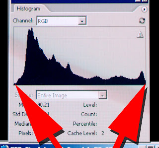 Levels histogram shows black point on left and white point on right. Those points are like goal posts and all the action happens between them. What is white stays white and what is black stays black.
The black and white points are fixed when you use Levels. The darkest tones cannot be made darker. Nor can the lightest tones be made lighter. That is what Brightness controls do.
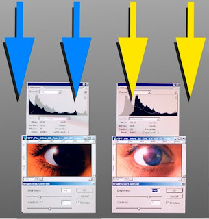 Turning down brightness moves the black point left to a point that is off the histogram (blue arrows). The opposite occurs if you turn up the brightness (yellow arrows). Anything off the chart doesn't show in the picture.
 Brightness controls move the white and black points beyond the left and right chart boundaries of the chart. Anything off the chart doesn't exist. That means the dynamic tone range is shifted up or down (or both) until white and black are shades of gray. This is fully described in the book.
Contrast flattens the amplitude of the curves, compressing or expanding the tone range dynamically. Reducing contrast compresses both light tones and dark tones closer to a single tone, 50% gray. Increasing contrast pushes the tone range the other way, toward two tones, black and white.
Gradient Tone Balancing
Frequently one part of a picture is too light or too dark compared to the rest of the picture. If so, make two duplicates of the image layer. Adjust one for the light part and one for the dark. Put the dark one over the light one. Make a layer mask for the upper layer using Gradients. Tweak the blend by erasing away parts that are unwanted.
Painting With the Eraser
A similar technique is to make one layer adjusted for darks and another for lights. I usually put the darker layer on top and erase through it to reveal the lighter layer below. The technique is like painting with light. Adjusting the opacity of the Eraser can make subtle effects.
Multiple Layers for Greater Control
Make as many different layers as you need to generate the widest possible dynamic tone range... the most tones. The layers can be individually adjusted for the parts of the picture that need work. They can also be used to bring out the subject(s).
Burn & Dodge
After the above procedures use the Burn and Dodge tools to fine tune tone balance.
Negatives that are extremely under or over exposed can't be totally done with the overall adjustments described above. For those kinds of images try to get a good range of mid tones. Doing that isn't usually a problem as under and over exposed images generally have low contrast.
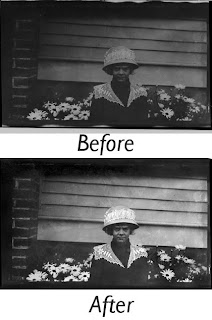 This underexposed picture had its highlights and shadows restored using the burning and dodging techniques described below.
To build contrast start by alternately dodging highlights and burning shadows. Use a light touch (intentional pun). Build up the contrast slowly. A dash of mid-tone work here and there helps even out look. After building the contrast to a 'certain' point you will be able to use global adjustments (Levels, etc.) to get closer to a normal looking picture.
Instant Sepia

Sepia is a popular look for old pictures. For 'instant sepia' shoot the negatives with your camera set for 6700°-7200° Kelvin (if you are using a daylight-balanced light box). That fools the camera and produces brownish colored images that are easily tweaked in PhotoShop® to the sepia shade you prefer.
True, when you invert the negative into a positive the brownish yellow tones will become bluish cyan ones. However, those can easily be reversed back to sepia using Hue & Saturation controls together with Color Balance.
Sepia is only one of many traditional tint colors for black-and-white pictures. Those who practice the alchemy of darkroom work use special chemicals called Toners to change or replace the silver halides in photo prints making them look warmer (reddish) or colder (bluish). Some popular toners are Selenium (red-brown to purple-brown tones), Blue (cold grays, actually), Gold (blue-black tones), Copper (reddish tones), and Iron (blue tones). PhotoShop® adjustments can easily match any of those looks, especially using multi-tone, gray scale tools.
Multi-Tone Variations In Grayscale Mode
Working in gray scale mode (vs RGB or CMYK) variations are possible using multi-tone tinting controls such as these:
● Duotone
● Tritone
● Quadtone
You'll need to convert your image to gray scale to use those tinting tools but after you've gotten the effect you want you can always switch back to RGB, and then further tweak your colors with the adjustments described earlier in this article.
The Color of Money
 One color I'm sure you'd love to tweak is that of your money.
 Converting photo negatives to digital images for giclée prints will bring you a new category of customers and a lot of new business. At least that has been our history at Vashon Island Imaging. It's a history that I hope will keep on repeating itself.


No comments:
Post a Comment