Back in the day I developed a way of enlarging grain even more by dipping the wet film alternately into very hot and cold water. That technique is called 'reticulation'.
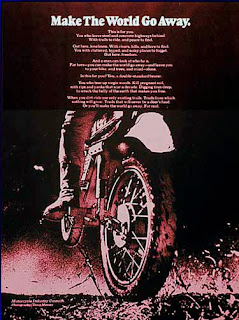 Monster-sized grains became the featured look of this 1969 public-service advertisement for the Motorcycle Industries Council. The 6-ad campaign presented ecologically oriented messages and was cited by the lauded publication Communications Arts®. It was a collaboration between Car & Driver® magazine art director Tom Ridinger, Cycle® magazine copy writer Art Guerero, and yours truly.
 If you are a man you can well understand how reticulation works. What happens if you relax in a sauna and then jump into ice water? Certain parts shrivel up, eh? That's what the grain does too. Reticulation forces smaller grains of silver to clump together into larger grains.
To make monster-sized film grain I used Kodak® Tri-X film and shot it at ISO 3200, which is 3 stops faster than the film's normal ISO 400 speed. To boost the film speed like that you over-develop, that is you develop it longer or use a higher temperature or both. Pushing one stop requires a 25% boost in development time; pushing two stops needs a 50% boost and 3-stops needs 100% more time if the temperature is 68° F (19° C) . Instead of standing there in the dark for a half-hour I'd boost the temperature way up. Then right at the end I'd dip the film into ice water. Zap!
The first time I used the grainy look was for Ghost Ship Albatross.
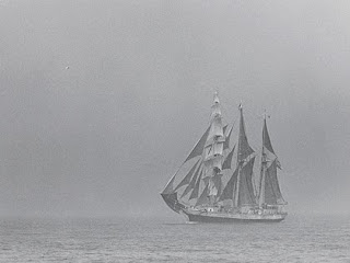
There is a story behind this picture. It was taken from the top of the mast of a 56-foot English cutter sailing in the Block Island Race Week regatta. I was hoisted to the top of the mast in the bosons chair (a canvas sling) while the ship was under full sail. At the top of the mast the rolling of the ship is intensified. Hanging on for dear life and trying to shoot was bad enough. Then I fumbled while changing rolls and all my film fell into the sea... except the roll that was still in the camera, which had this shot. So it's special for me.
Ghost Ship Albatross made its first appearance on the cover of a brochure for the National Association of Engine and Boat Manufacturers, sponsors of the New York Boat Show®. But that was in 1972 and since then a lot of water has passed under my hull.
Recently I rescued a 60 X 40-inch (152.4 X 101.6 cm) print of the picture that had been in storage and was suffering for it. The print was made by a New York custom lab called Modernage back in 1972 and adorned one of the rooms in my studio at 23 East 73rd Street. As I hung it in the Vashon Island studio I thought to myself, what a voyage this print has made.
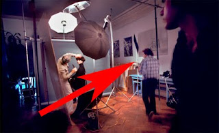 Red arrow points to Ghost Ship Albatross on studio wall at my New York studio in 1973 and to yours truly (in blue checked shirt) photographing the late great hair stylist Arnold Miller at work on a model. Arnie was the founder and brains behind Matrix Essentials®, which was sold to Clairol® by his wife Sydell when Arnie died in the early 1990's. It always blew me away that the CEO of a giant company would do his own styling work... then again, he was a superstar on the international haute coiffure scene.
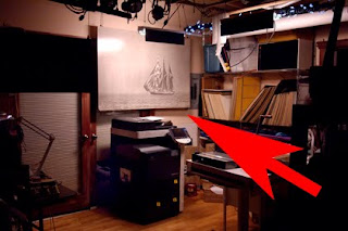 Today the very same print of Ghost Ship Albatross has found safe harbor in the Vashon Island Imaging printing studio.
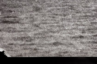 This 7-inch (17.5 cm) lower left corner section was particularly damaged by time and travel. First it went from New York to Hawaii where it lay in storage from 1981 to 1991 before being shipped to Vashon Island where it remained in storage until a couple of months ago when I started feeling sorry for it.
 To my surprise the old water-damaged print got a lot of attention and I could tell that folks were genuinely enthusiastic about it. So I decided to publish Ghost Ship Albatross as a limited edition of giclée prints. That's when I discovered that the original negative had gone missing in action. There are more than 500,000 pictures in my old film archives and the archive was organized way before computers.
At first I thought I was in luck when I found the envelope containing the original 41-year old 35mm negatives from that infamous roll. But the one negative I needed had been snipped off the roll and wasn't there! You know how that goes... I had put that very special negative in a 'safe' place. So I decided to use a copy negative made of a 20 X 16 inch (50.8 X 40.64 cm) exhibition print from an old portfolio collection.
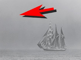 The red arrow points to a bird in the fog -- the 'albatross' -- enlarged below.
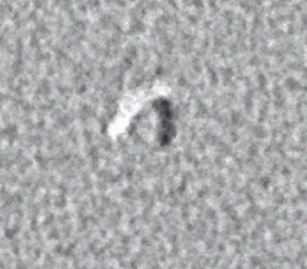 Darkroom technicians at Modernage thought that the bird was a dust mark and they very carefully retouched it out of the big 40 X 60 (152.4 X 101.6 cm) print I ordered. You can imagine my horror when I opened the package. The albatross shown here is 280 X 280 pixels, representing a 1.2 inch (3 cm) section of the 32-inch-wide print (81.28 cm). Blogspot limits pictures to 320 pixels on the long dimension, which makes it difficult to show details. Sometimes I enhance them for illustrative purposes, so that you see a closer approximation of what I see. Its a step beyond color management... you could call it 'perception management'.
The copy negative was shot 4 X 5 inches (10.16 X 12.7 cm) to accurately recreate the grain texture in the original. Shooting a large format picture avoids the problem of grain enlargement.
Copying Can Make Grain Stronger
Grain enlargement occurs with smaller formats because they don't have enough grains of their own to capture each individual grain in the original. Micro-clusters of grains are rounded-up into single grains.
Any rounding involves averaging, so the single-grain version won't have the same perceived color as the original cluster. The result is stronger looking grain... which may be a good thing in some cases, but not this one.
The tendency toward stronger grain is further enhanced by the contrast kick that occurs in any photocopying process. This phenomenon and its implications are discussed in detail in my book, Giclée Prepress - The Art of Giclée (www.gicleeprepress.com).
The 4X5 negative is copied with a digital camera. Two exposures are made, one with a softening filter on the camera lens. The softening effect should be ever so slight. The purpose is to get an alternate set of grains that contain more mid tones. The two exposures are merged into a single layer for further prepress.
I can hear you saying that the picture could just be softened in PhotoShop®, but the effect is not the same because you are softening only one set of grains. Have a second set of grains creates a third generation when the first and second grain sets are merged.
Fine Tune Grain with Unsharp Mask
All pictures taken with digital cameras need to be sharpened to some extent, some more than others (see picture of test strip #1, below). That is because digital cameras use algorithms that involve a certain degree of dithering, which softens the edges between pixels. There's much more about that in the book but the gist of it is that you need to sharpen using Unsharp Mask.
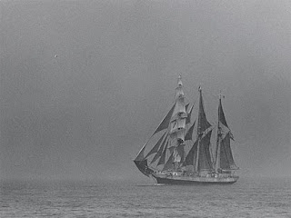 Sharpening the image 4.4 / 444 delivers sharp grain but makes the picture look darker.
All sharpening increases the contrast of pictures and also changes the dynamic tone range, eroding mid tones. That is one reason mid tones need to be retained in the copying stage.
The grain texture in the digital master needs sharpening to get rid of the camera's dithering and get closer to the look of the grain in the original. However, if you have strong grain to begin with the amount of sharpening needed may kick the contrast too much and make the grain look too strong. That can be minimized by making several copies of the image layer, sharpening them to varying degrees, and tweaking the look with adjustments to Layer Opacity and Blending Options
Test Strips Reveal What Monitor Doesn't
Grain matching can't be done on your monitor. Test strips are a must. As you can see from these three, the look of the picture was altered by the degree of sharpening.
Test strip #1 shows the un-sharpened, dithered original image.
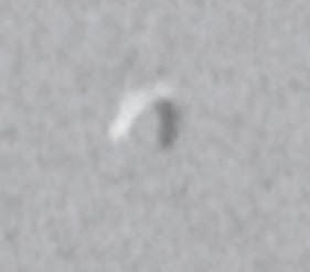
Test strip #2 shows result of heavy sharpening (4.4 / 444) and looks too dark and contrasty*.
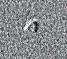
Test strip #3 combines the contrasty -- but very sharp -- layer (test strip #2) with a third layer that is a copy of the original (test strip #1) sharpened 1/4 as much (1.1 /111).
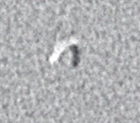
Final look has layer blending that is 44% of the sharp dark layer (44% opacity and 44% fill) on top of the lightly sharpened layer.

* 4.4 / 444 is a heavy setting for the Unsharp Mask unless you are making large prints. The print made of Ghost Ship Albatross is 36 X 24 inches (60.96 X 90.44 cm) and at that size the sharpening setting is 'moderate'. There have been instances when I have doubled up on the sharpening. If you like grain, that double dip should satisfy your taste for true grit.


No comments:
Post a Comment