I call my Wonderland the 'Zen of Giclée'. It is a meditative state, often a contemplative one... a trip down into the canyons and crevices of my own mind. A lot of things get sorted out there but it's hard to reach the Zen state under normal circumstances because of all the distractions that impede deep thinking.
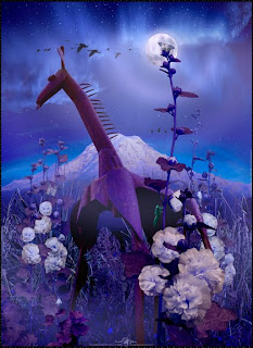
I was deep down that hole a couple of days ago when I was in the middle of making this new picture called 'Exuviae Illuminati' for the Giraffe, a trendy shop on Vashon Island that features Fair Trade items for home decor (http://www.giraffevashon.com/).
Originally I was going to get into a collection of pictures taken in Africa back in 2005 and make an illustration of a real giraffe. Then I discovered a statue of a giraffe by Vashon Island metal sculptor David L. Erue and that changed everything.
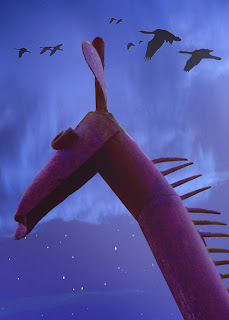
'Rediscover' would be more accurate since I drive by David Erue's studio every time I go to town. He lives 'right around the corner' and next door to some other friends. Visiting those friends I had a close encounter of the visual kind with Erue's life-size metal statue.
Drawn like a magnet to the rusting iron beast I found myself lying on the ground looking up at it through a wide-angle lens and shooting enough frames to collage a super-high-resolution (large) picture of it. That was the point of departure for an 80-hour voyage between the idea for the picture and its actualization. During that voyage the idea went through several metamorphoses on its way to becoming the finished illustration.
In this case the picture's subject (which is a dragonfly's exuvia) symbolizes the creation of art as well as the insect's metamorphosis from one state of being to another.
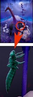
Exuviae are discarded shells left behind by insects, crustaceans and reptiles who either molt them or climb out of them after metamorphosing from one state to another. As remember that as a kid I discovered the exuviae of cicadas, an insect that morphs every 17th year.
Like a mosquito's, a dragonfly's life begins in water as a larva, which develops into a nymph, seen below in a jar of pond water.
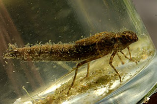
Dragonfly nymph ready to morph.
After up to five years under water the mature nymph climbs out of the water, clings to a branch or leaf, opens a 'hatch' in the shell behind its head, then climbs out as an air-breathing acrobat with aerial abilities unsurpassed by any other creature except possibly hummingbirds.
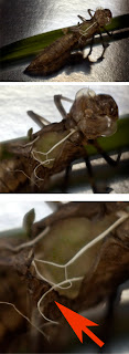
Red arrow points to edge of hatch. White 'strings' once held the shell to the nymph.
Airborne adults have up to two months to find mates and propagate (they do it '69' while flying!). Fertilized eggs are laid in or near water. Our pond at the Vashon Island studio is a favorite hunting and breeding ground for dragonflies and the marvelous creature features in several of my illustrations.
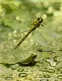
Pond Politics is the title of this illustration of dragonflies and a frog living in our pond.
The five year span of a dragonfly's life is 7.7% that of a 65-year-old person's. If I were a dragonfly, then I would spend 60 years underwater and five years as a flyer. (Can you see what I mean now about falling into the Wonderland hole?)
The creation of an artwork is a lot like the creation of a dragonfly. You spend a huge amount of time 'under water' (some people call it being 'in the weeds') preparing all the elements of the picture. The assembly of the final picture composition takes little time in comparison. It's like cooking food Asian style... hours spent chopping ingredients for a final 'flash in the pan'.

Indian chef Sam Rajarora whips up some flaming hot Punjabi fare.
Pictures start with an idea, which is then heavily influenced by the opportunities and challenges encountered manifesting it. This illustration is no exception. For example, the hollyhocks that really make this picture came into it a couple of days after I shot Erue's giraffe statue (David says it's a bird but for me it's either a giraffe or a dinosaur). Before them it was a very different picture.
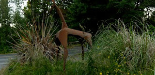
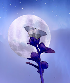
I really liked the spiky dry pompous grass around the giraffe and was working on paths for those picture elements when I was distracted by a change in the lighting outside my studio window by the pond. Some clouds had gathered covering the sun... perfect lighting for my other pet project, a picture entitled 'Hollyhock Moon'.
For that picture I had been periodically photographing the flowering hollyhocks in our garden. The picture was being made in honor of Pam Swanson (www.poetpam.com) as a present for our first wedding anniversary on September 9th because she rescued the flowers and nurtured them back to life after their tenuous beginnings when I was in charge of them.
So I grabbed the camera and went out to pick that day's flowers. As I was shooting them, in my mind's eye I saw the tall spiky hollyhocks amidst the grass spears surrounding the giraffe...and the two pictures merged into one. However, adding the hollyhocks to the picture, I had my work cut out for me.
As you know, when you are preparing all the pieces of a collage the devil is in the details. Each piece of the 'puzzle' must be made to look compatible with all the others. Cutting out each picture element so that it can be worked on individually is how this is done.
Pen Tool Is Best
PhotoShop® has several tools that can be used to cut out pieces from pictures. They have different levels of 'automation' which can make them easy or difficult to use depending on the kind of picture element you are isolating.
- Magic wand - very automated
- Color range - very automated
- Marquis - un-automated
- Slice - un-automated
- Pen - un-automated
Graphic and contrasty pictures are easier to take apart with automated tools than continuous tone photographs that have subtle shadings. For example, it is easy to separate a black dot on a white field using the Magic Wand, but that tool is useless trying to remove the same dot if it is on a black field.
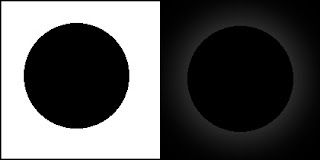
Note: Outer glow added to black dot on right to aid visibility.
That may seem stupid at first... a black dot on a black field. But what is black? Look around and you will see hundreds of shades of 'black' everywhere. Black is a color that cameras (and printers) always have trouble with and the result is often pictures with clogged up shadows and dark tones that are lifeless for lack of subtle variations. The same is true for whites and light tones. Primary colors can be problematic as well.
Try making a picture of a pile of charcoal briquettes. How much detail survives in your final print? Get out your old skiing pictures and you'll see problems in the lack of highlight details. Or, take a picture of a red rose and check how well you can differentiate between the petals of the flower. Problems like these are common because cameras and image processing technologies use algorithms that are aimed at 'average' tones... so called Mid Tones.
The best printing presents the widest dynamic tone range ...the most colors. Look at your prints. Can you see into the shadows and is their detail there. How about the highlights... are they blown out? These are deficiencies that can be corrected in prepress to make your prints look better. The mark of a good print is the width of its tone range and the subtlety of its details across the entire tone range, from the lightest to the darkest... not just mid tones.
Although there are many automated tools in PhotoShop® (and other image processing software like LightRoom®) making Selections from Paths nearly always gives the best results. There are a plenty of reasons why this is so and these are described in my book, Giclée Prepress - The Art of Giclée. However the gist of it is that the non-automated tools always deliver a superior result when working with continuous-tone images.
My tool of choice is the Pen. I use it to make Paths around the objects I am separating. The Paths are converted to Selections and those are used to make the cut out.
When I am demonstrating the Pen tool in my seminars about digital imaging and prepress at Vashon Island Imaging, I can see my students eyes roll as they realize that it takes a very long time to make a good path. Can you imagine non-stop path making for 50 hours? That's what Exuviae Illuminati required.
Making a Path in PhotoShop® is just like making a 'connect the dots' drawing, except that in this case you make the dots too. The more dots in the Path, the more accurate it will be. That can be a lot of dots. For example this picture has 11 hollyhock plants (of which 9 were used in the final version) and each one took 2 hours on average to outline. I know that because I was listening to KD Sessions by Kruder & Dorfmeister (which has a great tempo for dotting your way down the path) and I played it twice when I was outlining the smallest hollyhock. But what is small?
Work At 200% Final Size
The picture size you work at should be larger than what the finished picture will be. Wherever possible you should work at twice the size. If you are making a 16 X 20, work at 32 X 40 as long as you can and then reduce it down to 16 X 20 for printing. Working at twice-up size 'doubles' the amount of dots compared to working on a 16 X 20.
Zoom In on the part you are outlining and use the Pen on it at about 500% to 800% magnification. To put that magnification into perspective, consider this:
The 'original' for Exuviae Illuminati is 100 inches tall by 80 inches wide when printed at 240dpi. This assures that the image quality will be superb when reduced to 48 X 36 inches, which is the largest size that will be sold. (My illustrations are released as limited editions of 44 divided into seven sizes generally ranging from 16 inches to 48 inches on the long side.)
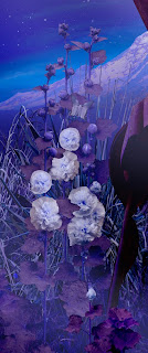
For a 100 X 80-inch picture the average hollyhock needed to be at least 40 inches tall -- or about 10,000 pixels. The tallest hollyhock in the picture is about 20,000 pixels high. To achieve those sizes with a 'normal' camera* each hollyhock plant was photographed in sections to make a collage of 5 vertical pictures (the tall one 8), each one being 4096 pixels high.
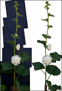
The five shots in each flower collage were overlapped about 50% to allow for lens distortions at the edges, which are the nemesis of image stitching. Using only the center 50% of each picture makes joining the sections more accurate, especially for images captured using zoom lenses which present the artist with 'barrel' and 'pincushion' distortion problems.
The combined resolution of the five collage pictures was enough to be about 40 inches tall at 240dpi. Here's the math: 5 X 4096 pixels = 20,480 pixels / 240 dpi = 85.33 inches / 50% (for overlap) = 42.66 inches.
*(I used a Nikon® D2 with a flat-field 55mm f/3.5 Micro-Nikkor® lens)
Make Paths at 500% - 800% Magnification
Even working on a picture that is twice as large as the final print isn't big enough to make a good Path. To plot enough coordinate 'dots' observe your work at a magnification between 500 and 800%. Viewing Exuviae Illuminati at 800% magnification, the equivalent height of a 40-inch hollyhock is 320 inches.
Each giant-sized hollyhock was outlined with dots every 1/2 inch on average (as seen on a 22-inch monitor), with more dots on curves and especially in the corners. That's a lot of dots... and a lot of Zen. You can see how fast it adds up when you consider that this picture was made from the following parts:
11 hollyhocks (each a collage of up to 5 frames)
2 moths
1 dragonfly exuviae
1 mountain (collage of 20 parts)
1 David Erue giraffe statue (collage of 12 parts)
1 pampas grass (collage of 6 parts)
1 moon (2 actually)
2 geese collections (pre-made collages)
2 skies (pre-made collages)
Preparing that many picture elements, 50 hours just seemed to zip right by. After the picture elements were isolated and processed I was at about the same point as the chop-chop at the Green Onion, our local Chinese restaurant here on Vashon Island. After chopping the ingredients they are ready for the wok where they will be fused together into a new and singular culinary creation.
Likewise, as the picture elements are assembled the picture evolves and morphs into its final form. The addition of each new element changes the balances and interrelationships within the picture's borders. This picture changed from a horizontal to a vertical format half way through because the triangulation of the composition required more height. (The key to good composition is a circle (or oval) containing triangles... explained further in my book and in earlier blogs.)
Every Picture Tells A Story
In Hollywood an editor does the work of assembling a motion picture from the miles and miles of film shot. The editor's work makes or breaks the movie. The editor has to cull the best 'take' from the many made of each and every scene (Stanley Kubrick is famous for having shot over 80 takes of one scene in his epic film Full Metal Jacket). Editors also sort through more miles of 'B-roll' material shot by other cameramen to provide other angles and points of view for visual variety. The way they cut scenes sets the 'tempo' of the scenes and of the entire production. But most importantly, good editors are storytellers.
Badly edited films are hard to follow and can feel visually uncomfortable. Well-edited movies present their stories seamlessly making them easy to follow and understand. Some editing styles are flamboyant and exaggerated, some choreographed to music, and others can be narrative or even contemplative. Whatever their style, successful editors do their work with a tough-love attitude. Paramount for an editor is propelling the story forward in the most understandable (and hopefully unforgettable) way. Whatever helps do that is in, whatever doesn't is out.
The editor works in the 'cutting room' ...well named since lots of scene takes are cut. The unwanted scenes land on the floor to be swept into oblivion. It's easy for the editor to discard scenes since someone else did all the work on them. But imagine how the cameraman feels when his special shot doesn't make the final cut.
You are a storyteller too. Your pictures speak for you. A successful picture is like well-written prose. Unnecessary words that clutter concepts are cut. Red-hot writing is often done with a blue pencil.
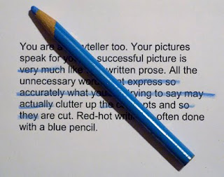
The point is that you must be a ruthless editor of your own work when making a collage composition. It can be really difficult to toss away an element you might have invested a few hours making, but so it goes in the illustration biz. Less can be more. While putting together your composition keep in mind the Swedish word 'lagom'.
How Much Is Enough?
'Lagom' means 'just enough'. It is as much a concept as a phrase. It's all about balance. Some people call it 'harmony'. In a picture it involves a lot of things, many of them completely unknown to the creator until the 'aha' moment when the composition just 'works'. Eureka!
I learned tough-love editing from Chris Korody when I worked at his famous multi-image production company Image Stream back in 1983. Chris is a pragmatist and a realist. Compassion is not his best quality and that is why he was able to put together a team that produced many of the best multi-image shows ever made. Chris and I both share places in the Multi-Image Hall of Fame but got there traveling very different roads, he in Los Angeles and I in New York.
(Multi-image is the term used to describe the technique of creating audiovisual shows using multiple slide projectors. Multi-image technology eventually migrated to digital projection instead of slides. Today, using Dataton® Watchout software and a few video projectors has the same visual impact that once needed 100 or more Kodak® slide projectors.)
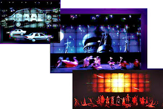
1984 world launch for Saab® 9000CD featured an 80-projector multi-image show on a screen 50-meters wide.
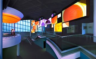
2006 Centers for Disease Control and Prevention (CDC) museum lobby features 19-screen multi-image show choreographed using Dataton® Watchout software.
I built my reputation making slide shows that were step-frame animations achieved by rapid-fire projection. For example, to set the world speed record for slides I made a show called 'Hawaii Xanadu' using 30 slide projectors aimed at the same screen. Viewers watched 2,400 slides (30 full slide trays) accompanied by the 3.5-minute Olivia Newton-John title song from her movie, Xanadu. That's an average of 11.4 slides per second, a 'frame' count approaching film speed (24 frames per second).
Although my animated style had won a box full of trophies it wasn't appropriate at Image Stream where Chris Korody put the reins on me and encouraged me to milk as much time as I could out of every scene instead of hurrying to the next.
You might ask how did a person with an award-winning career in corporate AV to get into fine art and giclée printing. The answer is the ephemeral nature of the AV medium itself. By that I mean simply this: Imagine yourself on the sunset side of life with nothing to 'show' for all your years in 'show' business.
There is no way that you would ever be able to see 'Xanadu' or any of my multi-image shows. Oh, you could see DVDs of old VHS tapes shot with primitive cameras and watch the visual choreography of a 100-foot-wide screen shrunken down to 640 pixels. Right. That's like seeing the Mona Lisa on a postage stamp... or Lawrence of Arabia on an iPad®.

Now instead of seeing a week's work explode on the screen like a skyrocket for a fleeting moment of glory, I can park my picture on the wall and look at it whenever I like... without batteries! But I digress....
One evening I emerged from a Zen state while dotting a hollyhock Path and found the TV tuned to Antiques Road Show on PBS. I'm no antique collector (although I have my fair share of ancient old gear) and usually I would pay no attention to such a show. But this time they were discussing what kind of items qualified to be called antiques and appear on the show.
Aha, I said to myself, this show will be good... like the perennial discussion on the question of 'what is Art?' That discussion is one I have profound interest in since the products of my labors -- giclée illustrations and artwork -- are discriminated against directly and indirectly by large swaths of the Arts world.
Listening to the show was comedic. One person said that to be an antique something had to be at least 100 years old, but another wanted to be able to include Art Deco and even Elvis Presley paraphernalia. Still another said it had nothing to do with the age of the items but with the stories about the people who collected the items. And so on. No two 'experts' could agree.
Discrimination against giclée is like that... no two experts can agree on whether giclée is even art at all. That comes from an unfocused yet widespread generalized feeling that all computer art is either bogus, illegitimate or both. Some people think that making giclée art is akin to making color copies, which cheapens the medium in their eyes. Many of those same people think that to make a picture in a computer involves just a few pushes of the right buttons. Well yeah, that's true if you add a few zeros. For example, to make Exuviae Illuminati I pushed computer buttons about 200,000 times. Check this math:
If I plotted one path point per second for 50 hours that would be 180,000... but sometimes I am much faster than that so bumping up the total by about 10% isn't unrealistic. That leads me to the question I love to ask those who say that the term 'giclée art' is an oxymoron:
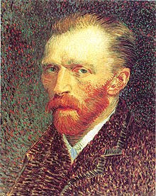
To make his portrait Vincent Van Gogh dabbed about 200,000 dots onto a canvas with colored paints instead of pixels... his works and those of other Pointillist painters are hailed as high Art.
Why is art made with camelhair brush more legitimate than work done with an 'electric' brush? That, dear reader is a question I often ponder during the hours spent in Wonderland. In the end, both methods put colors onto canvas.
No Pain No Gain
For people to appreciate art there seems to be a necessary 'pain' factor. The artist should suffer. More suffering means better art, or so that argument goes.
If that's the case digital art is doomed as long as people think that computerized picture production is painless. We have the good folks at companies like Adobe® and Epson® to thank for that misconception. They would have you believe that anyone can be an image pro using 'magic' or 'magnetic' tools and 'wizards'.
That reminds me of the old matchbook covers with a childlike cartoon of a dog's face and the come on, 'If You Can Draw This Dog You Can Be An Artist' (just send $$ to...).
Reminds me of John Gnagy too. He is most remembered for being America's original television art instructor, hosting You Are an Artist, on the NBC network back in the day. His ploy was a paint-by-numbers scheme, still used to 'teach' kids to this day.
Don't be misled by the hype about 'magic' anything. You'll never be a Wizard using wizards. The slogan of body-builders, 'no pain no gain', also applies to your work as a digital artist. So roll up your sleeves, take a deep breath, and plunge down the hole.
Use the Pen tool as a 'point' of departure, leading you down the Path, possibly to a Wonderland of your own.


Great stuff!
ReplyDeleteThank you...
Regards,
Progettazione Grafica